January 26th, 2026
13 Essential AI Tools for Data Analysis: Features & Pricing [2026]
By Zach Perkel · 38 min read
I tested dozens of AI tools for data analysis across marketing campaigns, financial reports, and operations dashboards. These 13 help business teams get insights without waiting on analysts or learning SQL.
Top 13 AI tools for data analysis in 2026: At a glance
AI tools for data analysis range from conversational assistants to technical platforms. Some of the tools below excel at visualization. Others are great at forecasting, and some offer collaborative notebooks. Here are the top 13 tools compared side by side:
Tool | Best For | Starting Price (billed annually) | Key Strength |
|---|---|---|---|
Data analysis using conversational queries | Natural language queries, automated reporting, database connections, and improves accuracy over time | ||
Interactive dashboards with AI-assisted insights | $75/user/month for a Creator license | Interactive dashboards, wide data connections, and custom calculations | |
Enterprise reporting within the Microsoft ecosystem | AI Copilot integration, Microsoft ecosystem compatibility, and real-time dashboards | ||
Quick visual analysis and automated charts | Automatic visualization, no-code interface, and instant insights | ||
Associative exploration across data sources | $200/month for 10 users | AI-powered insights, conversational analytics, and automated data prep | |
Quick one-off analysis on small datasets | $8/month, billed monthly | Code interpreter, conversational interface, and file uploads | |
Technical teams building SQL and Python notebooks | $36/editor/month, billed monthly | Collaborative notebooks, SQL and Python support, and version control | |
Collaborative data science with version control | Real-time collaboration, notebook sharing, and integration with data sources | ||
Automated narrative insights from metrics | Natural language search, automated narratives, and business intelligence | ||
Building predictive models without coding | Automated machine learning, model deployment, and predictive analytics | ||
Search-based analytics for data warehouses | AI-powered search, embedded analytics, and live data connections | ||
Analysis within Google Workspace files | $19.99/month, billed monthly | Google Workspace integration, multimodal analysis, and conversational AI | |
Detailed reasoning on uploaded datasets | Advanced reasoning, large context window, and data interpretation |
1. Julius: Best for data analysis using conversational queries
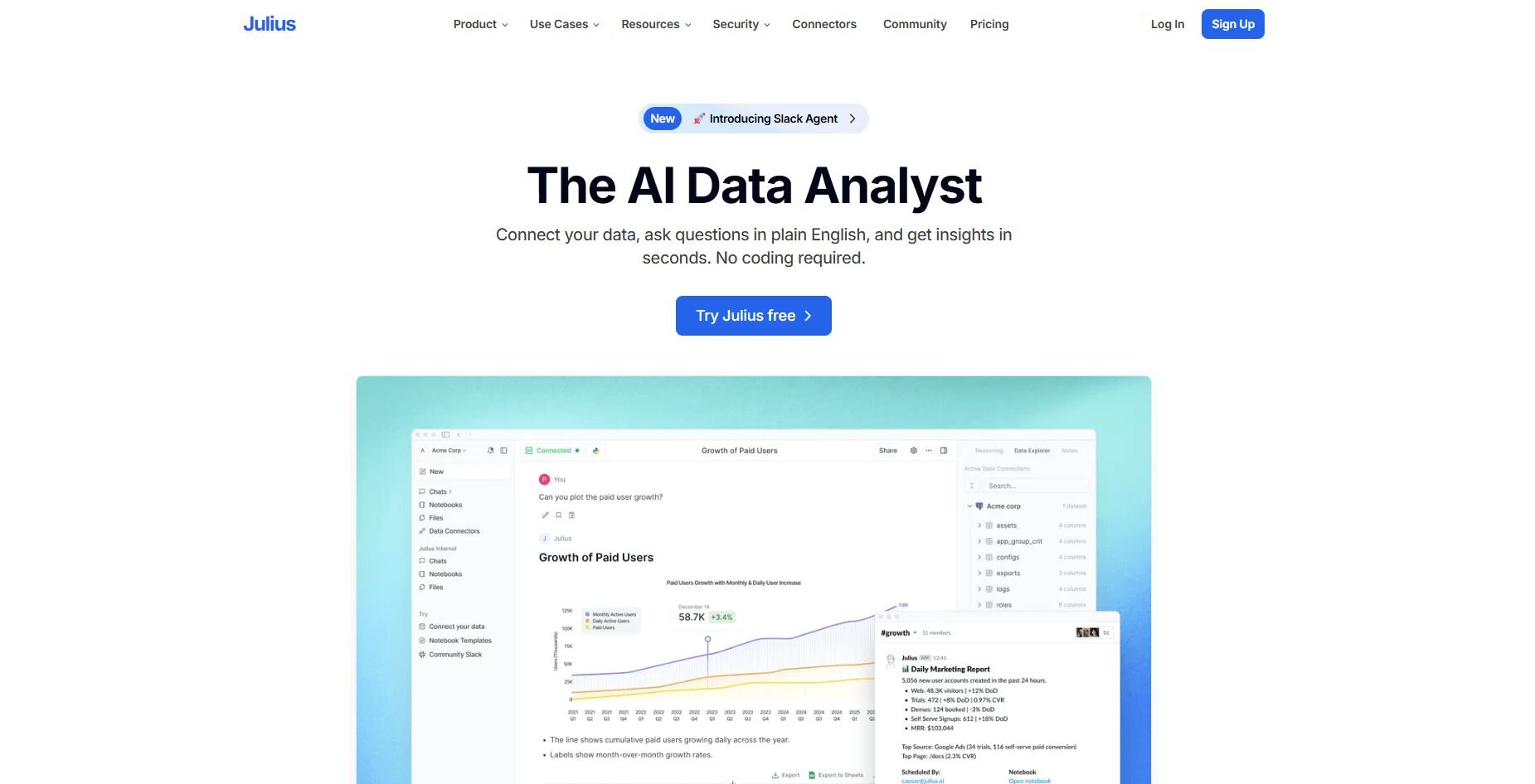
What it does: Julius is an AI data analysis tool that runs queries on your databases or spreadsheets and returns charts, tables, or summaries. It retries failed queries automatically and lets you save repeatable analyses that refresh with new data, so you can track metrics over time without writing SQL.
Who it's for: Business teams who work with structured data and want quick visual analysis without coding.
We designed Julius to help business teams analyze data from their databases and spreadsheets. After you connect sources like Postgres or Google Sheets, you can ask "Show revenue by region last quarter" or "Compare signup rates across campaigns." Julius runs the query and shows results in charts, tables, or summaries.
The platform shows which specific tables and columns produced each result. That transparency helps you verify the numbers before adding them to a presentation or sending them to your team.
Notebooks let you save analyses that run automatically on a schedule. Set up a weekly revenue summary or monthly customer report, and Julius updates it with current data and sends it to Slack or email. The tool also learns how your tables relate to each other, so it pulls from the right fields more consistently as you ask new questions.Key features
Natural language analysis: Ask questions and get visual answers
Connected data sources: Works with Postgres, BigQuery, Snowflake, and Google Sheets
Reusable Notebooks: Save recurring checks that auto refresh
Scheduled reporting: Send recurring results to Slack or email
Table relationship learning: Improves column and join accuracy over time
Pros
Quick setup for structured data
Clear charts for exploratory analysis
Automated recurring updates
Cons
Built more for business research than academic-level statistics
Requires clean, consistent data
Pricing
Julius starts at $37 per month.
Bottom line
2. Tableau: Best for interactive dashboards with AI-assisted insights
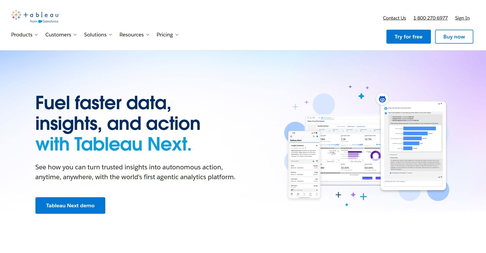
What it does: Tableau is a business intelligence platform that connects to databases, spreadsheets, and cloud platforms. You can use it to build interactive dashboards that update automatically. It uses AI features to suggest charts, highlight anomalies, and explain why specific data points are higher or lower than expected.
Who it's for: Teams that need to present data visually and share live dashboards across departments or clients.
I tested Tableau by connecting it to sales and marketing data across multiple sources. The drag-and-drop interface made building dashboards quick once I understood how dimensions and measures worked. Filters let me dig deeper into specific time periods or regions without rebuilding charts.
Tableau's AI features suggested chart types based on the fields I selected, which sped up early exploration. The Explain Data feature highlighted outliers and showed which factors likely contributed to those unusually high or low values.
Customizing calculations required some formula knowledge, but the interface made testing changes straightforward.
Key features
Interactive dashboards: Visualize KPIs and performance trends in real time
AI-assisted insights: Get chart suggestions and anomaly detection
Wide data connections: Integrates with spreadsheets, databases, and cloud apps
Pros
Visual, intuitive interface
Strong sharing and collaboration options
Works well with both small and large datasets
Cons
Can be complex for first-time users
Advanced customization may require training
Pricing
Tableau starts at $75 per user per month for a Creator license.
Bottom line
3. Microsoft Power BI: Best for enterprise reporting within Microsoft ecosystem
What it does: Power BI is a business intelligence platform from Microsoft that connects to data sources and builds reports with AI Copilot assistance. It integrates directly with Excel, Teams, and Azure, and updates dashboards in real time as data changes.
Who it's for: Organizations already using Microsoft tools that need enterprise reporting with AI features.
I connected Power BI to Excel files and SharePoint data I already used. The AI Copilot answered questions like "Show top performing products by margin" and built visuals automatically, which cut down manual chart setup.
Sharing reports through Teams was straightforward. Dashboards appeared directly in channels, and I could limit what each person saw using row-level security. That mattered when sharing client-facing reports.
Building custom calculations required DAX (Data Analysis Expressions), Microsoft's formula language for Power BI. The DAX syntax took some learning, but formulas stayed consistent once I set them up.Key features
AI Copilot integration: Ask questions and get AI-generated visuals
Microsoft ecosystem compatibility: Works directly with Excel, Teams, and Azure
Real-time dashboards: Updates automatically as source data changes
Pros
Smooth integration with Microsoft products
Strong security and access controls
AI Copilot speeds up report creation
Cons
DAX formulas can be complex for beginners
Works best if you’re already in the Microsoft ecosystem
Pricing
Bottom line
4. Polymer: Best for quick visual analysis and automated charts
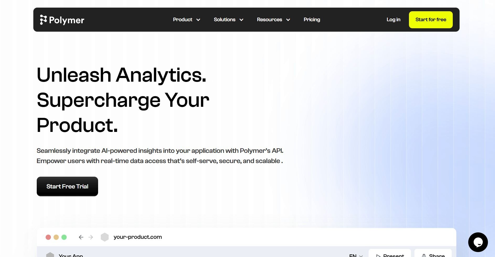
What it does: Polymer is an AI-powered analytics platform that automatically generates charts and dashboards from uploaded data. It analyzes your dataset and suggests visualizations without requiring manual chart building or data prep.
Who it's for: Business users who need fast visual insights from spreadsheets without technical setup.
Polymer impressed me with how quickly it turned raw CSV files into usable dashboards. After uploading sales data, it automatically created charts showing trends, distributions, and comparisons without any prompting. The setup took under a minute.
The platform highlighted interesting patterns like seasonal spikes and outliers, which helped me spot issues I would have missed in spreadsheets. Filtering worked intuitively with dropdown menus, making it easy to drill into specific segments or time periods.
Polymer handled exploratory analysis well, but when I needed custom calculations or joined tables, the options were limited.
Key features
Automatic visualization: Generates charts instantly from uploaded files
No-code interface: Build dashboards without formulas or queries
Instant insights: Highlights patterns and anomalies automatically
Pros
Fast setup
Intuitive for non-technical users
Good for quick exploratory analysis
Cons
Limited customization for complex analysis
Works best with single-table datasets
Pricing
Polymer starts at $25 per month.
Bottom line
5. Qlik Cloud Analytics: Best for associative exploration across data sources
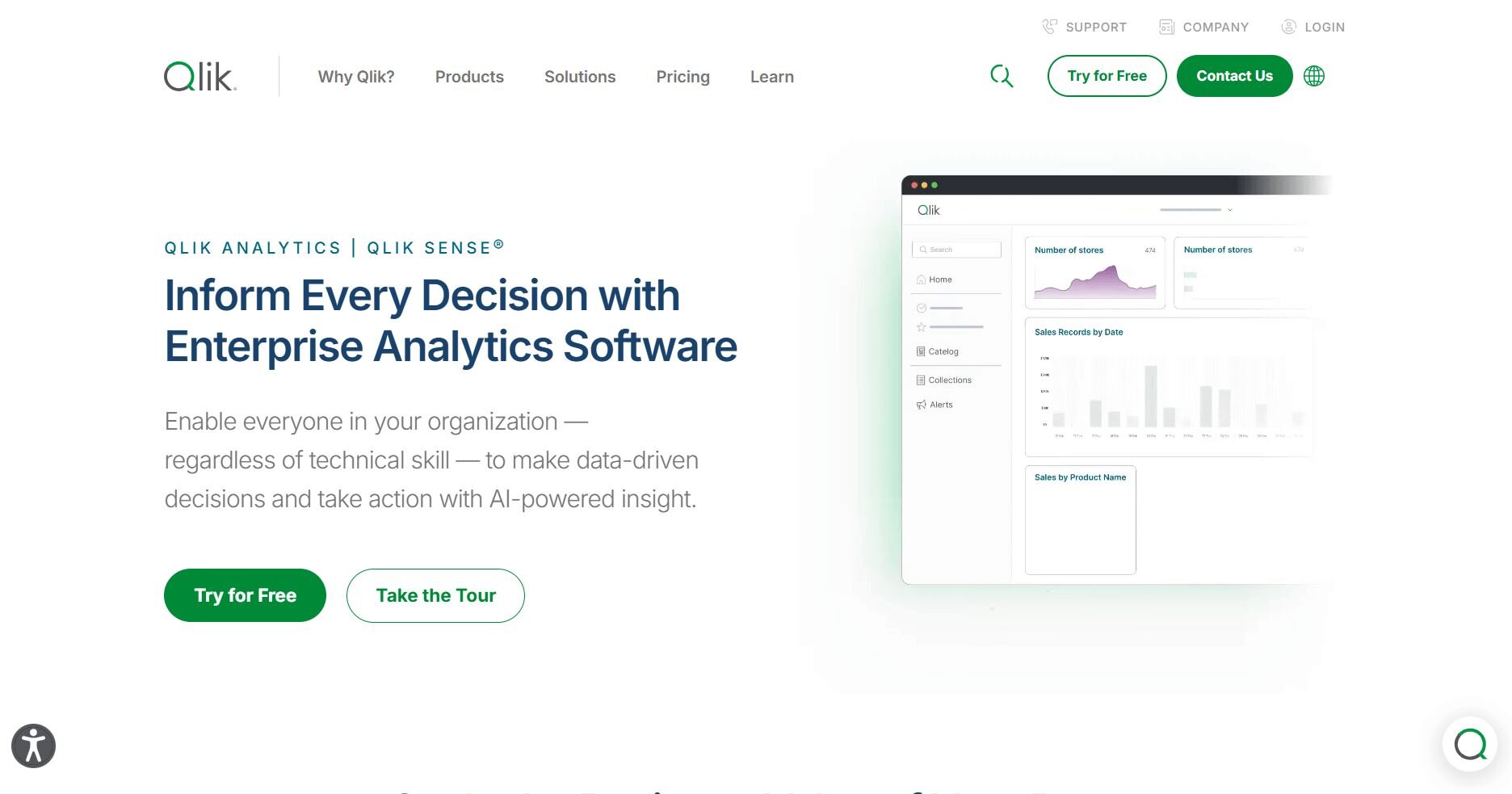
What it does: Qlik Cloud Analytics is a business intelligence platform that uses an associative engine to link data across multiple sources. It offers AI-powered insights, conversational analytics, and automated data prep to help users explore relationships in their data.
Who it's for: Teams that need to analyze data from multiple sources and explore how metrics relate to each other.
I tested Qlik Cloud Analytics to see how its associative model worked. Unlike traditional filters that limit what you see, Qlik's associative engine shows you all related data when you click something. When I selected a region, it highlighted connected products, customers, and inventory across every table automatically.
Data prep took time upfront. I had to define how tables connected before the associative engine worked properly. After setup, navigation was smooth, and the AI flagged trends I hadn't looked for.Key features
AI-powered insights: Automatically surfaces trends and correlations
Conversational analytics: Ask questions in natural language
Automated data prep: Cleans and structures data for analysis
Pros
Unique associative model reveals hidden relationships
Handles multiple data sources well
AI insights highlight unexpected patterns
Cons
Steeper learning curve than traditional BI tools
Initial data modeling requires time
Pricing
Qlik Cloud Analytics starts at $200 per month for 10 users.
Bottom line
6. ChatGPT: Best for quick one-off analysis on small datasets
What it does: ChatGPT is an AI chatbot from OpenAI that includes a Code Interpreter feature for analyzing uploaded files. It can run Python code, create charts, and answer questions about data through conversation.
Who it's for: Users who need occasional analysis on small to medium files without installing specialized software.
I uploaded several CSV files into ChatGPT to see how it handled data questions. For simple tasks like calculating averages, finding trends, or creating basic charts, it worked quickly.
ChatGPT's conversational interface made iteration easy. When a chart wasn't quite right, I could say "Make the bars blue and sort by value" and it adjusted immediately. That back-and-forth felt more natural than clicking through menus.
The limitations became clear with larger files or complex analysis. It struggled with larger or more complex files, sometimes timing out or returning errors. Joining multiple tables or running statistical tests required very specific prompting, and results weren't always consistent between attempts.Key features
Code interpreter: Runs Python analysis on uploaded files
Conversational interface: Ask follow-up questions to refine results
File uploads: Accepts CSV, Excel, and other common formats
Pros
No setup or installation required
Natural conversation makes iteration fast
Works well for simple analysis
Cons
Can struggle with very large or complex datasets due to file size and time limits
Inconsistent results on complex queries
Pricing
ChatGPT starts at $8 per month with the new ChatGPT Go plan, billed monthly.
Bottom line
7. Hex: Best for technical teams building SQL and Python notebooks
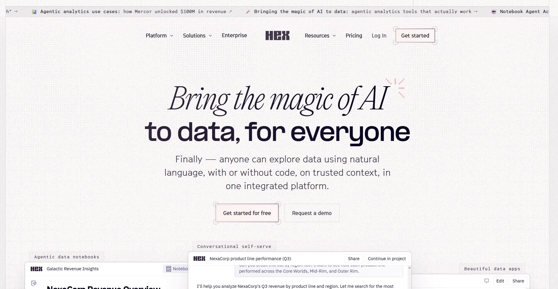
What it does: Hex is a collaborative notebook platform that combines SQL with either Python or R in one workspace. It lets technical teams write queries, build visualizations, and share interactive reports with version control and scheduling features.
Who it's for: Data analysts and engineers who code in SQL or Python and need to collaborate on analysis projects.
I tested Hex by building a notebook that pulled data from Postgres. I cleaned the notebook with Python and created visualizations. The interface made switching between SQL queries and Python code smooth since both ran in the same environment without exporting files between tools.
Version control tracked changes automatically, which helped when I needed to revert a broken query or see what a teammate modified. Scheduling notebooks to run daily worked reliably, and outputs appeared in Slack on time.
Hex's strength is flexibility for technical users. I could use SQL for data pulls, Python for transformations, and built-in charting for visuals. The trade-off is a steeper learning curve for non-technical users who don't write code regularly.Key features
Collaborative notebooks: Multiple users can edit and comment in real time
SQL and Python support: Write queries and code in the same workspace
Version control: Track changes and revert to previous versions
Pros
Smooth workflow for technical users
Strong collaboration features
Reliable scheduling and automation
Cons
Requires coding knowledge
Not built for non-technical users
Pricing
Hex starts at $36 per editor per month, billed monthly.
Bottom line
Hex works well when your team already writes SQL or Python and needs a collaborative space to build and share analysis. The version control and scheduling keep recurring work organized. If you need more advanced machine learning capabilities alongside notebooks, DataRobot might be a better fit.
8. Deepnote: Best for collaborative data science with version control
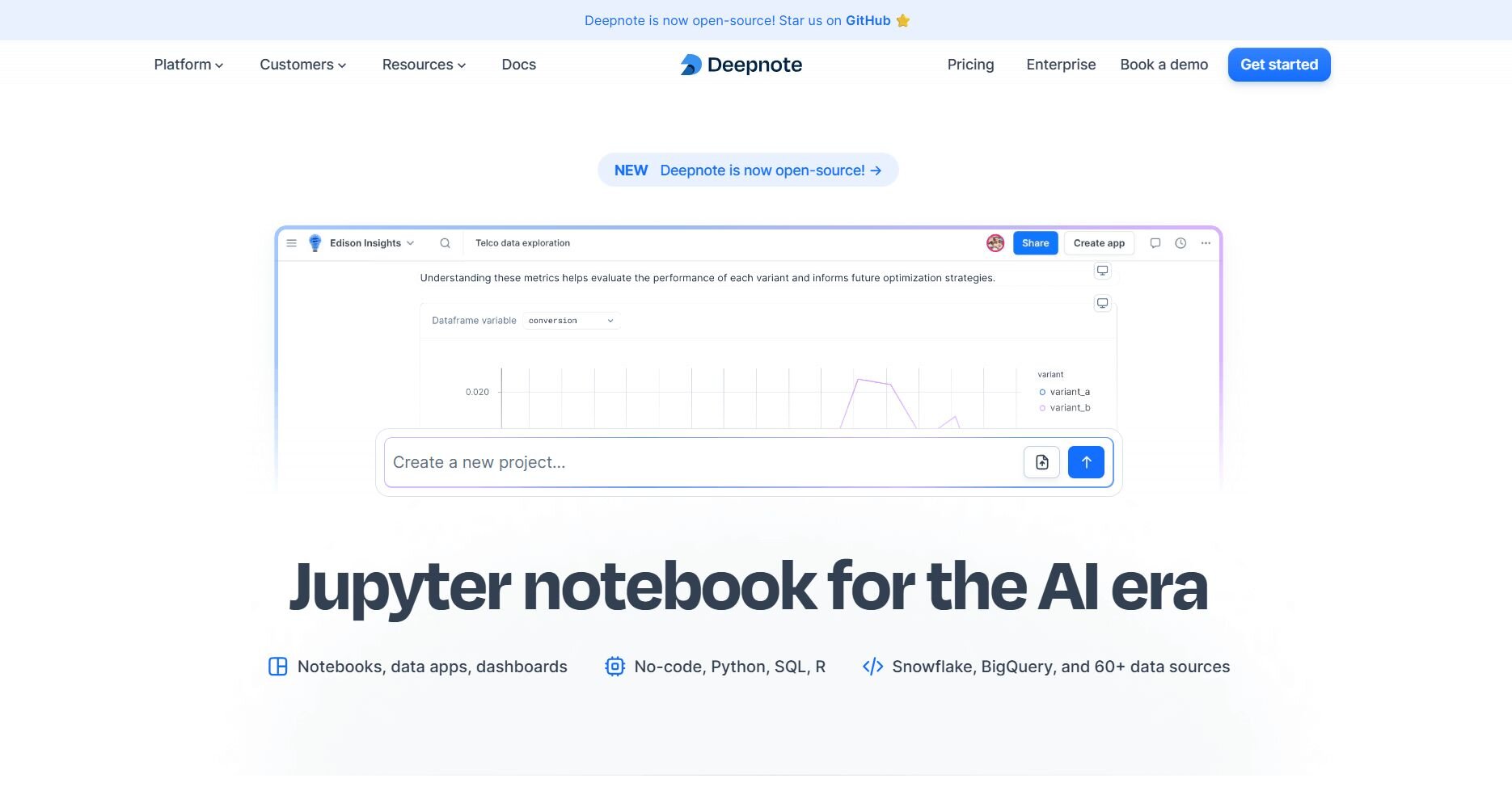
What it does: Deepnote is a cloud-based notebook platform built for data science teams. It supports Python, SQL, and real-time collaboration with integrated data connections, version history, and scheduled runs.
Who it's for: Data scientists and analysts who work in notebooks and need to collaborate on projects with teammates.
Deepnote performed well when I tested it with a team project that combined SQL queries and Python modeling. Multiple people edited the same notebook simultaneously, and changes appeared in real time without conflicts or overwriting each other's work.
The platform connected directly to Postgres and BigQuery, which eliminated the need to export and upload data files. I could query databases with SQL, process results in Python, and build charts all in one place.
Sharing notebooks was simple since viewers saw the latest version automatically. Version control let me roll back changes when tests didn't work, and comments kept feedback organized next to specific code blocks.Key features
Real-time collaboration: Multiple users can edit notebooks together
Notebook sharing: Share interactive reports with version history
Integration with data sources: Connect directly to databases and cloud platforms
Pros
Strong real-time collaboration
Direct database connections
Good version control and commenting
Cons
Requires Python or SQL knowledge
Limited for non-technical users
Pricing
Deepnote starts at $39 per editor per month.
Bottom line
9. AnswerRocket: Best for automated narrative insights from metrics
What it does: AnswerRocket is an AI analytics platform that generates written explanations of business metrics. It connects to data sources, answers questions in natural language, and creates narratives that explain what changed and why.
Who it's for: Business teams that need quick explanations of performance changes without building dashboards or writing queries.
One of the best things I noticed in AnswerRocket was how it explained metric changes in plain English. I asked, "Why did revenue drop last month?" and got a written summary pointing to specific regions, products, and customer segments that drove the decline.
The narrative format worked well for reports and presentations since I could copy the explanation directly instead of interpreting charts. AnswerRocket highlighted the biggest drivers automatically, which saved time compared to slicing data manually in other tools.
The platform required clean, well-structured data to work properly. When my data had inconsistent naming or missing values, answers became less accurate.
Key features
Natural language search: Ask questions and get written explanations
Automated narratives: Generates summaries of metric changes
Business intelligence: Connects to data sources and explains trends
Pros
Explains changes in plain language
Good for executive reports
Highlights key drivers automatically
Cons
Requires clean, structured data
Setup takes time to define metrics
Pricing
AnswerRocket uses custom pricing.
Bottom line
10. DataRobot: Best for building predictive models without coding
What it does: DataRobot is an automated machine learning platform that builds, tests, and deploys predictive models. It handles data prep, feature engineering, and model selection automatically, then lets you deploy models into production.
Who it's for: Business analysts and data teams who need predictive analytics without writing machine learning code.
I liked how DataRobot automated the entire modeling process. I uploaded customer churn data, and the platform tested dozens of algorithms automatically, ranked them by accuracy, and explained which features drove predictions. That process would have taken days manually.
The platform showed which variables mattered for each prediction, which helped me explain results to stakeholders. I could compare models side-by-side and see trade-offs between accuracy and speed before choosing one to deploy. The main limitation was the cost and setup time.
Key features
Automated machine learning: Tests multiple algorithms and selects the best
Model deployment: Creates API endpoints for production use
Predictive analytics: Forecasts outcomes based on historical data
Pros
Automates complex modeling work
Explains predictions clearly
Strong deployment and monitoring tools
Cons
Expensive for small teams or projects
Setup takes time for best results
Pricing
DataRobot uses custom pricing.
Bottom line
11. ThoughtSpot: Best for search-based analytics for data warehouses
What it does: ThoughtSpot is an AI-powered analytics platform that works like a search engine for business data. It connects to data warehouses and lets users type questions to get charts and answers instantly.
Who it's for: Enterprise teams with data warehouses who want self-service analytics without building reports manually.
I liked how ThoughtSpot handled search when I tested it. I typed "revenue by region last quarter" and got a chart immediately without selecting fields or choosing visualization types. The search understood business terms and matched them to database columns automatically.
ThoughtSpot's AI Sage feature suggested follow-up questions based on what I asked. It also highlighted anomalies in the data. When revenue dropped in one region, it flagged the change and let me drill into the causes with one click.
The platform required significant setup time to map business terms to database fields. But once configured, non-technical users could explore data independently.Key features
AI-powered search: Type questions and get instant visualizations
Embedded analytics: Add search-based analytics to other applications
Live data connections: Query data warehouses directly without extracts
Pros
Intuitive search interface
Good for self-service analytics
Strong embedding capabilities
Cons
Requires initial setup to map terms
Works best with enterprise data warehouses
Pricing
ThoughtSpot starts at $25 per user per month.
Bottom line
12. Google Gemini: Best for analysis within Google Workspace files
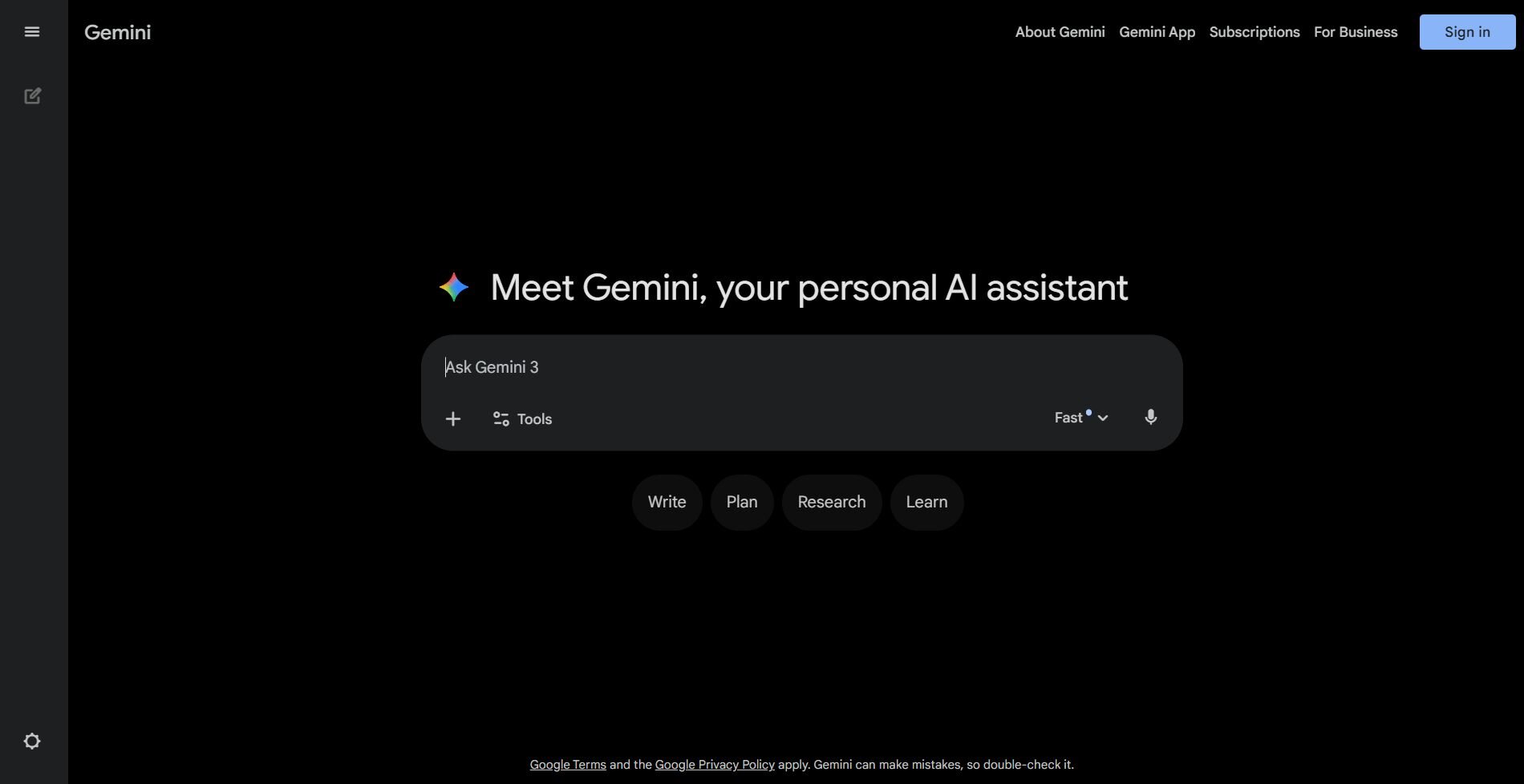
What it does: Google Gemini is an AI assistant from Google that analyzes data in Sheets, Docs, and Drive. It answers questions, creates summaries, and generates insights using conversational AI with access to your Workspace files.
Who it's for: Teams that work primarily in Google Workspace and need quick analysis without leaving their tools.
I tested Google Gemini by asking it to analyze a Google Sheet with sales data. It calculated totals, identified trends, and created summaries without requiring me to write formulas. The integration with Google Workspace meant I could ask questions directly in Sheets or Docs.
Gemini handled multimodal analysis well. I uploaded an image of a chart and asked it to extract the data and recreate it in a Sheet. It recognized the values and rebuilt the chart accurately, which reduced manual data entry.
Gemini worked best on files under a few thousand rows and struggled with multi-table joins or statistical tests. For basic business analysis in Workspace, it covered most needs.
Key features
Google Workspace integration: Works directly in Sheets, Docs, and Drive
Multimodal analysis: Handles text, images, and data together
Conversational AI: Ask questions in natural language
Pros
No setup required for Workspace users
Handles images and documents
Fast for simple analysis
Cons
Limited with large or complex datasets
Works best within the Google ecosystem
Pricing
Google Gemini starts at $19.99 per month, billed monthly.
Bottom line
13. Claude: Best for detailed reasoning on uploaded datasets
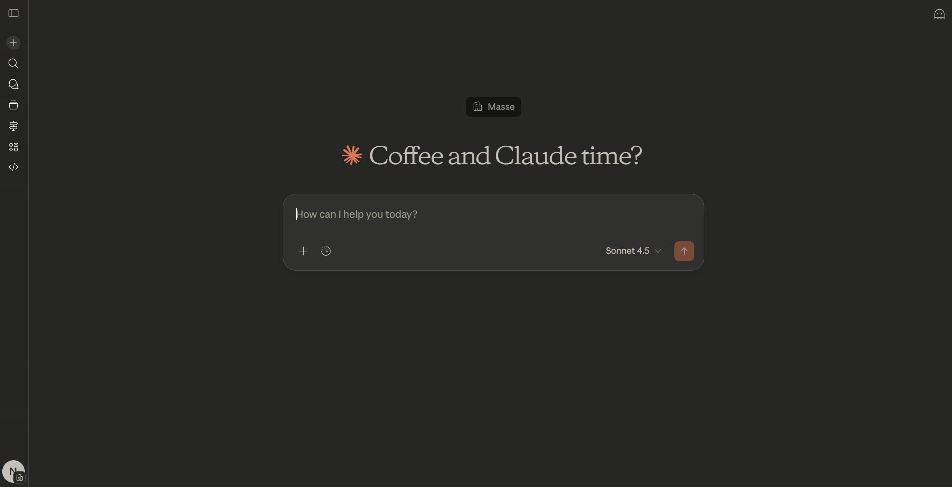
What it does: Claude is an AI assistant from Anthropic that analyzes uploaded files and provides detailed written responses. It handles data interpretation, statistical reasoning, and complex questions with a large context window.
Who it's for: Users who need thoughtful analysis and explanations on datasets with nuanced questions.
Claude performed well when I tested it with a survey dataset that needed interpretation. I uploaded the CSV and asked it to identify correlations and explain patterns. Claude provided detailed reasoning about relationships in the data and suggested additional analyses worth exploring.
The large context window let me upload longer files than some chatbots handle. I could ask follow-up questions that referenced earlier parts of the conversation, and Claude maintained context throughout. That continuity made iterative analysis smoother.
Claude's strength is reasoning depth. It explained statistical concepts clearly and flagged potential issues with data quality or analysis approaches. The trade-off I found was that responses took longer than simpler tools, and it didn't generate interactive charts natively.
Key features
Advanced reasoning: Provides detailed explanations of data patterns
Large context window: Handles longer files and conversations
Data interpretation: Explains statistical concepts and relationships
Pros
Thoughtful, detailed responses
Good for complex questions
Explains reasoning clearly
Cons
Slower than simpler tools
Limited native visualization
Pricing
Claude starts at $17 per month.
Bottom line
How I tested these AI tools for data analysis
I tested these tools across marketing campaigns, financial reporting, and operations projects. I wanted to see whether each platform could answer business questions accurately. I also wanted to check whether teams could use them without needing technical support.
Here’s what I looked at:
Setup speed: How long it took to connect data sources and start getting answers.
Query accuracy: Whether natural language questions returned correct results or required multiple attempts.
Data handling: How each tool managed different file sizes, from small CSVs to enterprise databases.
Visualization quality: If the charts clearly showed trends or needed manual cleanup.
Collaboration features: How easily teams could share results and work together on analysis.
Learning curve: Whether business users could run analysis independently or needed technical training.
Repeatability: If I could save workflows and rerun them with updated data.
Cost value: What you actually get at each pricing tier compared to what's advertised.
Which AI data analysis tool should you choose?
Your choice of AI data analysis tool depends on whether you need natural language queries, predictive modeling, interactive dashboards, or collaborative notebooks.
Choose:
Julius if you want to analyze connected databases through natural language and build reports that update automatically on a schedule.
Tableau if your team needs interactive dashboards with strong visualization controls and AI-assisted insights.
Microsoft Power BI if you already use Microsoft tools and need enterprise reporting with role-based access controls.
Polymer if you need to upload spreadsheets and see visual insights immediately without any setup.
Qlik Cloud Analytics if you want to explore how metrics connect across multiple data sources using an associative engine.
ChatGPT if you need quick analysis on small files and prefer a conversational interface over specialized software.
Hex if your team writes SQL and Python and needs a collaborative workspace with version control.
Deepnote if you work on data science projects that require real-time collaboration and direct database connections.
AnswerRocket if you need written explanations of metric changes for executive reports rather than building dashboards.
DataRobot if you want to build and deploy predictive models without writing machine learning code.
ThoughtSpot if you have a data warehouse and want teams to search for answers like using Google.
Google Gemini if your data lives in Google Workspace and you want analysis without leaving Sheets or Docs.
Claude if you need detailed reasoning and explanations about your data with careful statistical interpretation.
My final verdict
I found that Tableau and Power BI handle visualization and dashboards well for teams that build reports manually. ChatGPT and Claude work for quick questions on small files, but they struggle with larger datasets or repeatable workflows. DataRobot and ThoughtSpot serve enterprise teams with data warehouses and predictive modeling needs.
Julius combines natural language queries with connected databases and scheduled reports. You can analyze live data without writing code, and reports update automatically. I've found this works well for teams who need consistent insights without waiting on analysts, especially when questions change weekly but data sources stay the same.
Want to simplify data analysis? Try Julius
AI tools for data analysis help you find patterns and trends that aren't obvious in raw data. Julius makes that process faster by letting you analyze data through natural language, so you don't have to write SQL or scripts. It connects directly to your databases and files, then delivers charts, summaries, and insights you can share quickly.
Here’s how Julius helps:
Quick single-metric checks: Ask for an average, spread, or distribution, and Julius shows you the numbers with an easy-to-read chart.
Built-in visualization: Get histograms, box plots, and bar charts on the spot instead of jumping into another tool to build them.
Catch outliers early: Julius highlights suspicious values and metrics that throw off your results, so you can make confident business decisions based on clean and trustworthy data.
Recurring summaries: Schedule analyses like weekly revenue or delivery time at the 95th percentile and receive them automatically by email or Slack.
Smarter over time with the Learning Sub Agent: Julius's Learning Sub Agent automatically learns your database structure, table relationships, and column meanings as you use it. With each query on connected data, it gets better at finding the right information and delivering faster, more accurate answers without manual configuration.
One-click sharing: Turn a thread of analysis into a PDF report you can pass along without extra formatting.
Direct connections: Link your databases and files so results come from live data, not stale spreadsheets.
Ready to see how Julius can help your team make better decisions? Try Julius for free today.
Frequently asked questions
What's the difference between AI data analysis tools and traditional BI platforms?
Do I need to know SQL or Python to use AI data analysis tools?
How does messy or incomplete data affect AI data analysis tools?
AI data analysis tools require clean, well-structured data to deliver accurate results; messy or incomplete data often leads to errors or unreliable answers. You'll get better results if you standardize column names, fill gaps, and remove duplicates before analysis. Some platforms include automated data prep features, but they can't fix every data quality issue.
Can multiple team members work on the same analysis simultaneously?
Yes, platforms like Hex, Deepnote, and Qlik Cloud Analytics let multiple users edit and comment in real time. Tools like Julius and Tableau let you share results but don't support live co-editing. Choose platforms with version control if your team needs to build an analysis together.
