February 16th, 2026
The 8 Best BI Tools You Need to Know for 2026
By Drew Hahn · 29 min read

8 Best BI tools: At a glance
Tool | Best For | Starting price | Key strength |
|---|---|---|---|
SQL-free data analysis | Natural language queries, live database connections, automated charts, and scheduled analyses | ||
Teams already using Microsoft products | Interactive dashboards, Excel integration, shared metrics, and access controls | ||
Visual analysis and custom dashboards | $75/user/month for a Creator license | Drag-and-drop builder, custom calculations, and flexible layouts | |
Simple reporting with Google data | Free | Google Ads and Analytics connectors, shareable reports, and basic data blending | |
Embedded reporting for small teams | $48/month for Cloud | Prebuilt dashboards, data imports, scheduled reports, and app integrations | |
Monitoring company-wide metrics | Real-time dashboards, alerts, large data imports, and team sharing | ||
Search-based data exploration | Keyword search, AI suggestions, live queries, and visual answers | ||
Exploring relationships in data | $200/month for 10 users | Associative engine, interactive dashboards, data modeling, and governed metrics |
1. Julius: Best for SQL-free data analysis
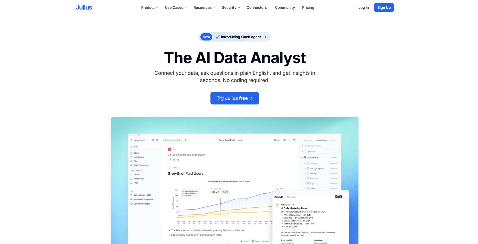
What it does: Julius is an AI data analysis tool that lets you ask questions about your databases or spreadsheets in plain English and get back charts, tables, or summaries. You connect your data sources like Postgres or Google Sheets, type what you want to know, and Julius shows results without requiring SQL.
Who it's for: Business teams who work with structured data and want quick visual analysis without writing code.
We designed Julius to help business users get answers from their data without learning SQL. After you connect databases like Postgres, Snowflake, or BigQuery, you can ask questions in plain English. Julius can return charts, summaries, or raw data tables depending on what you need.
Julius learns the structure of your connected databases over time. As you ask more questions, it figures out which tables and columns you use most often and how your datasets connect. This helps Julius pull the right fields on its own, so results get more accurate over time without extra setup.
We also built Notebooks so you can save analyses that run automatically on a schedule. Set up a weekly revenue summary or monthly customer report once, and Julius refreshes it with current data and sends updates to Slack or email. That keeps recurring analyses organized without manual work each time you need the report.
Tip: We have a Tableau vs Power BI vs Julius guide if you’d like to see how these 3 tools compare.
Key features
Ask questions naturally: Type what you want to know and get charts or tables back
Link live databases: Connect Postgres, Snowflake, BigQuery, or spreadsheets directly
Save repeatable workflows: Build analyses once and run them on a schedule
Auto-send reports: Get results delivered to Slack or your inbox automatically
Learn data structure: Understands table connections better with each query you run
Pros
Business users can explore data independently without analyst support
Charts and summaries generated from natural language questions
Works for both quick exploration and scheduled recurring reports
Cons
Performance depends on clean, well-structured data
Advanced statistical modeling requires external tools
Pricing
Julius starts at $20 per month.
Bottom line
2. Power BI: Best for teams already using Microsoft products
What it does: Power BI is a business intelligence platform that connects to databases, spreadsheets, and Microsoft applications. You can build reports and dashboards using a drag-and-drop interface, then publish them to share with your team. It includes AI features that surface patterns, support basic forecasting, and answer questions in natural language.
Who it's for: Teams that already use Microsoft tools and want to create reports without leaving that environment.
To test Power BI, I connected it directly to my Excel files, SharePoint lists, and SQL databases. The integration meant I could pull data from multiple Microsoft sources and see them update together in one dashboard. I liked that I could do this without extra setup.
The drag-and-drop editor made building visuals simple. I could add filters, slicers, and cross-chart interactions so viewers could explore the data themselves. The Q&A feature let me type questions like "total sales by region" and get a chart back, though it worked better with simpler queries.
I wanted to build custom calculations, so I spent time learning DAX formulas. The syntax felt close to Excel formulas but different enough that I had to reference documentation regularly.
Key features
Microsoft integration: Works natively with Excel, SharePoint, Teams, and Azure
Natural language Q&A: Type questions and get visual answers based on your data
Role-based security: Control who sees which data in shared reports
Pros
Low cost if you already have Office 365
Publish reports to the web or mobile easily
Updates data on a schedule you set
Cons
DAX formulas have a learning curve
Performance can slow with very large datasets
Pricing
Bottom line
3. Tableau: Best for visual analysis and custom dashboards

What it does: Tableau is a business intelligence platform that connects to databases, spreadsheets, and cloud platforms. You can drag and drop fields to build interactive dashboards that update as the underlying data refreshes. It uses AI to suggest charts, highlight anomalies, and point to factors that may explain why some data points are higher or lower than expected.
Who it's for: Teams that need to present data visually and share live dashboards across departments or clients.
I tested Tableau by connecting it to sales and marketing data across multiple sources. The drag-and-drop interface made building dashboards easier once I understood how dimensions and measures worked. Filters let me dig deeper into specific time periods or regions without rebuilding charts.
Tableau's "Show Me" feature suggested chart types based on the fields I selected, which helped me move faster when building my first views. After I had some charts built, the “Explain Data” tool let me click on outliers to see which factors may have contributed to those spikes or drops.
When I wanted to go beyond basic charts, I had to learn some formula syntax to customize calculations. But when I did, I could test changes and see the results update right away.
Tip: We also have a guide on Tableau’s features if you’d like to learn more.
Key features
Drag-and-drop builder: Create visualizations by moving fields onto a canvas
Smart analytics: AI recommends visualizations and flags unusual patterns
Cross-platform connectors: Pull data from Excel, SQL databases, Salesforce, and cloud storage
Pros
Builds complex charts without coding
Updates dashboards as connected data refreshes
Lets you drill down into specific segments
Cons
Steep learning curve for new users
Requires some training for advanced features like calculated fields
Pricing
Bottom line
4. Looker Studio: Best for simple reporting with Google data
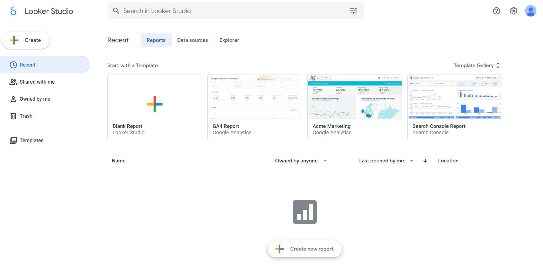
What it does: Looker Studio is Google's free business intelligence tool that connects to Google Analytics, Ads, Sheets, and other data sources. You can drag and drop charts and tables onto a canvas to build reports. It lets you share reports with people who have the link, and viewers can apply filters to explore the data themselves.
Who it's for: Teams that work primarily in Google Workspace and need quick reports without paying for software.
I connected Looker Studio to my Google Analytics and Google Ads accounts to see how quickly I could build a marketing performance report. I pulled website traffic and ad spend into the same view, which let me compare channel performance without jumping between platforms.
The chart customization options felt limited once I moved past basic bar and line graphs. I couldn't adjust colors beyond a preset palette or control font sizes the way I wanted. Performance also dropped once I added a sixth data source to the report, and charts took longer to load.
Sharing worked the same way as other Google Workspace tools, where I could allow viewers to see the report without logging in and control edit access through the standard permission settings.
Key features
Google ecosystem integration: Connects to Analytics, Ads, Sheets, and BigQuery
Free tier: No cost for basic reporting and sharing
Template library: Start with pre-built report layouts for common use cases
Pros
No software cost
Works quickly if you use Google products
Sharing reports takes one click
Cons
Limited chart customization options
Performance drops with multiple data sources
Pricing
Bottom line
5. Zoho Analytics: Best for embedded reporting for small teams
What it does: Zoho Analytics is a business intelligence platform that connects to databases, spreadsheets, and cloud applications. You can build dashboards using drag-and-drop tools, then schedule reports to run on a recurring basis and send results by email. It includes AI features that suggest visualizations and answer questions in natural language.
Who it's for: Small teams that need affordable BI tools with scheduling and AI assistance built in.
Zoho Analytics gave me access to pre-built dashboards for common business metrics like sales pipelines and marketing funnels. I connected a Google Sheets file with sales data, and the platform suggested visualizations based on the data types in each column. That saved setup time compared to starting from scratch.
The AI assistant let me type questions like “show me revenue by month” and generated charts based on my data. It worked well for straightforward queries, but struggled when I asked more complex questions with multiple filters. I had to rephrase a few times to get useful results.
I set up a weekly sales summary to email my team every Monday morning, and it ran without issues. The email included a PDF attachment and a link to the live dashboard.
Key features
Pre-built dashboards: Start with templates for sales, marketing, and finance metrics
AI assistant: Ask questions in plain language and get chart responses
Scheduled delivery: Auto-send reports via email on a recurring schedule
Pros
Lower cost than enterprise BI tools
Includes AI features in lower-priced plans
Easy setup for common use cases
Cons
AI assistant struggles with complex queries
Interface feels dated compared to newer tools
Pricing
Bottom line
6. Domo: Best for monitoring company-wide metrics
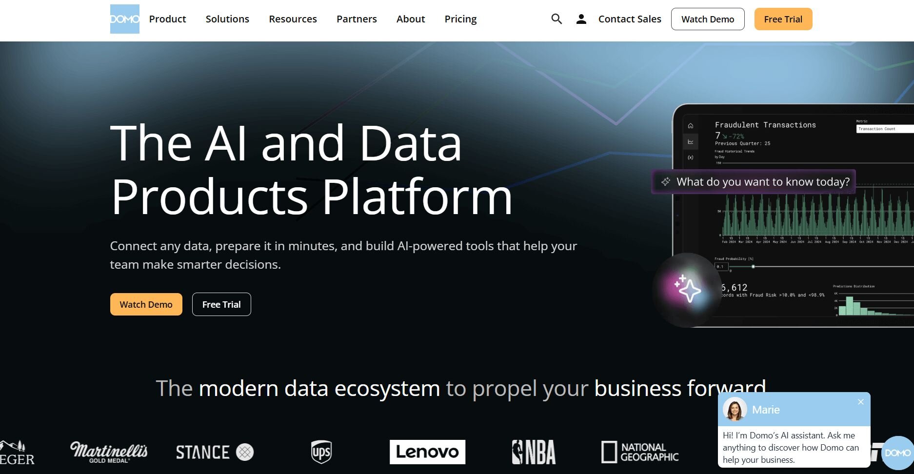
What it does: Domo is a cloud-based business intelligence platform that connects to databases, cloud apps, and spreadsheets. You can build dashboards that refresh in near real time, set up alerts when metrics hit certain thresholds, and share reports with teams across your company. It supports large data volumes and lets you blend data from multiple sources without writing code.
Who it's for: Mid-size to large companies that need to monitor metrics across departments and want real-time dashboard updates.
Testing Domo showed me how it handles large datasets without slowing down. I connected sales data, marketing analytics, and customer support tickets, then built a dashboard that pulled from all three. The platform combined the sources and updated charts as new information came in throughout the day.
I created a notification to ping me in Slack whenever daily revenue dropped below a certain threshold. The alert fired correctly and included a link directly to the relevant dashboard so I could investigate immediately.
Domo packs a lot of features, and I had to click through several menus to find specific settings during my first week of testing. Once I understood the layout, building new dashboards went faster.
Key features
Real-time updates: Dashboards refresh as underlying data changes throughout the day
Custom alerts: Get notified in email or Slack when metrics cross thresholds
Large-scale data handling: Process and visualize high-volume datasets at scale
Pros
Handles complex data from multiple sources
Updates metrics throughout the day
Alert system helps teams stay informed through notifications
Cons
Takes time to learn the interface
Custom pricing makes budget planning harder
Pricing
Bottom line
7. ThoughtSpot: Best for search-based data exploration
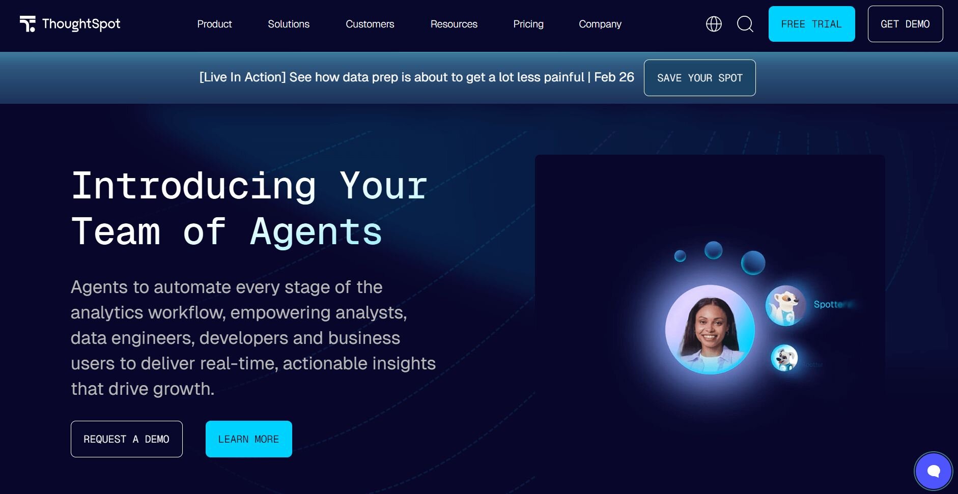
What it does: ThoughtSpot is a business intelligence platform that lets you search your data using keywords instead of building charts manually. You type questions like "revenue by region last quarter" into a search bar, and the platform generates visualizations based on your query. It includes AI features that suggest follow-up questions and highlight related patterns in the data.
Who it's for: Teams that want quick answers from their data without learning dashboard builders or drag-and-drop tools.
I connected ThoughtSpot to a sales database to test how well the search feature worked. Typing "total sales by month" returned a line chart quickly without me selecting chart types or configuring axes. The platform interpreted my query and picked the visualization that made sense for the data.
After each search, ThoughtSpot recommended related questions like "compare this to last year" or "show top performing regions," and clicking them generated new charts without extra setup. That helped me explore angles I hadn't thought to ask about initially.
Search accuracy dropped when I used vague terms or phrased questions in ways the platform didn't recognize. I had to rephrase queries a few times before getting useful results, especially for more complex calculations involving multiple filters.Key features
Keyword search: Type questions and get charts without building them manually
AI-powered suggestions: Get recommendations for related questions to explore
Live query engine: Results refresh as underlying data changes
Pros
Fast answers without dashboard setup
Suggests questions you might not think to ask
Works well for exploratory analysis
Cons
Search struggles with complex or vague queries
Requires clean, well-labeled data to interpret questions correctly
Pricing
Bottom line
8. Qlik Sense: Best for exploring relationships in data
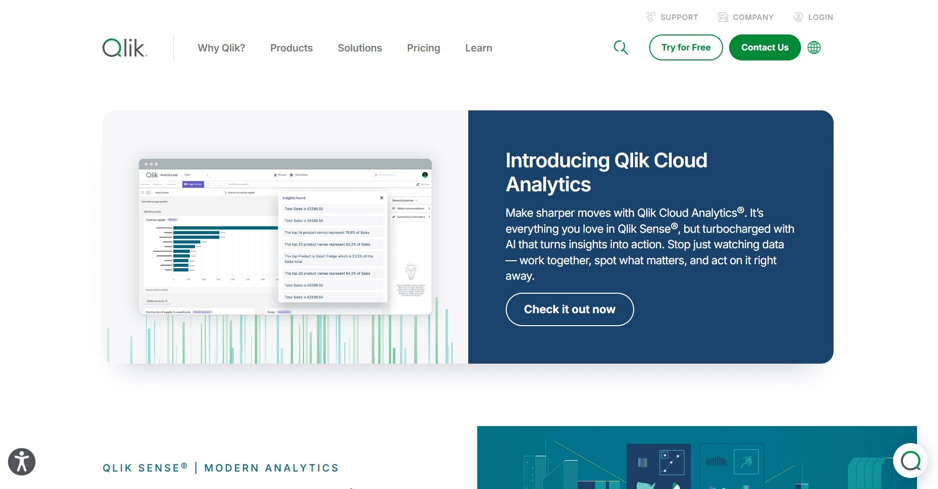
What it does: Qlik Sense is a business intelligence platform that uses an associative engine to show how different data values relate to each other. When you click a value in a chart, the platform highlights related data across other visualizations on the dashboard. It lets you build interactive dashboards and create custom calculations.
Who it's for: Teams that need to explore complex data relationships and want interactive dashboards that respond to user selections.
I built a dashboard in Qlik Sense using sales and customer data to test the associative engine, which automatically shows how data points relate when you click on values. When I clicked on a specific product category in one chart, every other chart on the dashboard updated to show only data related to that selection. Unrelated data points turned gray, making it clear what connected and what didn't.
The associative model made exploration intuitive once I understood how selections worked. I could drill into specific customer segments or time periods by clicking values instead of setting up filters manually. The visual feedback showed me which data had relationships and which didn't.
Building custom metrics required learning Qlik's expression syntax. The formulas felt different from Excel or SQL, and I spent time in documentation figuring out how to write calculations correctly. Once I had the syntax down, I could create reusable metrics that worked across multiple dashboards.Key features
Associative engine: Click a data point to see related information across charts
Interactive dashboards: Filter data by selecting values directly in visualizations
Governed metrics: Create consistent calculations that work across reports
Pros
Shows data relationships clearly
Exploration feels natural through clicking
Handles complex datasets at scale
Cons
Expression syntax has a learning curve
Requires technical setup to perform well at scale
Pricing
Bottom line
How I tested these business intelligence tools
I evaluated each platform by connecting it to real business data and running through tasks that business users need to complete. That meant building dashboards, setting up scheduled reports, and testing how well each tool handled questions from non-technical team members.
During testing, I focused on:
Setup speed: How long it took to connect data sources and build the first working dashboard
Learning curve: Whether business users could navigate the platform without constant help from IT or analysts
Query flexibility: How well each tool handled both simple requests and more complex analysis across multiple data sources
Performance under load: Whether dashboards stayed responsive when pulling from large datasets or multiple connections
Automation capabilities: Which platforms let me schedule reports and set up alerts without repeated manual steps
Real-world usability: How the tools performed when I asked questions the way actual business users would phrase them, not in perfect technical language
Which BI tool should you choose?
Your choice of business intelligence tool depends on which software your team already uses, how technical your users are, and whether you need self-service analysis or enterprise-scale reporting.
Choose:
Julius if you want to query databases in plain English and set up recurring analyses without writing SQL.
Power BI if your company runs on Microsoft products and you need dashboards that integrate with Excel and Teams.
Tableau if you need advanced visualization options and custom calculations for complex data presentations.
Looker Studio if you work primarily in Google Workspace and want free reporting for Analytics and Ads data.
Zoho Analytics if you run a small team with a limited budget and need AI-assisted insights without enterprise pricing.
Domo if you monitor metrics across multiple departments and need real-time dashboards with alert notifications.
ThoughtSpot if you want search-based exploration where you type questions instead of building charts manually.
Qlik Sense if you need to understand how data points relate across datasets through interactive selection rather than preset filters.
My final verdict
I noticed that teams managing large data volumes often pick Domo or Qlik Sense for real-time monitoring across departments, while smaller teams in Google Workspace tend to use Looker Studio for basic reporting. Power BI and Tableau fit companies that need advanced visualizations or tight integration with existing enterprise software.
Julius takes an easier approach by letting you ask questions in natural language and see charts from connected databases without learning SQL. That approach works well when your team needs recurring analysis but wants to reduce reliance on data analysts for routine questions. It keeps exploration fast while making reports repeatable for business users who need consistent metrics.Want to explore your business data without writing code? Try Julius
Business intelligence tools help teams track metrics and monitor performance, but not every question needs a dashboard. Julius is a data analysis tool that connects directly to your data and lets you explore metrics, trends, and outliers by asking questions in natural language.
Here’s how Julius helps:
Quick single-metric checks: Ask for an average, spread, or distribution, and Julius shows you the numbers with an easy-to-read chart.
Built-in visualization: Get histograms, box plots, and bar charts on the spot instead of jumping into another tool to build them.
Catch outliers early: Julius highlights suspicious values and metrics that throw off your results, so you can make confident business decisions based on clean and trustworthy data.
Recurring summaries: Schedule analyses like weekly revenue or delivery time at the 95th percentile and receive them automatically by email or Slack.
Smarter over time with the Learning Sub Agent: Julius's Learning Sub Agent automatically learns your database structure, table relationships, and column meanings as you use it. With each query on connected data, it gets better at finding the right information and delivering faster, more accurate answers without manual configuration.
One-click sharing: Turn a thread of analysis into a PDF report you can pass along without extra formatting.
Direct connections: Link your databases and files so results come from live data, not stale spreadsheets.
