January 23th, 2026
How to Choose the Best Colors for Data Visualization in 2026
By Zach Perkel · 21 min read
After testing color schemes across dozens of quarterly reports and campaign dashboards, I learned that the charts getting the most attention weren't always the prettiest ones. Here's what works for business visualizations in 2026.
How to choose the best color palettes for data visualization
For business data visualization, color palettes fall into three main categories, each designed for different types of data. The palette you choose depends entirely on what your data represents. Here are the three choices:
1. Sequential palettes: Best for showing data that goes from low to high

[ HEX codes: “#71F5C7”, “#61D2AA”, “#51B08F”, “#418E73”, “#326C58” ]
Sequential palettes move from light to dark (or dark to light) in a single color family. For example, in the screenshot above, you can see a color story going from light green to dark green.
These palettes work when your data has a natural order or progression. The darkest color represents the highest value, the lightest represents the lowest.
Here’s when to use sequential palettes:
Sales growth over time: Monthly revenue trending upward shows darker colors as values increase
Temperature maps: Heat gradually building across regions or time periods
Website traffic analysis: Page views ranging from low-performing to high-performing pages
Customer satisfaction scores: Ratings from 1 to 10, where higher numbers get darker shades
I've used sequential palettes for marketing campaign performance dashboards where conversion rates ranged from 2% to 15%. The gradient made it obvious which campaigns needed attention and which were crushing it.
2. Diverging palettes: Best for showing positive and negative changes

[ HEX codes: “#B89B47”, “#DACB9D”, “#E6E7ED”, “#6D7BC7”, “#1E319E” ]
Diverging palettes use two distinct colors that meet at a neutral midpoint, usually white or gray. One color represents values above the midpoint, the other represents values below it.
These palettes work when your data has a meaningful center point with deviations in both directions.
Here’s when to use diverging palettes:
Profit and loss statements: Blue for profits, yellow or orange for losses, with break-even in the middle
Survey results: Agreement vs. disagreement with neutral responses centered
Performance vs. target: Blue for above target, orange for below target, white at 100%
Year-over-year comparisons: Growth in one color, decline in another
I built a quarterly performance dashboard for a product team where we compared actual sales against the forecast. The diverging palette (blue for exceeding forecast, orange for falling short) made underperforming products immediately visible without anyone needing to read numbers.
Tip: Although red and green are a logical choice for profit and loss, it’s a good idea to avoid red and green together. Red-green colorblindness is a common form of color vision deficiency, making these colors appear similar or indistinguishable to affected viewers. I’ll discuss this further in the best practices section below.3. Categorical palettes: Best for comparing different groups or categories

[ HEX codes: “#E63154”, “#EB8253”, “#F5CB65”, “#89B662”, “#45AACC” ]
Categorical palettes, also called qualitative palettes, use distinct, unrelated colors to represent different groups or categories. Each color needs to be visibly different from the others since there's no hierarchical relationship between categories.
These palettes work when comparing things that don't have a natural order.
Here’s when to use categorical palettes:
Department budgets: Finance, Marketing, Engineering, and Sales each get their own color
Product line revenue: Different products or services with no ranking between them
Regional performance: Geographic areas where no region is "higher" or "lower" than another
Channel attribution: Organic search, paid ads, social media, and email as separate categories
I initially created a marketing channel report that tracked 12 different sources, each with its own color. However, nobody could tell which color represented which channel without constantly checking the legend. When I consolidated the visualization to show 6 main channels and grouped minor sources as "Other," the chart became clear enough for stakeholders to spot trends immediately.
How to choose the best colors for graphs and charts in data visualization
Color decisions can fail because people skip straight to picking shades without understanding what their data needs. Here's the four-step process that saves time and produces clearer charts and graphs:
Start with your data structure: Look at whether your data shows progression (sequential), deviation from a center point (diverging), or distinct categories (categorical). Match your palette type to your data structure first.
Consider your audience and context: A dashboard for your marketing team can use different colors than a board presentation. Internal reports allow for more experimental choices, while external reports need conservative palettes like blues, grays, and muted greens. Consider where people will view your visualization and how quickly they need to grasp the information.
Test your color choices: Show your visualization to a few people from your target audience before finalizing it. Ask them what stands out, what's confusing, and whether they can quickly identify trends. Their feedback catches problems you've become blind to after staring at the chart for hours.
Apply and iterate: Build your visualization with your chosen colors, then step away for a few hours. Come back with fresh eyes and look for issues. Colors that seemed fine initially might clash or create unintended emphasis. Adjust as needed and test again on different devices.
What are color code formats?
Color code formats are systems for representing colors digitally or in print using numerical values. The most common formats are HEX, RGB, CMYK, and HSL, each designed for different platforms and purposes. Let’s discuss the formats below:
HEX codes (like #4e79a7): Six-digit codes that work best for web-based tools and design software like Figma or Canva. Most color pickers default to HEX, making it the easiest format to share with your team.
RGB values (like 78, 121, 167): Red, Green, Blue numbers that range from 0 to 255. Digital screens display colors using RGB, so this format works well in Excel, PowerPoint, and Google Slides. Use RGB when you need precise color matching across Microsoft Office tools.
CMYK (like 54, 27, 0, 35): Cyan, Magenta, Yellow, Black percentages used for printed materials. If your visualization will be printed in a report or presentation handout, convert your colors to CMYK first to avoid colors that look bright on screen but turn muddy in print.
HSL (like 207, 37%, 48%): Hue, Saturation, Lightness values that make it easier to adjust brightness without changing the base color. Use HSL when you need to create lighter or darker versions of a brand color while keeping the same hue.
More color palette examples for data visualization
Choosing colors gets easier when you have proven combinations to start from. Here are palettes from Adobe Color with HEX codes:
1. Example sequential color palettes
Blue
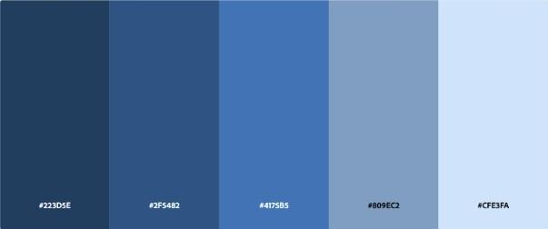
Source [ “#223D5E”, “#2F5482”, “#4175B5”, “#809EC2”, “#CFE3FA” ]
Pink/Magenta
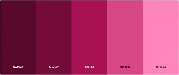
Source [ “#57092A”, “#750C39”, “#A81152”, “#D94886”, “#FF85BA” ]
2. Example diverging palettes
Brown-green
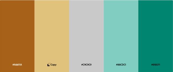
Source [ “#A6611A”, “#DFC27D”, “#C9C9C9”, “#80CDC1”, “#018571” ]
Green-orange
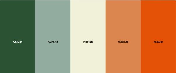
Source [ “#2C5234”, “#92ACA0”, “#F1F1D8”, “#DB864E”, “#E35205” ]
3. Example categorical palettes
Muted
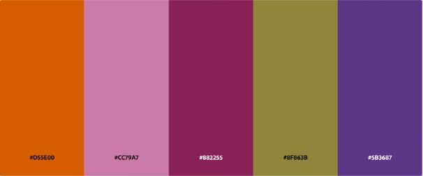
Source [ “#D55E00”, “#CC79A7”, “#882255”, “#8F863B”, “#5B3687” ]
Pastel
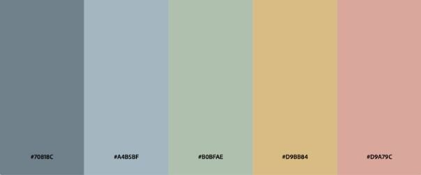
Source [ “#70818C”, “#A4B5BF”, “#B0BFAE”, “#D9BB84”, #D9A79C” ]
Color psychology in data visualization
Colors trigger emotional responses that influence how people interpret your data. Blue conveys trust and stability, red signals urgency or danger, and green represents growth or money. Choose colors that reinforce the message your data is telling.
Here's what different colors communicate in business contexts:
Blue: Trust, stability, calm. Use blue for financial data, corporate metrics, or anything where you want to project reliability. Most business dashboards default to blue for a reason.
Red: Urgency, danger, excitement. Red works well for highlighting problems, losses, or metrics that need immediate attention. I use red sparingly since it can trigger an alarm even when the data isn't necessarily bad.
Green: Growth, money, safety. Green naturally fits revenue growth, profit increases, or positive performance indicators. It signals "go" or "good" in most Western business contexts.
Yellow: Optimism, warning, attention. Yellow highlights important information without the alarm of red. It works well for metrics that need monitoring but aren't critical yet.
Orange: Creativity, enthusiasm, energy. Orange draws attention without the negative associations of red. I've found it works well for innovation metrics, new initiatives, or data points I want people to notice without concern.
Gray: Neutral, balanced, background. Gray keeps secondary information visible without competing for attention. Use it for reference lines, benchmarks, or less important categories.
Purple: Luxury, creativity, uniqueness. Purple works for premium products, creative metrics, or data you want to position as special or high-value.
Best practices for using colors in data visualization
Limit your color palette to between 5 and 7 colors
Using too many colors in a categorical chart makes it harder for people to distinguish between categories. The colors start looking similar, and your audience needs to keep checking the legend. Try to keep your palettes between 5 and 7 colors for ease of use.
I built a regional sales dashboard that initially used 12 colors for different product categories. Nobody could remember which shade of blue represented which product. When I consolidated to 6 main categories and grouped the rest as "Other," the chart became readable.
If you need to show more than 7 categories, split your visualization into multiple charts or use a different chart type.
Use color purposefully, not decoratively
Every color in your chart should communicate something specific about the data. Decorative colors add visual noise without adding meaning. Use your boldest, most saturated colors for the data points you want people to notice first.
I've reviewed marketing reports where bright colors highlighted less important metrics while key performance indicators sat in muted tones. The visual hierarchy contradicted the data hierarchy.
Maintain consistent color meanings across visualizations
Keep the same colors for the same metrics. When you use blue for revenue in one chart, keep blue as revenue across all your charts. Switching color assignments between visualizations forces people to relearn what each color means.
I worked on a quarterly business review where the finance team used green for profit in Q1 slides but switched to blue for profit in Q2 slides. Executives kept getting confused. Consistency matters more than variety.
Consider cultural color associations
Colors carry different meanings across cultures. Red signals danger in Western contexts but represents prosperity in many Asian cultures. Green means growth in most business settings but can signal inexperience in other contexts.
If your visualization will reach international audiences, research how your chosen colors might be interpreted. When in doubt, test with a few people from your target regions.Test on different devices and in print
Colors that look distinct on your high-resolution monitor might blend together on a laptop screen or disappear entirely in black-and-white prints. I've seen yellow data labels that looked fine on my laptop but completely disappeared when projected. Test your colors on the actual devices or formats your audience will use.
Check your visualizations on multiple devices before sharing them. Print a copy if there's any chance someone will print your report. Adjust colors that don't translate well across formats.Start with grayscale, add color strategically
Build your chart in shades of gray first. If the data relationships are clear in grayscale, then add color to emphasize specific insights. If the chart doesn't work in grayscale, color won't fix it.
This approach forces you to use color as emphasis rather than decoration. The most important data points get color, everything else stays gray or muted.Make your visualizations accessible
Accessible visualizations work for people with color vision deficiencies and other visual limitations. Roughly 8% of men and 0.5% of women worldwide have color vision deficiency. The most common form is difficulty distinguishing between reds and greens, often called red-green colorblindness, which includes protanopia and deuteranopia.
Run your color choices through a colorblind simulator before finalizing your visualization. Tools like Coblis or Color Oracle show you how your chart appears to people with different types of colorblindness.
Color shouldn't be the only way you communicate information. Add labels directly on your charts, use patterns or textures to differentiate categories, or include annotations that explain key data points. Icons, hatching patterns, or different shapes give people multiple ways to interpret your data beyond color alone.
Accessibility guidelines recommend a contrast ratio of at least 4.5:1 for normal text and 3:1 for large text between your colors and background. Light text on a light background or dark text on a dark background becomes hard to read for people with low vision or when viewing on lower-quality screens. Use tools like WebAIM's contrast checker to verify your colors have enough difference between them.Best tools for choosing data visualization colors
I've tested dozens of color tools over the years. These save the most time when building business visualizations:
ColorBrewer: Originally designed for cartography, ColorBrewer offers pre-made sequential, diverging, and categorical palettes. You can filter by colorblind-safe options and see how each palette looks with different numbers of data classes.
Coolors: Generates random color palettes and lets you lock colors you like while randomizing the rest. You can also upload an image and extract its color palette, which helps when matching brand colors. The tool shows hex codes, RGB values, and lets you export palettes in multiple formats. Available at coolors.co.
Adobe Color: Creates color schemes based on color theory rules (complementary, analogous, triadic). You can explore trending palettes from the Adobe community or build custom schemes from scratch. The accessibility tools check contrast ratios between colors.
Viz Palette: Shows you how your chosen colors appear to people with different types of colorblindness. Upload your palette or enter hex codes, and it simulates protanopia, deuteranopia, and tritanopia. This catches red-green or blue-yellow combinations that won't work for colorblind viewers.
Julius simplifies color customization for data visualization
Choosing the best colors for data visualization is faster when your tool handles the technical work. Julius automatically applies clear, readable color palettes to your visualizations, and you can customize them through plain English prompts or adjust settings to match your brand colors.
Julius is an AI-powered data analysis tool that connects directly to your data and shares insights, charts, and reports quickly.
Here’s how Julius helps:
Built-in visualization: Get histograms, box plots, and bar charts on the spot instead of jumping into another tool to build them.
Quick single-metric checks: Ask for an average, spread, or distribution, and Julius shows you the numbers with an easy-to-read chart.
Catch outliers early: Julius highlights suspicious values and metrics that throw off your results, so you can make confident business decisions based on clean and trustworthy data.
Recurring summaries: Schedule analyses like weekly revenue or delivery time at the 95th percentile and receive them automatically by email or Slack.
Smarter over time with the Learning Sub Agent: Julius's Learning Sub Agent automatically learns your database structure, table relationships, and column meanings as you use it. With each query on connected data, it gets better at finding the right information and delivering faster, more accurate answers without manual configuration.
One-click sharing: Turn a thread of analysis into a PDF report you can pass along without extra formatting.
Direct connections: Link your databases and files so results come from live data, not stale spreadsheets.
