January 26th, 2026
Top 8 Data Visualization Tools for Business in 2026: Expert Picks
By Simon Avila · 25 min read
After testing the best data visualization tools, here are the 8 platforms for dashboards, reports, and analysis in 2026.
8 Best data visualization tools for 2026: At a glance
Data visualization tools serve different audiences, from marketers who need simple charts to analysts running complex queries on connected databases. Here are the 8 best tools compared side by side:
Tool | Best For | Starting Price (billed annually) | Key Strength |
|---|---|---|---|
Business users who need fast visual answers from their data | Natural language queries turn data into charts | ||
Advanced visualizations for enterprises | $75/month for a Creator license | Powerful customization with complex datasets | |
Microsoft ecosystem integration | AI-powered insights with familiar tools | ||
Free reporting for Google users | Free | Simple dashboards with live data connections | |
Exploring data through free-form filtering | $200/month for 10 users | Associative analytics reveal hidden patterns | |
Real-time monitoring and alerts | $19/month + usage, billed monthly | Live dashboards track system performance | |
Complex data from multiple sources | Handles large datasets with embedded analytics | ||
Simple charts for presentations | $120/year for the Individual Pro plan | Quick visuals with drag-and-drop design |
1. Julius: Best for business users who need fast visual answers from their data
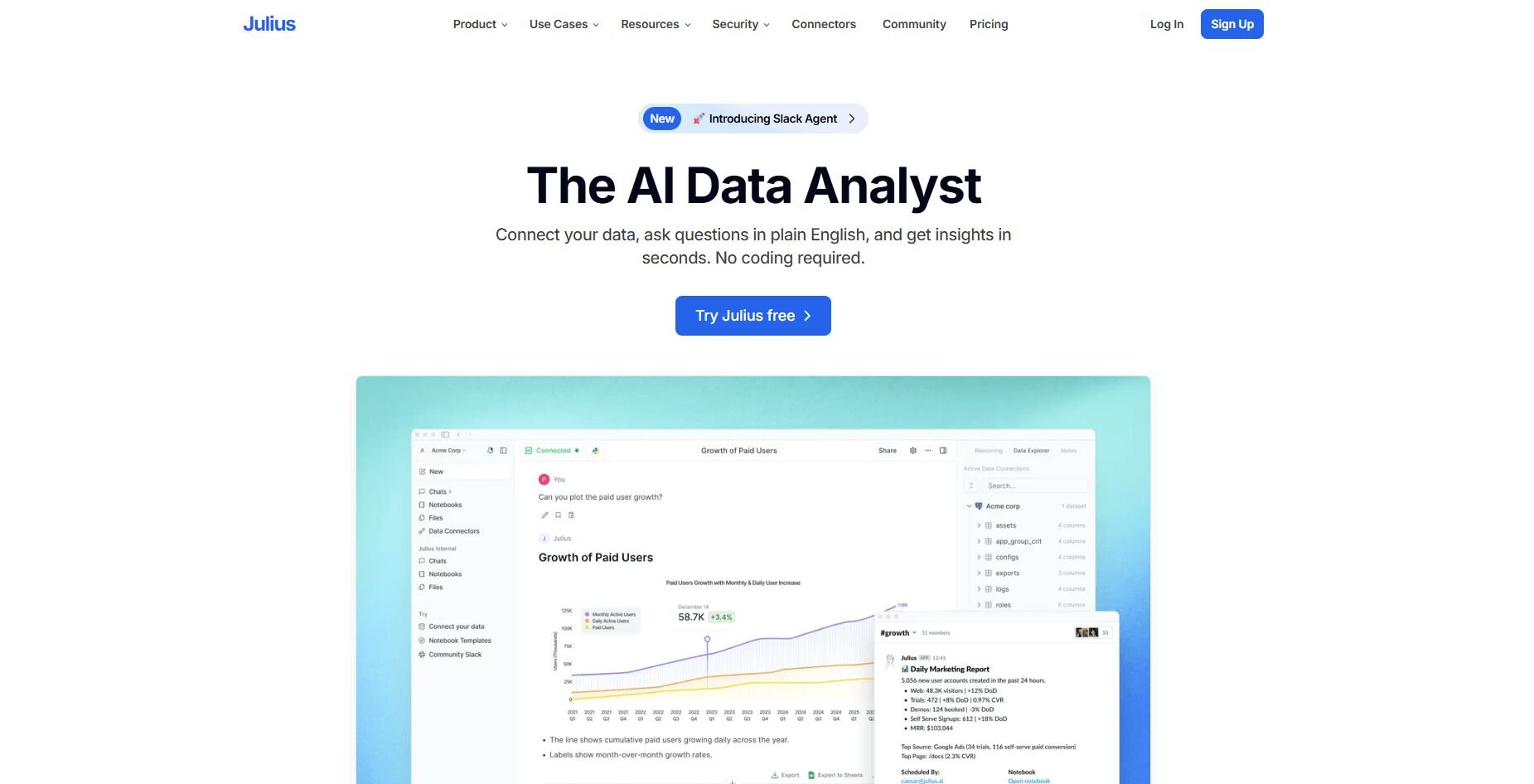
What it does: Julius is an AI-powered data analysis tool that creates data visualizations from your questions. It connects to databases, spreadsheets, and business platforms like Postgres or Google Sheets. You ask questions about your data in natural language and get visual answers like charts, tables, or summaries without writing any code.
Who it's for: Business users who work with structured data and want visual answers without coding.
We designed Julius for business teams who want to visualize data without needing SQL knowledge. When you connect your sources, you can ask plain English questions about your data. Julius generates visualizations like charts and tables so you can analyze metrics and spot trends without knowing how to code.
Notebooks let you save your analysis and set it to run automatically. Choose weekly or monthly refresh schedules, and Julius sends the updated charts to Slack or email. You get fresh numbers without redoing the work.
Julius also learns how your data is organized over time. As it figures out how your tables connect, it gets better at finding the right information when you ask new questions. That means answers become more accurate the longer you use the platform.Key features
Natural language queries: Ask questions and get visual answers without SQL
Database connections: Works with Postgres, BigQuery, Snowflake, and Google Sheets
Repeatable notebooks: Save recurring analyses that refresh on schedule
Scheduled reporting: Automatic updates delivered to Slack or email
Data exploration: Compare metrics across groups, time periods, or segments
Pros
Connects to databases and spreadsheets easily
Lets you verify data sources behind each visual
Saves time with scheduled recurring reports
Cons
Built more for business analysis than academic statistics
Works better with clean, organized data
Pricing
Julius starts at $37 per month.
Bottom line
2. Tableau: Best for advanced visualizations for enterprises
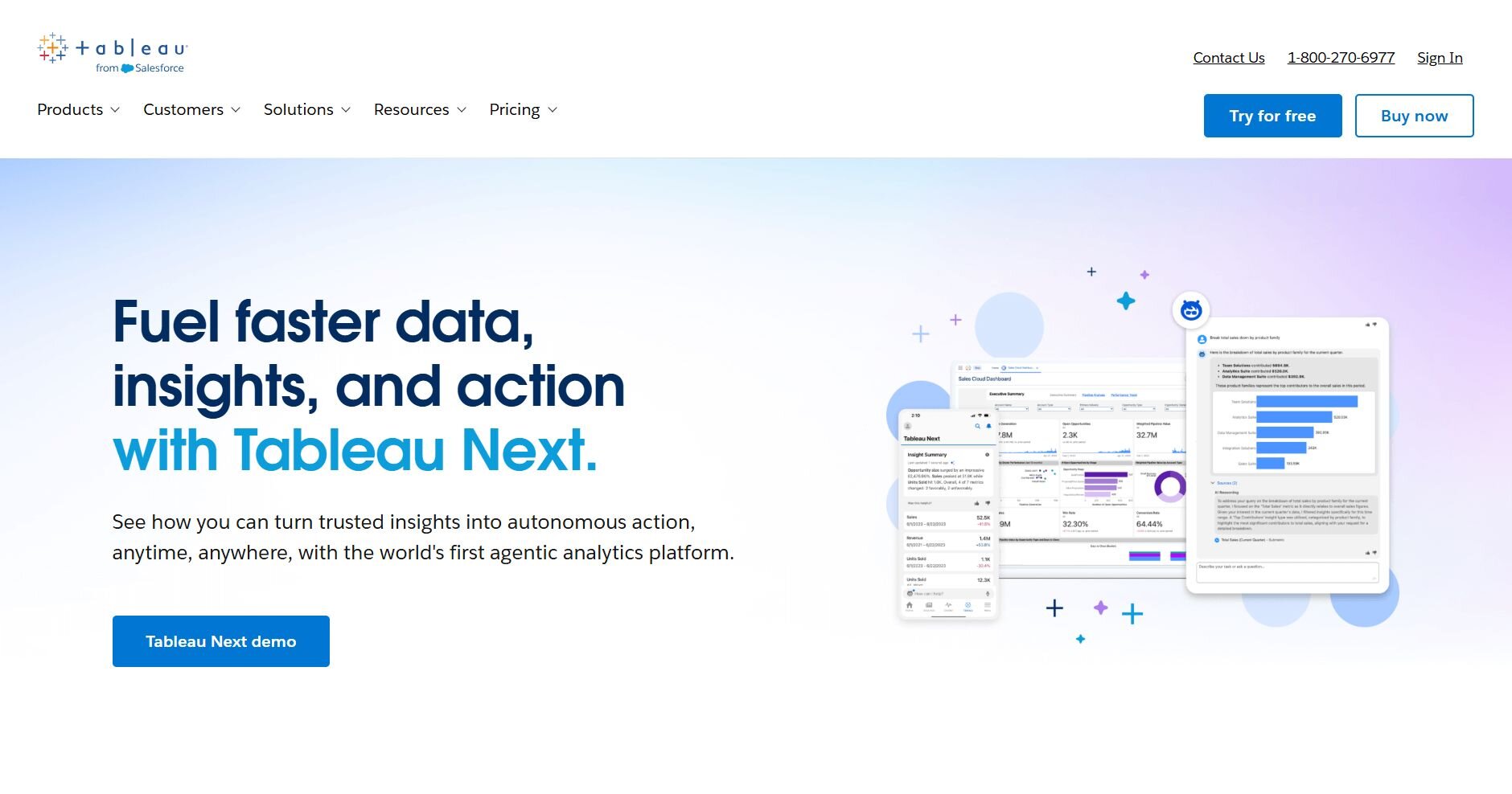
What it does: Tableau is a data visualization platform that lets you connect to databases, spreadsheets, and cloud sources to build interactive dashboards and reports. You can drag and drop data fields to create charts, maps, and custom visuals without coding.
Who it's for: Enterprise teams and analysts who need powerful, customizable data visualizations.
I tested Tableau to see how it handles complex datasets, and the drag-and-drop interface made it easy to build detailed dashboards. You can connect multiple data sources and create custom calculations directly in the platform, so you're not limited to basic chart types.
What impressed me most was the level of control you get over every visual element. You can adjust colors, labels, filters, and layouts to match specific requirements. The visualizations stayed interactive even with larger datasets, so you can explore specific data points. Tableau also lets you publish dashboards to share with teams or embed them in other applications.
Key features
Custom visualizations: Build detailed charts with full design control
Multi-source connections: Combine data from databases, files, and cloud platforms
Interactive dashboards: Let users filter and explore data in real time
Pros
Strong customization for complex visuals
Handles large datasets well
Works with many data sources
Cons
Steep learning curve for beginners
Higher cost compared to simpler tools
Pricing
Tableau starts at $75 per month for a Creator license.
Bottom line
3. Power BI: Best for Microsoft ecosystem integration
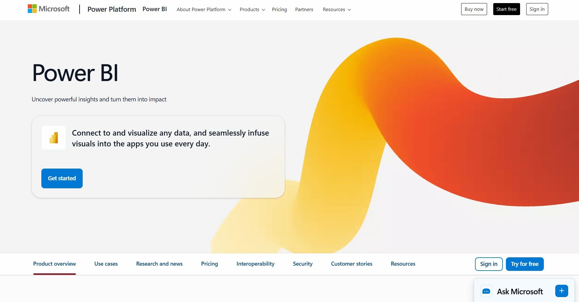
What it does: Power BI is a business intelligence platform from Microsoft that lets you connect to data sources and create interactive reports and dashboards. You can pull data from Excel, SQL databases, cloud services, and other Microsoft tools to build visualizations.
Who it's for: Teams already using Microsoft products who need business intelligence and reporting tools.
Power BI connected to my Excel files and SharePoint data without any setup issues. The interface looked similar to other Microsoft products, so I didn't feel like I was learning a new system from scratch. I could build charts using the drag-and-drop builder right away.
The AI capabilities stood out because you can type questions like "show sales by region" and get visual answers fast. That Q&A feature worked well when I needed quick insights without building full dashboards.
Publishing reports was straightforward too. You set permissions and schedule refreshes, so your team always sees current data without manual updates.
Key features
Microsoft integration: Works directly with Excel, Teams, SharePoint, and Azure
AI-powered insights: Ask questions in natural language and get visual answers
Automated refreshes: Schedule reports to update with live data
Pros
Familiar interface for Microsoft users
Lower cost than enterprise alternatives
Strong AI features for quick insights
Cons
Works best within the Microsoft ecosystem
Free version has limited sharing options
Pricing
Power BI starts at $14 per user per month.
Bottom line
Power BI is a solid choice if your team already uses Microsoft tools and you need affordable business intelligence reporting. If you're working outside the Microsoft ecosystem, Tableau might be a better fit.
4. Looker Studio: Best for free reporting for Google users

What it does: Looker Studio is Google's free data visualization tool for building dashboards and reports. It connects to Google Analytics, Google Sheets, BigQuery, and other data sources. You drag elements onto a canvas to create charts, tables, and filters, and you can share reports with anyone who has the link.
Who it's for: Teams using Google Workspace who need simple reporting without paying for additional tools.
Looker Studio pulled data from my Google Sheets and Analytics accounts without needing any connectors or authentication steps. The template library gave me a starting point, so I didn't have to build everything from scratch. I liked that I could customize colors, fonts, and layouts to match the style I wanted.
The sharing options worked well because I could set view-only or edit permissions for different people. Reports updated automatically when the source data changed, so I was always looking at current numbers.
Key features
Google ecosystem integration: Connects directly to Analytics, Sheets, and BigQuery
Collaborative editing: Multiple people can work on the same report
Automatic updates: Reports refresh when source data changes
Pros
Completely free to use
Easy setup for Google data sources
Simple sharing with link-based permissions
Cons
Limited customization compared to paid tools
Can be slow with large datasets
Pricing
Looker Studio is free to use.
Bottom line
5. Qlik Cloud Analytics: Best for exploring data through free-form filtering
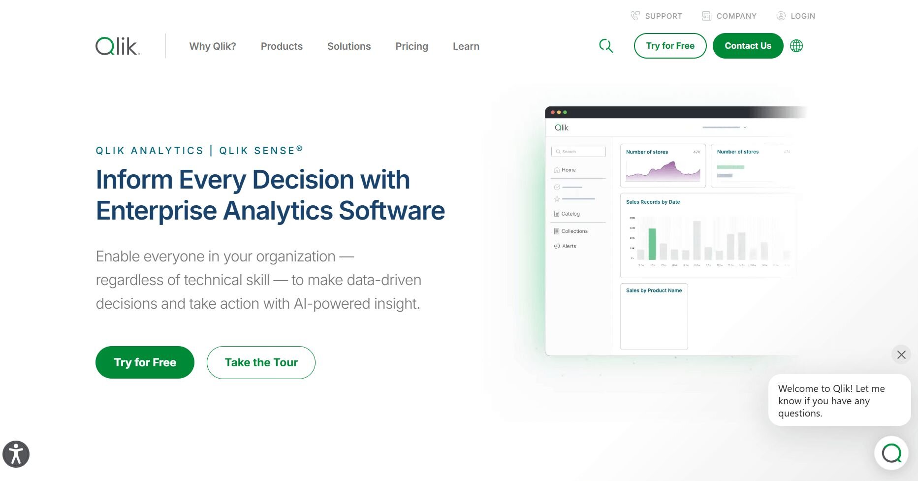
What it does: Qlik Cloud Analytics is a business intelligence platform that lets you explore data by clicking on any value to filter the entire dashboard. When you select something, all related charts update automatically to show connections. You can connect to databases, cloud services, and files to build interactive visualizations.
Who it's for: Analysts and business users who want to explore data relationships interactively.
Qlik Cloud Analytics uses associative analytics, which means you can click any data point and see how it connects to everything else. The platform highlights which data is related and which isn't, so you know what's connected before you start exploring.
I clicked on a region in one chart and watched every other visual update to show just that region's data. That made it easy to spot patterns I wouldn't have found with static filters.
Building dashboards was straightforward with the drag-and-drop interface. I added charts and tables without writing code, and they responded to my selections automatically.Key features
Associative analytics: Click any value to filter all related data automatically
Visual relationships: See which data points connect
Self-service dashboards: Build and explore visualizations without IT support
Pros
Strong for exploring data relationships
Highlights connected and unconnected data
Good for ad-hoc analysis
Cons
Steeper learning curve than simpler tools
Higher cost for small teams
Pricing
Qlik Cloud Analytics starts at $200 per month for 10 users.
Bottom line
6. Grafana: Best for real-time monitoring and alerts
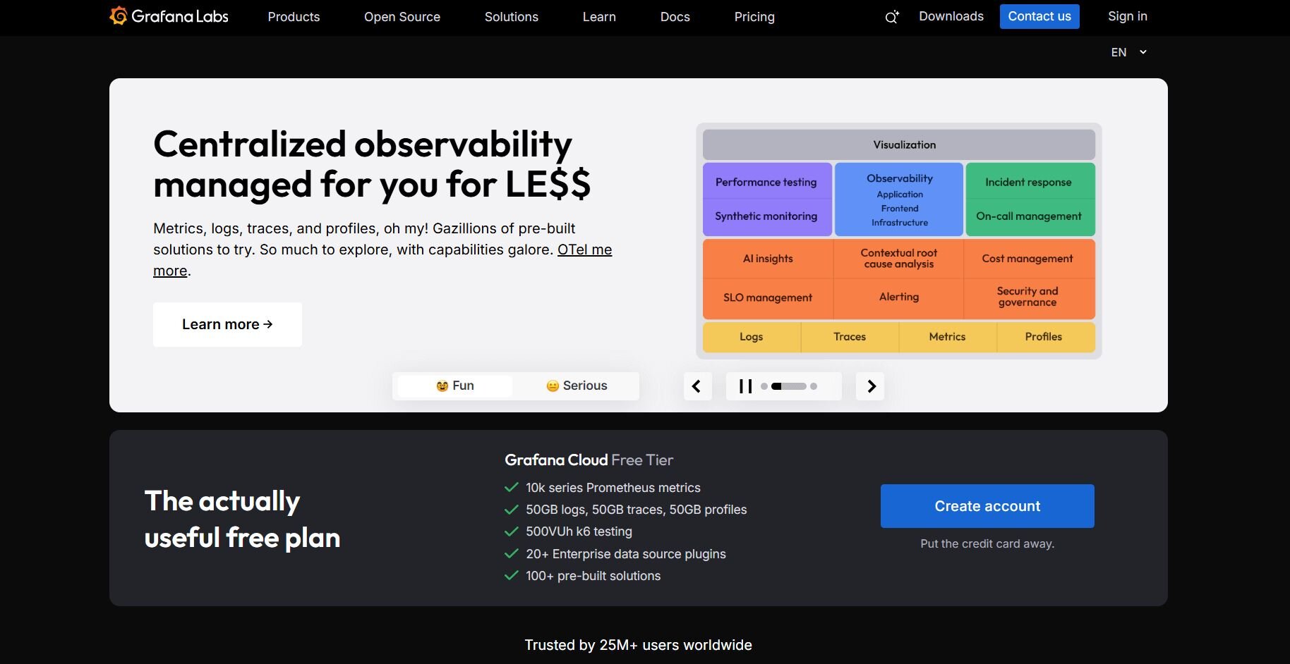
What it does: Grafana is an open-source platform for building dashboards that track metrics in real time. It includes alerting features that notify you when metrics hit certain thresholds.
Who it's for: Technical teams who need to monitor systems, applications, or infrastructure performance.
I set up Grafana with a test database and watched the dashboards update automatically as new data arrived. The plugin library made it easy to connect different data sources without writing custom code. I added plugins for the databases I needed and they worked right after setup.
I configured alerts to trigger when metrics crossed specific thresholds. Grafana sent notifications straight to Slack, so I could step away from the screen without missing important changes.
Building dashboards took some technical knowledge since I had to write queries directly. But once I set everything up, the dashboards ran continuously and updated on their own.
Key features
Real-time updates: Dashboards refresh automatically as data changes
Custom alerts: Set thresholds and get notifications when metrics change
Plugin ecosystem: Extend functionality with community-built integrations
Pros
Strong for monitoring live systems
Open-source with an active community
Flexible alerting options
Cons
Requires technical knowledge to set up
Not designed for business reporting
Pricing
Grafana starts at $19 per month plus usage costs, billed monthly.
Bottom line
7. Sisense: Best for complex data from multiple sources
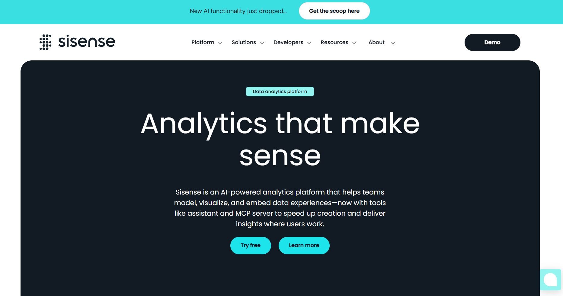
What it does: Sisense is a business intelligence platform that combines data from multiple databases, cloud services, and files into a single analytics environment. You can build dashboards and embed them into other applications. It includes features for handling large datasets and creating custom calculations.
Who it's for: Enterprise teams that need to analyze data from many different sources in one place.
Sisense let me connect several databases at once and pull them together into a single dashboard. The platform handled most of the data combination work, so I didn't spend time setting everything up manually. I could also add my own calculations directly in the dashboard editor.
Building dashboards was straightforward with the drag-and-drop interface. I added charts and widgets to the canvas, and the platform let me customize how everything looked. The preview updated as I made changes, so I could see exactly what users would see.
Performance stayed consistent even when I worked with larger datasets. The platform kept queries running quickly without me needing to adjust anything.
Key features
Multi-source integration: Combine data from different databases and services
Embedded analytics: Put dashboards directly into your applications
Large dataset handling: Process big data without performance slowdowns
Pros
Handles multiple data sources well
Strong embedded analytics capabilities
Good performance with large datasets
Cons
Higher complexity than simpler tools
Requires an enterprise budget
Pricing
Sisense uses custom pricing.
Bottom line
8. Canva: Best for simple charts for presentations
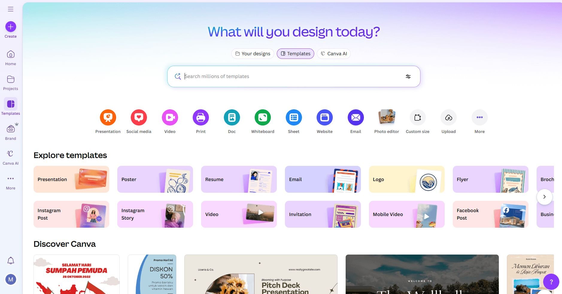
What it does: Canva is a design platform that includes basic chart and graph creation tools. You can upload data or enter it manually to create bar charts, line graphs, pie charts, and simple infographics. It also includes a vast library of free and premium templates.
Who it's for: Marketers and non-technical users who need quick, good-looking charts for presentations and content.
Canva made it easy to create charts that matched my desired style. I uploaded a CSV file and picked a chart type from the menu. The design templates helped me put together presentation slides with data visualizations already styled to look polished.
The drag-and-drop editor let me adjust colors, labels, and layouts without any design skills. I could download finished charts as images or PDFs to use in other documents.
I liked that Canva let me create presentation-ready charts in just a few minutes. The downside is that it doesn't offer as many customization options as tools built specifically for data visualization.
Key features
Template library: Pre-designed charts and presentation layouts
Brand customization: Match colors and fonts to your style
Multiple export formats: Download as images, PDFs, or presentation files
Pros
Very easy to use
Fast chart creation
Good for non-technical users
Cons
Limited data visualization features
Not built for complex analysis
Pricing
Canva starts at $120 per year for the Individual Pro plan.
Bottom line
How I tested these data visualization tools
I connected real data sources to each platform and ran common SaaS queries. I tracked user groups, calculated churn rates, built funnels, and checked how fast each tool gave clear answers without help from a data team.
I also looked at setup time, data accuracy, and whether tools did what they promised. Some looked great in demos but needed a complex setup or perfect data. Others worked well with messy data and gave reliable results faster.
Here's what I focused on during testing:
Setup speed: How long it took to connect data sources and get the first useful insight
Query flexibility: Whether I could answer follow-up questions without hitting tool limitations
Data accuracy: How well the tool handled edge cases like refunds, plan changes, or cancelled trials
Learning curve: Whether non-technical team members could use the tool independently or needed constant data team support
Export and sharing: How easy it was to get results into presentations, emails, or Slack without manual reformatting
Cost at scale: Whether pricing stayed reasonable as data volume or user seats increased
Which data visualization tool should you choose?
The right choice of data visualization tool depends on what you need to build and how your team works with data. Choose:
Julius if you need quick data analysis and visualizations from connected sources without writing SQL.
Tableau if you need advanced customization and detailed control over complex enterprise dashboards.
Power BI if your team uses Microsoft tools and you want affordable business intelligence with AI features.
Looker Studio if you work with Google data sources and want free reporting dashboards.
Qlik Cloud Analytics if you need to explore data relationships through interactive filtering and associative analytics.
Grafana if you need to monitor real-time metrics and set up alerts for system performance.
Sisense if you need to combine data from multiple sources and handle large datasets.
Canva if you need simple, polished charts for presentations and marketing materials.
My final verdict
Teams building enterprise dashboards usually pick Tableau or Power BI for the control they offer. Looker Studio works for Google users who want free reporting, and Grafana is good for real-time monitoring. I like Canva for when I need quick, simple graphics and visualizations.
Julius takes a different approach by skipping the drag-and-drop builder entirely. You connect your data sources, ask questions in plain English, and get charts back. I've found this works better for quick analysis when you don't want to learn another interface or wait on data teams to build dashboards for you.Ready to visualize your data without writing code? Try Julius
Many of the best data visualization tools make you write SQL or learn complex drag-and-drop builders. With Julius, you can get visualizations by asking questions in plain English, no coding required.
Julius is an AI-powered data analysis tool that connects directly to your data and shares insights, charts, and reports quickly.
Here’s how Julius helps:
Built-in visualization: Get histograms, box plots, and bar charts on the spot instead of jumping into another tool to build them.
Quick single-metric checks: Ask for an average, spread, or distribution, and Julius shows you the numbers with an easy-to-read chart.
Catch outliers early: Julius highlights suspicious values and metrics that throw off your results, so you can make confident business decisions based on clean and trustworthy data.
Recurring summaries: Schedule analyses like weekly revenue or delivery time at the 95th percentile and receive them automatically by email or Slack.
Smarter over time with the Learning Sub Agent: Julius's Learning Sub Agent automatically learns your database structure, table relationships, and column meanings as you use it. With each query on connected data, it gets better at finding the right information and delivering faster, more accurate answers without manual configuration.
One-click sharing: Turn a thread of analysis into a PDF report you can pass along without extra formatting.
Direct connections: Link your databases and files so results come from live data, not stale spreadsheets.
Frequently asked questions
What's the difference between data visualization tools and business intelligence platforms?
Do I need technical skills to use data visualization tools?
No, you don't need technical skills for tools like Julius, Looker Studio, and Canva. These platforms let you create charts through plain English questions or drag-and-drop actions. Tableau and Power BI also offer visual builders, but understanding basic data structures helps you use their advanced features.
