December 8th, 2025
Top 12 Grafana Alternatives for Data Visualization in 2025
By Zach Perkel · 30 min read
After testing visualization and reporting tools on marketing and business datasets, I found 12 Grafana alternatives that deliver clearer dashboards with less setup in 2025.
Top 12 Grafana alternatives: At a glance
Most Grafana alternatives focus on logs, metrics, traces, or general observability. Others provide lighter dashboards or faster ways to explore data without configuration. Here’s a side-by-side view of the top competitors in 2025:
Alternative | Best for | Starting price (billed monthly) | Key advantage compared to Grafana |
|---|---|---|---|
Quick metric checks without query language knowledge | Simple visual answers to metric questions without configuring panels or query languages | ||
Full open-source observability | Metrics, logs, and traces in one stack without separate backends | ||
Elasticsearch-centered dashboards | $99/month, usage-based, or self-managed | Native support for Elasticsearch logs and search queries | |
Cloud-scale monitoring | Unified platform for infra, logs, APM, and security | ||
Full-stack performance tracking | Strong APM and distributed tracing for complex apps | ||
Log-heavy environments | Fast log search and alerting for large datasets | ||
Metrics collection for infra and apps | Free | Simple metric collection with strong Kubernetes support | |
Enterprise observability | Automatic service discovery and AI-driven insights | ||
Cloud-native log analysis | Fast log search with built-in analytics for modern cloud environments | ||
High-performance time-series storage | Efficient long-term metric storage for large workloads | ||
Managed infrastructure monitoring | Hosted monitoring with strong alerting and agent-based checks without running your own servers | ||
Application performance monitoring | Transaction-level analysis that helps you trace performance issues across production services without manual correlation |
Why I looked for Grafana alternatives
I used Grafana for monitoring work and kept hitting setup steps that slowed everything down. I spent too much time rewriting queries to get panels to show the right signal, and simple checks often turned into long rounds of adjusting fields and filters. I also had to jump between different systems for logs, metrics, and traces, which made fast troubleshooting harder than it should have been.
Grafana pricing pushed me to look at other options once I needed scheduled reports and wider team access. Features like PDF exports, sharing controls, and role management sit behind enterprise tiers, and the cost climbs fast as your team grows. The platform handled complex environments well, but it demanded more time and configuration than I needed for daily monitoring.
After some testing and research, I found a few reasons why people looked for Grafana alternatives:
High setup overhead: You configure several services before the dashboards work the way you want
Limited reporting features: Scheduled reports and exports require higher pricing tiers
Query-heavy workflow: Many panels rely on writing or editing queries, which slows teams that want fast visibility
1. Julius: Best for quick metric checks without query language knowledge
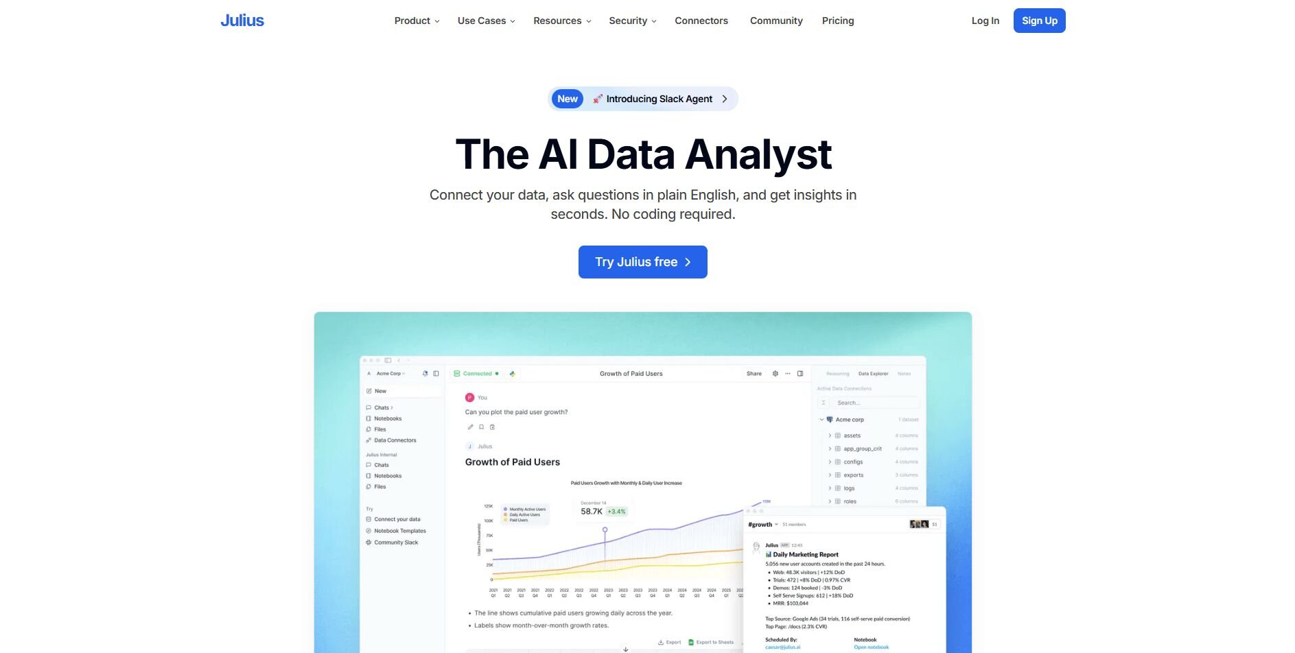
We designed Julius to help you get a quick chart from your data without dealing with the setup work that monitoring platforms often expect. You connect a source, ask a question in natural language, and Julius returns a chart without configuring panels or learning a query language. This helps when you want a quick read on a number or trend instead of managing dashboards or pipelines.
Each result opens in a Notebook that shows the steps behind your analysis. You can review the logic, make changes, and schedule updates in the same place. This makes repeating weekly checks or updating earlier work much easier.
Julius keeps track of the questions you ask, the filters you apply, and the tables you pull from. This lets your follow-up questions use the same structure without repeating earlier steps.
You can use the visual view for quick answers or open the code when you want to see how the result was created. Both options follow the same workflow, which keeps reporting simple, whether you want a direct chart or a closer look at the query behind it.Why it beats Grafana
Less setup: Create a chart without configuring storage layers or plugins
Natural language prompts: Ask for a metric or chart in plain English
Visible steps: Each result sits in a Notebook you can review and refine
Flexible workflow: Switch between visuals and code when needed
Session context: Julius remembers earlier steps, so your follow-up questions stay consistent with previous results
Pros
Quick chart creation from natural language
Easy sharing with clean visual outputs
Notebook workflow that keeps the analysis organized
Cons
Not designed for logs, traces, or alerting
Lighter dashboard features than full observability platforms
Pricing
Julius starts at $16 per month for the Plus plan.
Bottom line
Julius is a good fit when you want simple visual answers without managing queries or configuring dashboards. If you need deep coverage across logs, metrics, and traces, SigNoz may be a better match for that work.
2. SigNoz: Best for full open-source observability
We designed Julius to help you get a quick chart from your data without dealing with the setup work that monitoring platforms often expect. You connect a source, ask a question in natural language, and Julius returns a chart without configuring panels or learning a query language. This helps when you want a quick read on a number or trend instead of managing dashboards or pipelines.
Each result opens in a Notebook that shows the steps behind your analysis. You can review the logic, make changes, and schedule updates in the same place. This makes repeating weekly checks or updating earlier work much easier.
Julius keeps track of the questions you ask, the filters you apply, and the tables you pull from. This lets your follow-up questions use the same structure without repeating earlier steps.
You can use the visual view for quick answers or open the code when you want to see how the result was created. Both options follow the same workflow, which keeps reporting simple, whether you want a direct chart or a closer look at the query behind it.Why it beats Grafana
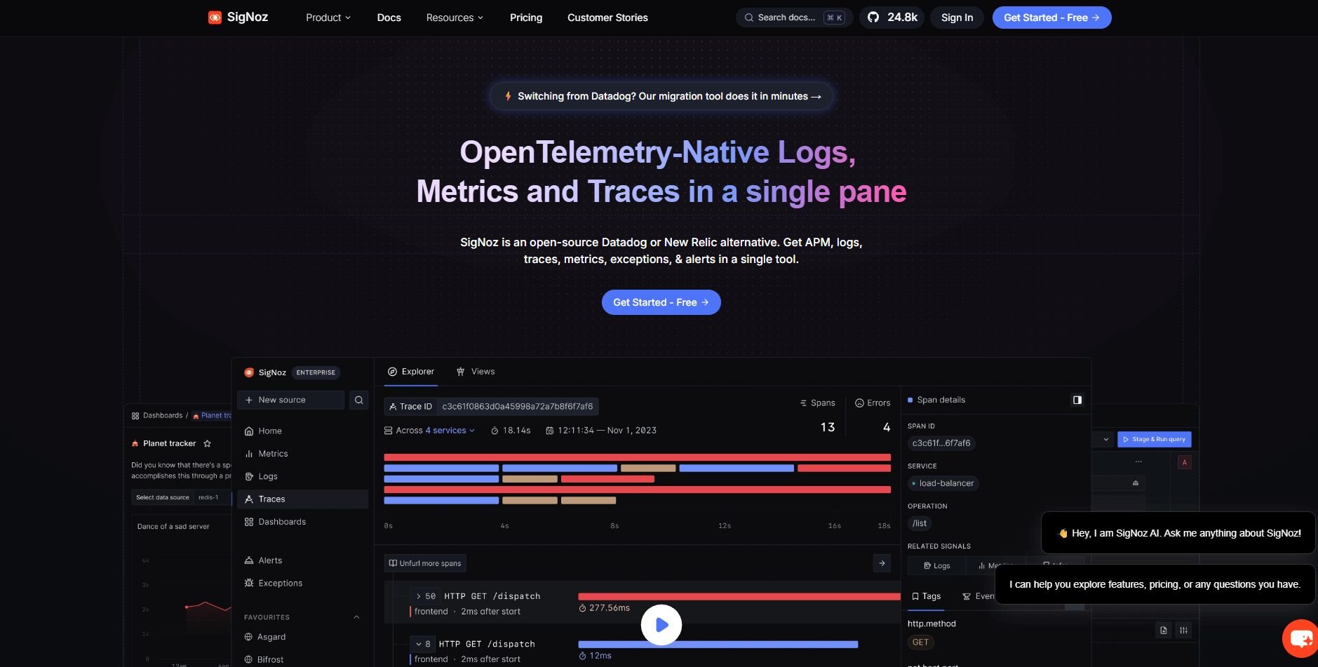
Unified telemetry: Metrics, logs, and traces load in one place
Open source: Self-hosted flexibility without enterprise requirements
Tracing views: Clear paths to identify performance issues
Pros
Good tracing tools
Clear dashboards
Open-source flexibility
Cons
Setup takes time
Needs resources for hosting
Pricing
SigNoz offers a free version. Paid plans start at $49 per month, billed monthly.
Bottom line
SigNoz gives you open-source visibility across metrics, logs, and traces in one place, and that setup makes troubleshooting more direct. If you want a managed setup with broader cloud integrations, Datadog may fit better.
3. Kibana: Best for Elasticsearch-centered dashboards
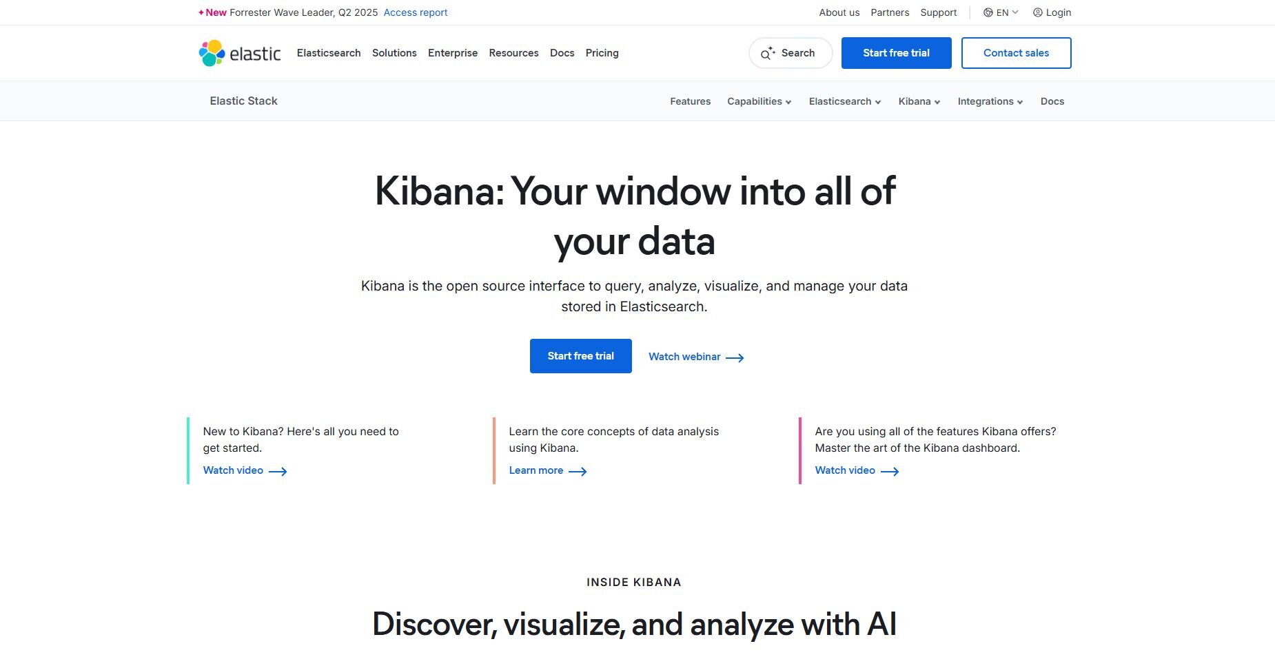
Kibana is the visualization layer for Elasticsearch, built for teams that already rely on indexed log data. I connected it to a cluster with several active indices to see how it handled dense event streams. The Discover tab stood out first because it cut through noisy logs fast and made host and status filters easy to use.
Once the basics were in place, the dashboards helped me track request patterns and error spikes without much setup. The charts, tables, and filters worked best when the indices were mapped cleanly, and the JSON view gave enough detail for deeper checks. Most of the workflow stayed straightforward.
Kibana’s strength shows up when your logs already live in Elasticsearch. It turns those indices into fast searches and practical dashboards without needing a second tool.
Why it beats Grafana
Search strength: Fast log exploration with Elasticsearch queries
Native fit: Works directly with the Elastic ecosystem
Flexible visuals: Good tools for indexed data
Pros
Fast log search
Strong filtering
Good visual options
Cons
Depends on Elasticsearch
Index setup can be complex
Pricing
Kibana starts at $99 per month, billed monthly. They also have usage-based or self-managed pricing.
Bottom line
Kibana stands out for fast log searches inside Elasticsearch, giving you a clear way to narrow events and spot patterns. If you want deeper APM coverage, New Relic may be a better match.
4. Datadog: Best for cloud-scale monitoring
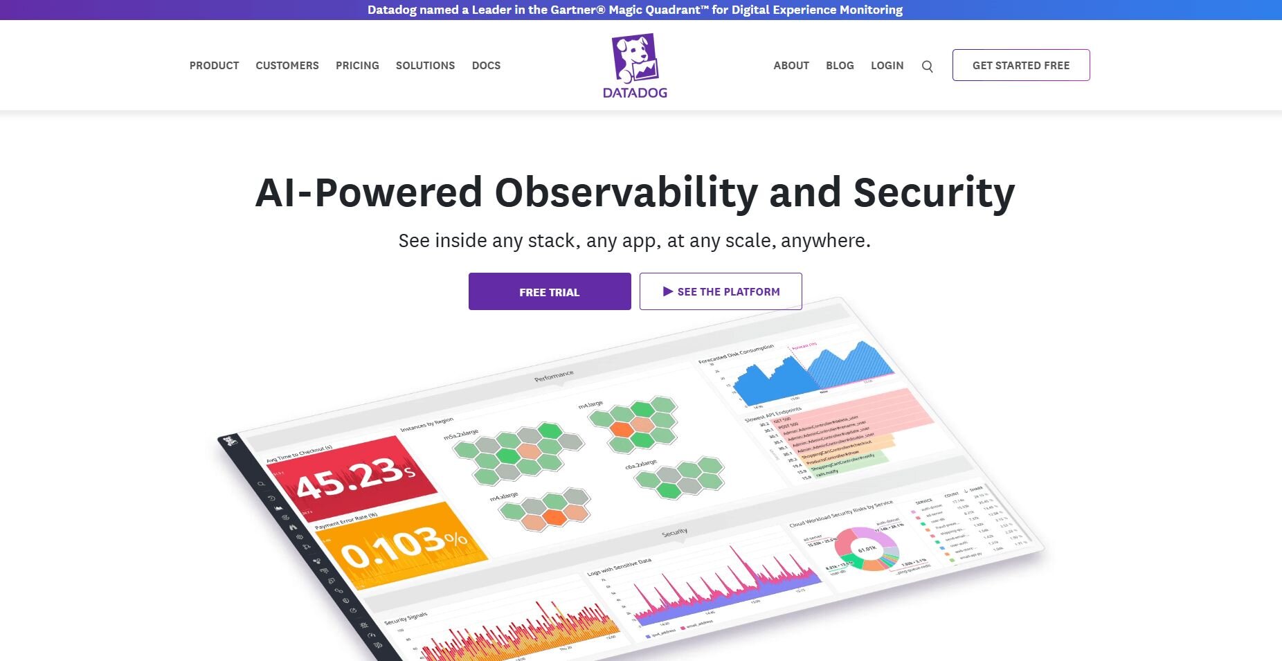
Datadog is a cloud monitoring platform that pulls your metrics, logs, and APM data into a single workspace.
I set it up on a small service to see how fast the dashboards produced something useful, and the default views gave a solid read on system activity right away. The APM panel highlighted slow endpoints without any digging.
As I added more load, the dashboards kept pace and showed latency changes clearly. Alert templates made it easy to set checks for pressure points, and the linked logs added enough context to understand what triggered them. Moving between traces and metrics was easy once I got familiar with the layout.
Why it beats Grafana
Single platform: Logs, metrics, and APM connect in one place
Strong integrations: Broad cloud and service coverage
Actionable views: Built-in dashboards surface issues quickly
Pros
Wide integration library
Good APM tools
Clear dashboards
Cons
Costs rise with usage
Can feel heavy for small teams
Pricing
Datadog uses modular, usage-based pricing.
Bottom line
Datadog brings metrics, logs, and APM together in one cloud platform, making full-stack monitoring easier to manage. If you want simpler dashboards for quick metric checks, Julius can save you time.
5. New Relic: Best for full-stack performance tracking
New Relic is an observability platform that focuses heavily on tracing and application behavior. I hooked up a small test app to see how much detail it surfaced, and the traces came through with timing breakdowns that exposed slow spots fast. The service map helped me see how calls moved between components.
During heavier traffic, the platform highlighted where the slowdown started and grouped errors into clear clusters. The tracing views stayed readable even when the load increased, and the log panel added just enough context to confirm what went wrong. It kept deeper reviews from turning into a long hunt.
New Relic is strongest when you want a clear picture of how requests move through the app and where delays appear.
Why it beats Grafana
Detailed APM: Clear traces for finding bottlenecks
Service maps: Visual graphs show component connections
Unified view: Metrics, logs, and traces in one place
Pros
Strong APM detail
Helpful service maps
Good tracing tools
Cons
Complex at first
Pricing varies by usage
Pricing
New Relic uses custom pricing.
Bottom line
New Relic provides detailed tracing and service maps, helping you break down performance issues across an application’s request path. If you want lightweight reporting instead of deep APM data, Julius can be easier to work with.
6. Splunk: Best for log-heavy environments
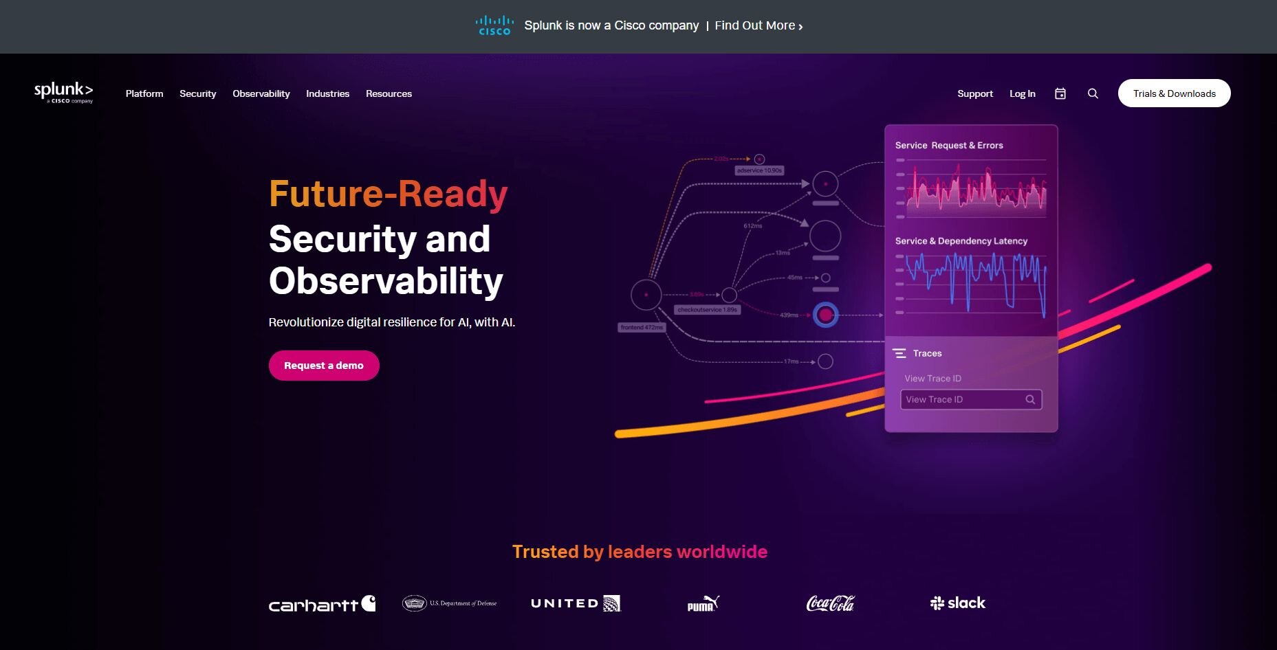
Splunk is a log analysis platform built for large volumes of machine data.
I sent a steady stream of events to see how quickly it made them usable. The search tools responded fast, and filtering by fields or keywords kept the noise down enough to spot odd spikes early. It gave me a good baseline for error tracking.
When I built dashboards to monitor ongoing activity, the queries stayed quick even as the dataset grew. The timelines and charts updated smoothly, and the query language opened the door to deeper checks when I needed more detail. I also liked that Splunk stayed reliable even under heavier loads.
Why it beats Grafana
Faster log handling: Designed for heavy log workloads
Strong search capabilities: Field-based queries respond fast
Event timelines: Help track patterns across large datasets
Pros
Great for high-volume logs
Flexible search tools
Good dashboard editor
Cons
Pricing scales pretty fast
Learning the query language takes time
Pricing
Splunk uses custom pricing.
Bottom line
Splunk gives you powerful log search and high-volume ingestion, which helps when your systems generate constant machine data. If you also need tracing or metrics in the same platform, Dynatrace may offer broader coverage.
7. Prometheus: Best for metrics collection for infra and apps
Prometheus is an open-source monitoring system built around time-series data. It collects metrics by scraping your services on a set schedule and stores everything with timestamps and labels so you can sort and compare values easily.
I set up exporters across several small apps to see how quickly data showed up, and the values populated in the server right away. The graph view helped me confirm scrapers were running correctly.
As I increased metric volume, the query responses stayed quick and predictable. The storage engine handled new series without slowing down, and alert rules for CPU and latency fired exactly when the thresholds were hit. It handled the load in a way that made the results dependable.
Why it beats Grafana
Pull-based scraping: Predictable metric collection
Fast time-series queries: Handles large datasets with ease
Clear alert rules: Thresholds trigger consistent responses
Pros
Efficient storage
Reliable scrapers
Strong alert manager
Cons
Requires PromQL knowledge
Logs and traces need external tools
Pricing
Prometheus is free to use.
Bottom line
8. Dynatrace: Best for enterprise observability
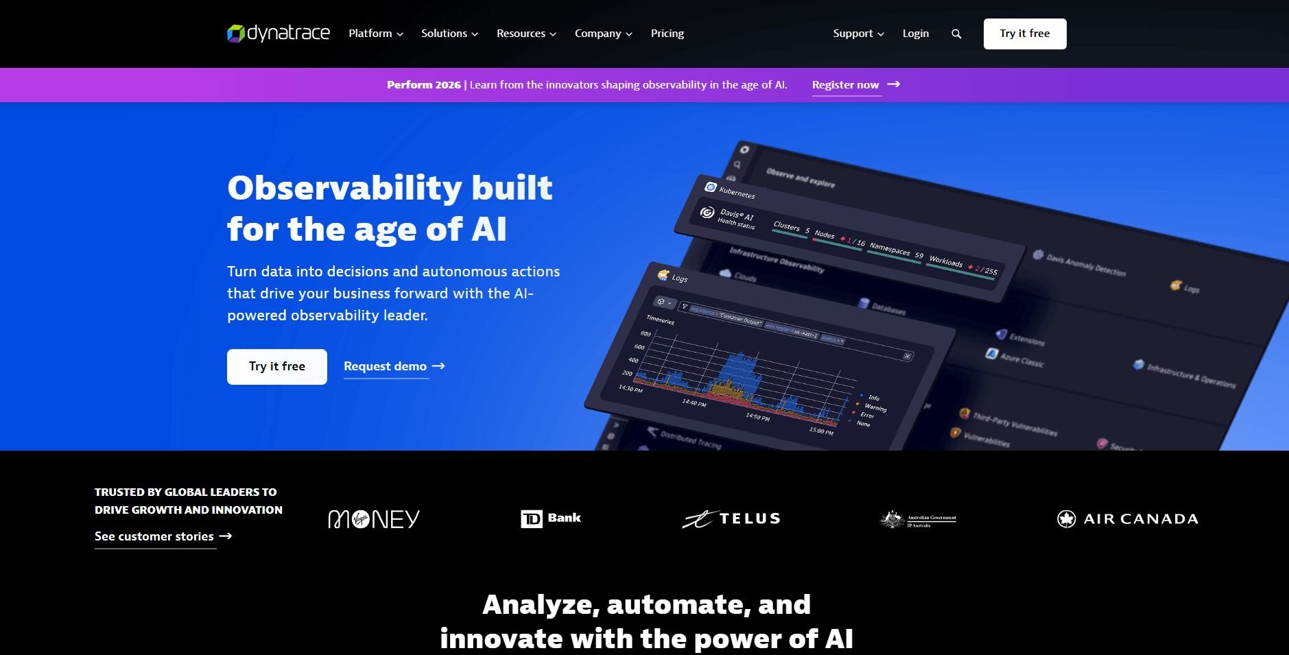
Dynatrace is an enterprise observability platform that tracks metrics, logs, traces, and user behavior in one system. It focuses on automatic discovery to reduce setup work.
After I connected to a test environment, it mapped the service relationships pretty quickly. The dashboards highlighted latency shifts clearly enough that I could see where performance dropped.
As I increased traffic, the platform pointed out which endpoints slowed first and linked them to the calls that caused the delay. Opening a trace showed full timing details, and the connected logs added the context needed to confirm each issue. The workflow kept longer reviews focused.
Why it beats Grafana
Automatic discovery: Detects services without manual mapping
AI-assisted insights: Flags unusual performance patterns
Unified observability: Metrics, logs, and traces in one place
Pros
Strong service mapping
Helpful performance insights
Good tracing detail
Cons
Complex pricing
Can feel heavy for smaller teams
Pricing
Dynatrace uses usage-based pricing.
Bottom line
9. Sumo Logic: Best for cloud-native log analysis
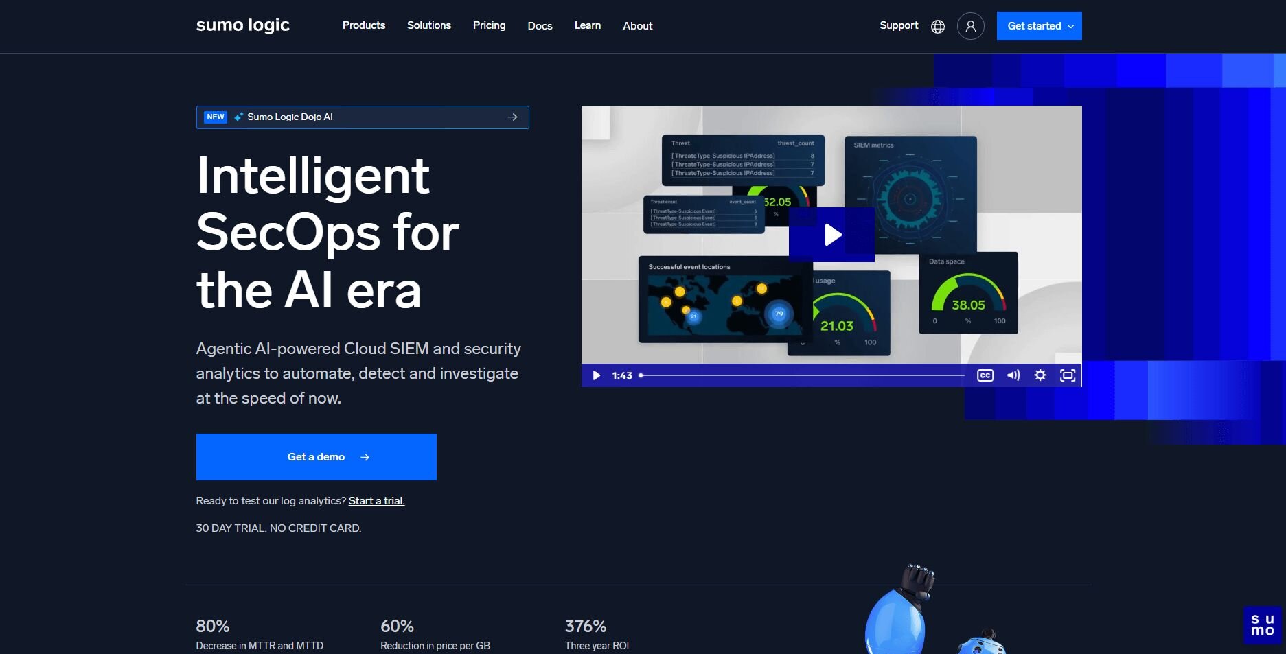
Sumo Logic is a cloud-native log and metrics platform designed for fast searches and real-time dashboards. After I set up the collectors, new entries flowed in fast, and the field-based searches responded fast enough to track spikes without delay. It gave me a clear early view of anomalies.
Watching latency and traffic trends was straightforward with the built-in charts and heatmaps. Panels refreshed on a predictable schedule, and alert rules triggered as soon as error rates climbed during tests. The workflow stayed smooth even with heavier activity.
Sumo Logic is most useful when you want quick log access without running the storage layer yourself.
Why it beats Grafana
Fast log search: Optimized for cloud-scale events
Built-in analytics: Heatmaps and patterns highlight issues
Cloud-native setup: No storage infrastructure to manage
Pros
Quick ingestion
Strong search tools
Real-time dashboards
Cons
Pricing grows with volume
Must manage field structure for best results
Pricing
Sumo Logic uses usage-based pricing.
Bottom line
Sumo Logic gives you fast log search and real-time dashboards, which helps you track cloud workloads with fewer steps. If you want deeper performance insights, AppDynamics may offer stronger tracing tools.
10. VictoriaMetrics: Best for high-performance time-series storage
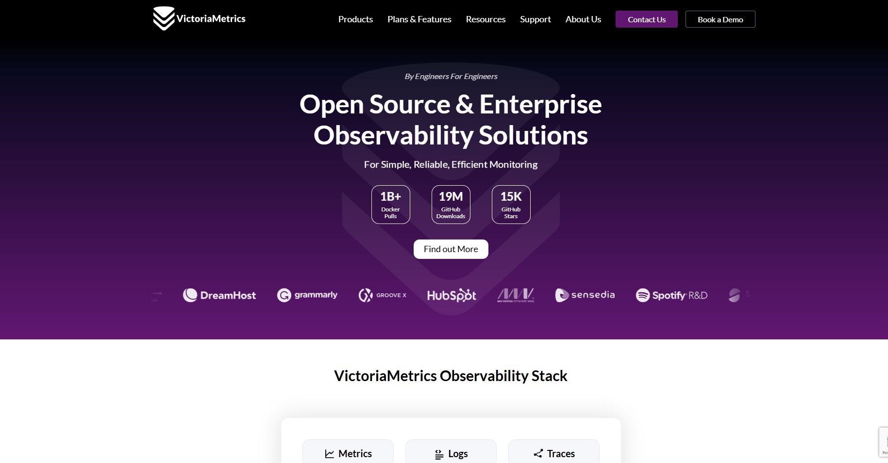
VictoriaMetrics is a time-series database built for large metric workloads and long-term retention. It’s known for fast queries and efficient storage.
I used its built-in charts to check long-range trends, and they were clear enough that I didn’t have to jump into external tools to confirm the patterns. As I pushed more metrics through it, the storage footprint stayed smaller than expected, and the query speed held steady. It handled scale without the slowdown you often see in other engines.
I did notice that setup takes a bit of planning, but the payoff is noticeable once traffic ramps up.
Why it beats Grafana
Optimized storage: Handles long-term metrics efficiently
High-speed queries: Returns results quickly at scale
Scalable design: Handles large series counts dependably
Pros
Efficient time-series engine
Fast queries
Good long-term retention
Cons
Setup takes planning
Limited built-in visuals
Pricing
VictoriaMetrics uses custom pricing.
Bottom line
VictoriaMetrics handles high-volume time-series data with fast queries and efficient storage, making it a strong fit for long-term metrics. If you want full tracing and logs together, Dynatrace may offer broader coverage.
11. Zabbix Cloud: Best for managed infrastructure monitoring
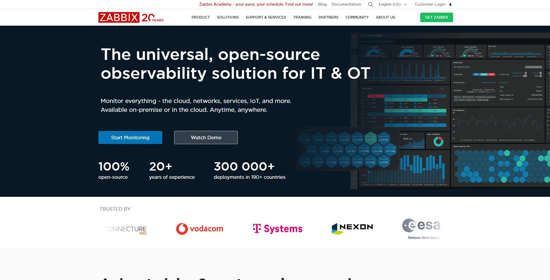
Zabbix Cloud offers managed infrastructure monitoring with agent-based checks. Once I added a few test servers, the system metrics appeared quickly, and the built-in templates covered databases and common services without extra setup. It gave me a clean view of system health right away.
I set alert rules for CPU and service failures next, and the notifications included enough detail to show exactly what changed. The dashboards tracked load, network activity, and service status in a way that made trends easy to follow during each test.
Zabbix Cloud works well when you want strong agent-level visibility without hosting the monitoring stack yourself.
Why it beats Grafana
Agent-based detail: More system metrics than scraper-only tools
Managed hosting: No servers to maintain
Strong alerting: Clear rules for infrastructure conditions
Pros
Reliable agent checks
Good alert controls
Useful infrastructure dashboards
Cons
Interface feels dated
Limited for application-level tracing
Pricing
Zabbix Cloud starts at $50 per month, billed monthly.
Bottom line
Zabbix Cloud gives you strong agent-based checks and a managed environment that removes the work of running your own monitoring server. If you want broader log analytics, Splunk might be a better fit.
12. AppDynamics: Best for application performance monitoring
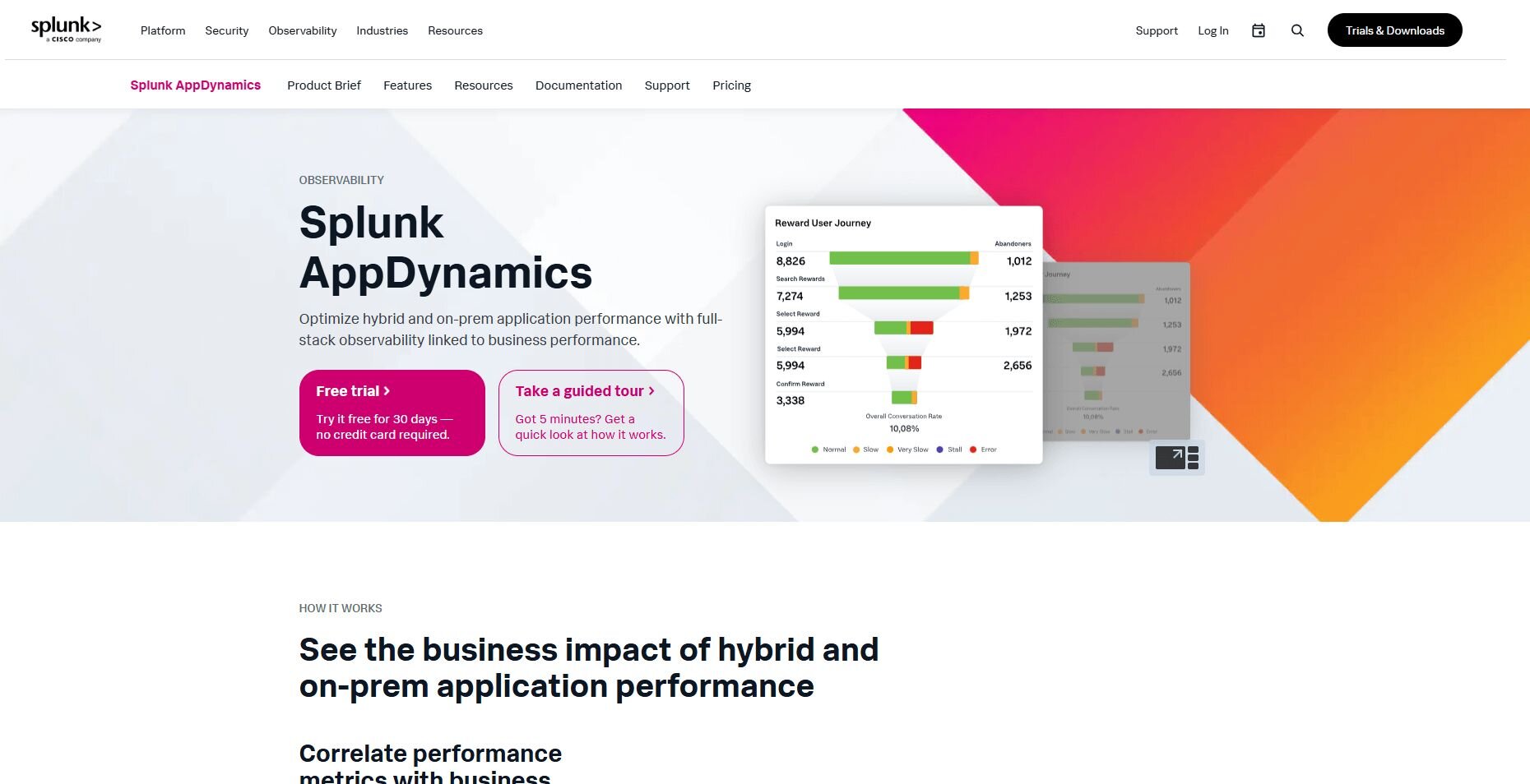
Splunk AppDynamics is an application performance management (APM) platform that traces transactions across distributed apps. It gives teams a close look at timing, dependencies, and performance issues.
When I linked a small test service to it, the platform mapped the request path clearly and showed where time was spent in each step. That early breakdown made performance issues easier to spot.
Under heavier loads, the dashboards highlighted latency jumps, grouped repeated errors, and surfaced the endpoints that slowed down first.
Why it beats Grafana
Transaction tracing: Detailed timing across service calls
Service maps: Clear view of dependencies
Strong APM focus: Built for production performance analysis
Pros
Great transaction detail
Helpful service maps
Solid database insights
Cons
Longer setup
Pricing varies by deployment
Pricing
AppDynamics uses custom pricing.
Bottom line
AppDynamics delivers detailed transaction traces and clear service maps, making it easier to track down slow requests in complex apps. If you need strong log search instead, Splunk may be a better match.
How I tested these Grafana alternatives
I tested each Grafana alternative on the same set of services to see how well they handled real monitoring work. I pushed traffic through small applications, watched how the tools reacted under load, and checked how quickly I could move from raw telemetry to a clear answer. This gave me a direct read on which platforms helped me work faster and which ones slowed me down.
Here’s what I looked at during testing:
Setup flow: How long it took to connect a service, ship data, and get the first useful chart or trace.
Signal clarity: Whether slow endpoints, error spikes, or latency jumps were obvious without extra digging.
Responsiveness under load: How dashboards, searches, and traces behaved when traffic increased.
Cross-view navigation: How easy it was to move between metrics, logs, and traces while investigating an issue.
Alert behavior: When alerts fired, how quickly they arrived, and whether the message told me what changed.
Dashboard usability: How quickly I could shape a clean view of system health without heavy configuration.
Noise management: Whether the tool helped filter irrelevant events so I could focus on real problems.
How to choose the right Grafana alternative
Choosing a Grafana alternative depends on the type of signals you track and how much setup you want to manage. Each tool handles metrics, logs, or traces differently, so the best match comes down to the kind of work you do every day. Choose:
Julius if you want quick metric checks in natural language without handling query languages or panel setup.
SigNoz if you want an open-source stack with metrics, logs, and traces in one place.
Kibana if your data already lives in Elasticsearch and you need fast log searches.
Datadog if you want one cloud platform that covers infrastructure, logs, APM, and alerts.
New Relic if you want deep tracing detail and service maps for complex applications.
Splunk if you work in log-heavy environments and need strong search tools.
Prometheus if you want direct metric scraping and fast time-series queries.
Dynatrace if you need automatic discovery and full-stack visibility across large systems.
Sumo Logic if you want fast log analytics without managing storage.
VictoriaMetrics if you need high-performance time-series storage at scale.
Zabbix Cloud if you want managed, agent-based checks for servers and networks.
AppDynamics if you want detailed transaction timing for application performance issues.
My final verdict
During testing, I saw clear patterns in how the major tools behave. Datadog and New Relic delivered strong full-stack views, while Splunk and Sumo Logic returned log searches faster and with cleaner matches during high-traffic periods. Prometheus and SigNoz handled metric-heavy workloads well, especially when I pushed more traffic through the test services.
Julius gives you a faster way to check a metric or trend without setting up dashboards or learning a query language. You move from a question to a chart in a direct workflow, and I’ve found that this helps you stay focused on the issue instead of the tooling. That structure keeps routine reviews clear and supports the way monitoring teams work when they need quick answers.
Try Julius if you want a faster alternative to Grafana
When you compare Grafana alternatives, the biggest difference often comes down to how quickly you can get a useful chart. Julius removes the extra steps by letting you ask for a visual in natural language and pulling results directly from your data source without added systems to manage.
Here’s how Julius helps:
Quick single-metric checks: Ask for an average, spread, or distribution, and Julius shows you the numbers with an easy-to-read chart.
Built-in visualization: Get histograms, box plots, and bar charts on the spot instead of jumping into another tool to build them.
Catch outliers early: Julius highlights values that throw off your results, so decisions rest on clean data.
Recurring summaries: Schedule analyses like weekly revenue or delivery time at the 95th percentile and receive them automatically by email or Slack.
Smarter over time: With each query, Julius gets better at understanding how your connected data is organized. It learns where to find the right tables and relationships, so it can return answers more quickly and with better accuracy.
One-click sharing: Turn a thread of analysis into a PDF report you can pass along without extra formatting.
Direct connections: Link your databases and files so results come from live data, not stale spreadsheets.
Ready to see how Julius can help your team make better decisions? Try Julius for free today.
Frequently asked questions
Is Grafana suitable for non-technical teams?
No, Grafana isn’t fully suited for non-technical teams because custom dashboards still rely on data source setup and query work. You can use its templates and plugins to get started with simpler views, but building or adjusting anything beyond the basics requires technical skills. Most non-technical teams choose tools that let them create charts without managing queries or panel configuration.
Why do teams switch from Grafana to other tools?
Teams switch from Grafana when setup, query work, or reporting limits slow down daily reporting. Grafana handles charts well, but deeper troubleshooting often requires separate tools for logs or traces. Many teams move to platforms that combine signals in one place and reduce the time spent adjusting panels.
Is Grafana free for team reporting?
No, Grafana isn’t fully free for team reporting because features like scheduled reports, PDF exports, and advanced access controls require a paid plan. The free tier supports shared dashboards and basic collaboration, but teams that need automated reporting or tighter permissions will need a subscription. You should compare Grafana’s pricing with the reporting volume and controls your team relies on.
