December 17th, 2025
12 Best Marketing Data Visualization Tools: Full 2025 Guide
By Drew Hahn · 32 min read
I ran campaign data through the leading marketing data visualization tools to see how well they handled attribution checks, spend trends, and channel comparisons. These 12 delivered the clearest read on what’s working and what needs attention in 2025
12 Best marketing data visualization tools: At a glance
Marketing data visualization tools differ in how they process campaign metrics, connect to data sources, and present charts you can use in reports. Here’s a quick look at pricing, best uses, and each tool’s key strength:
Tool | Best For | Starting Price (billed annually) | Key Strength |
|---|---|---|---|
Fast charting without SQL | Natural language queries with visual output | ||
Free dashboards for Google data | Free | Easy connections to Google Ads, GA4, and Sheets | |
Deep analysis | $75/user/month for the creator license | Rich visuals with advanced filtering | |
Large datasets | Strong modeling with the Microsoft ecosystem | ||
Centralized reporting | Broad connectors with real-time dashboards | ||
Complex data models | $200/month for 10 users | Flexible pipelines with strong transformation tools | |
Quick branded visuals | Templates that make reporting simple | ||
Clean charts for publishing | Accessible, responsive visuals | ||
Automated dashboards | Easy sharing with role-based access | ||
Custom chart types | Free | Wide range of unique visualization templates | |
Client reporting dashboards | $59/month for 5 clients | Ready-made marketing dashboards with 80+ data connectors | |
Embedded analytics | API-driven dashboards for internal tools |
1. Julius: Best for fast charting without SQL
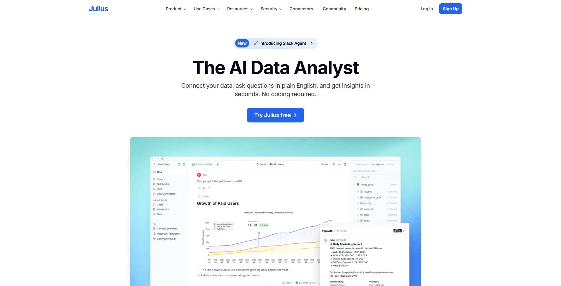
What it does: Julius turns your marketing data into charts and summaries using natural language prompts. You connect a source, describe the metric you want, and Julius writes the query. The result appears as a visual or table that you can export.
Who it’s for: Business users who want clear charts and quick answers without writing SQL.
We built Julius to make marketing analysis easier when you want a chart fast. You can ask for trend lines, breakdowns, or clear comparisons, and Julius returns a visual you can review before deciding what to check next. It works well when you switch between tables or connected sources and need clean outputs for teammates who prefer straightforward charts.
Julius scans your tables to pick up column names, formats, and dates. This helps follow-up questions use the right fields so you can stay focused on the insight you need. Marketing teams often jump between spend tables, lead records, and performance metrics, and Julius keeps these elements organized within the same analysis flow.
Notebooks support repeatable reporting without extra work. You can save a sequence of prompts, rerun them with fresh data, and keep the layout stable across reporting cycles. Scheduled runs send updated visuals to Slack or email so you don’t have to rebuild the same report every week.Key features
Natural language querying: Ask for trends, comparisons, or channel-level details and get a chart or table.
Notebook workflows: Save multi-step analyses and rerun them with updated marketing data.
Data connectors: Bring in data from sources like Postgres or Google Sheets with minimal setup.
Schema inspection: Review table details before running queries so you know what fields Julius will use.
Scheduled reports: Send updated visuals to Slack or email on a regular cadence.
Pros
Produces charts without manual SQL
Supports repeatable weekly reporting
Connects to common marketing data sources quickly
Cons
Not suited for advanced statistical modeling
Limited dashboard layout customization
Pricing
Julius starts at $37 per month.
Bottom line
2. Looker Studio: Best for free dashboards for Google data
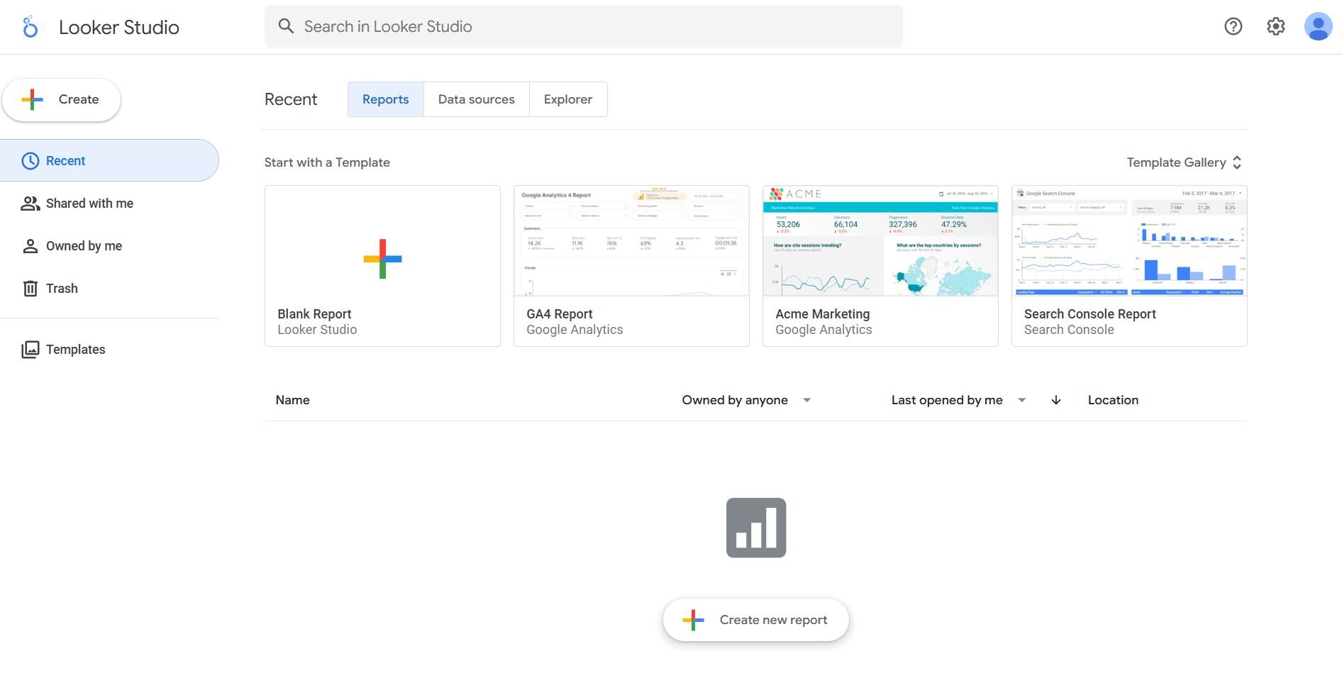
What it does: Looker Studio connects your Google data sources and turns them into editable dashboards. You can combine metrics, add filters, and build reports with charts and tables. The tool supports live connections so updates flow in without manual refreshes.
Who it’s for: Marketers who rely on Google Ads, GA4, and GSC and want a free way to build dashboards.
I tried Looker Studio when I needed a quick way to compare GA4 and Google Ads data in one place. The connectors pulled in metrics without extra steps, and I could check trends by switching date ranges. It helped me get a clear layout fast without any setup outside the Google ecosystem.
During testing, I liked how easy it was to adjust page structure. Moving charts and filters around helped me test different storylines for weekly reports. Blending worked for simple joins when I wanted cost and conversion data in the same view.
The dashboards stayed readable even when I added more filters to the page. Teams could scan key metrics without needing extra context.Key features
Live Google connectors: Pull data from Google Ads, GA4, and GSC without manual uploads.
Dashboard editor: Arrange charts, filters, and text blocks with a drag interface.
Data blending: Combine metrics from multiple sources for simple comparisons.
Pros
Free to use
Strong Google integrations
Flexible layout editor
Cons
Slow with large blends
Limited styling options
Pricing
Bottom line
3. Tableau: Best for deep analysis
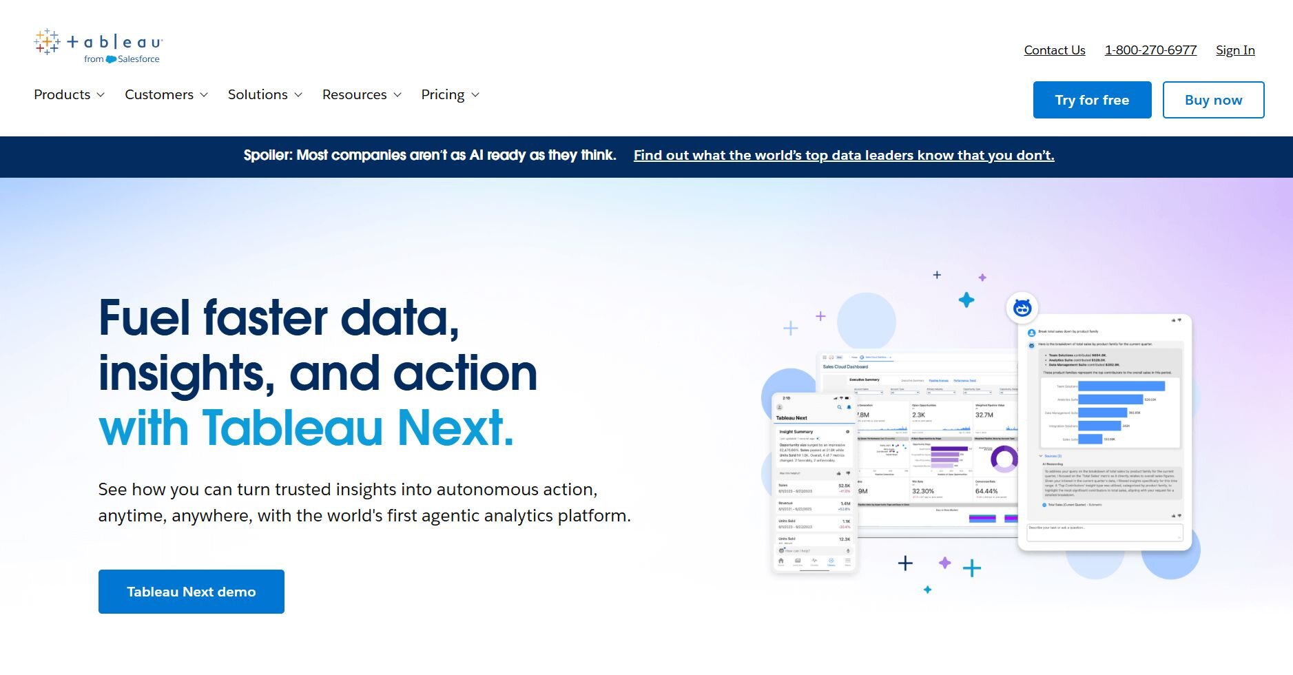
What it does: Tableau connects to multiple data sources and turns them into interactive dashboards. You can build charts, apply filters, and run comparisons through a drag interface built for analysis. The product supports large datasets and detailed drilldowns.
Who it’s for: Analysts who need strong control over visuals and metrics.
I tested Tableau when I needed more control over visuals and deeper breakdowns of large exports. Building charts through the drag-and-drop interface made it easy to compare regions and channels, and drilldowns helped me trace shifts in spend. The workbook layout kept each step of the review organized.
During testing, Tableau handled large tables without slowing the visual layer. I liked how filters reacted quickly when I explored narrow slices of the data. Formatting options gave me room to match the layout of reports my team already used.
Switching between worksheet views made it easier to compare approaches during analysis. The workbook structure kept everything aligned as I refined each chart.
Key features
Interactive dashboards: Build flexible visuals with filters and drilldowns.
Live and extracted data: Work with real-time data or staged extracts.
Workbook structure: Keep multiple analyses organized in one file.
Pros
Strong visual customization
Handles large datasets
Reliable filtering tools
Cons
Steeper learning curve
Requires setup for sharing
Pricing
Bottom line
4. Power BI: Best for large datasets
What it does: Power BI connects to spreadsheets, databases, and cloud services and converts them into dashboards and charts. You can model data, create reusable measures, and publish reports for teams. The tool supports large tables and detailed transformations.
Who it’s for: Users who need strong modeling for high-volume data.
I used Power BI to check how it handled heavy marketing tables and recurring metrics. The model view helped me set relationships before building visuals, and that structure made the charts react the way I expected. Measures were useful because I could apply the same calculation across reports without rewriting anything.
During testing, I used Power Query to fix field types and remove extra columns. Cleaning data before loading it into the model made the visuals clearer during reviews. The editor gave me detailed control over each step.
Calculated measures behaved consistently across new visuals, which made complex reports easier to manage. The model view also gave me a clear map of how tables interacted.
Key features
Data modeling: Build relationships and measures for consistent reporting.
Power Query: Clean and transform data before loading it into reports.
Report publishing: Share dashboards across your organization.
Pros
Great for large tables
Strong modeling tools
Reliable calculations
Cons
Dense interface
Setup required for sharing
Pricing
Power BI starts at $14 per user per month.
Bottom line
5. Domo: Best for centralized reporting
What it does: Domo connects many data sources and converts them into shared dashboards. You can create cards, set alerts, and build dataflows to prepare metrics. The platform supports real-time updates and centralized reporting.
Who it’s for: Teams that manage many sources and want everything in one place.
I tested Domo by connecting several marketing sources to see how well it handled cross-channel reporting. The connectors pulled in campaign and spend data cleanly, and I could test small visuals as cards before arranging them. Switching between datasets was simple once everything was connected.
During testing, I used DataFlows to prepare tables for reporting. Merging fields and setting types inside the flow kept the dashboards stable during updates. The editor made it easy to trace how each table supported the final charts, which helped me compare it to other data visualization tools.
Card previews provided a safe space to test small changes before publishing anything. This setup made refinement smoother during busy reporting cycles.Key features
Dataflows: Prepare data with joins and transformations.
Real-time updates: Keep dashboards fresh without manual refreshes.
Cards: Build and test visuals before arranging them in dashboards.
Pros
Large connector library
Good for multi-source reporting
Reliable scheduled updates
Cons
Takes time to learn
Interface can feel busy
Pricing
Bottom line
6. Qlik: Best for complex data models
What it does: Qlik loads data from multiple sources and shapes it into analysis-ready models. You can build dashboards, link large tables, and run comparisons across fields. The associative engine lets you explore data without predefined pathways.
Who it’s for: Users who need flexible modeling across high-volume marketing data.
Qlik is a broad analytics platform, and I tested it by loading large spend and conversion tables to see how the model behaved. The associative engine helped me move between segments without planning every step, and it kept connections visible as I explored changes in performance. Visuals reacted consistently once the model was set.
During testing, I used the editor to clean fields before loading them into the model. Fixing types and renaming columns helped the dashboards respond the way I expected. The interface gave me room to test different joins before saving the final structure.
Scenario testing stayed predictable because selections carried through the entire exploration path. The clear model view helped me verify relationships before saving changes.Key features
Associative engine: Explore data with flexible paths.
Modeling editor: Shape tables and relationships before analysis.
Custom dashboards: Build visuals with drill and filter controls.
Pros
Handles complex joins
Good for large data models
Flexible exploration tools
Cons
Learning curve for modeling
Interface can feel dense
Pricing
Qlik starts at $200 per month for 10 users.
Bottom line
7. Infogram: Best for quick branded visuals
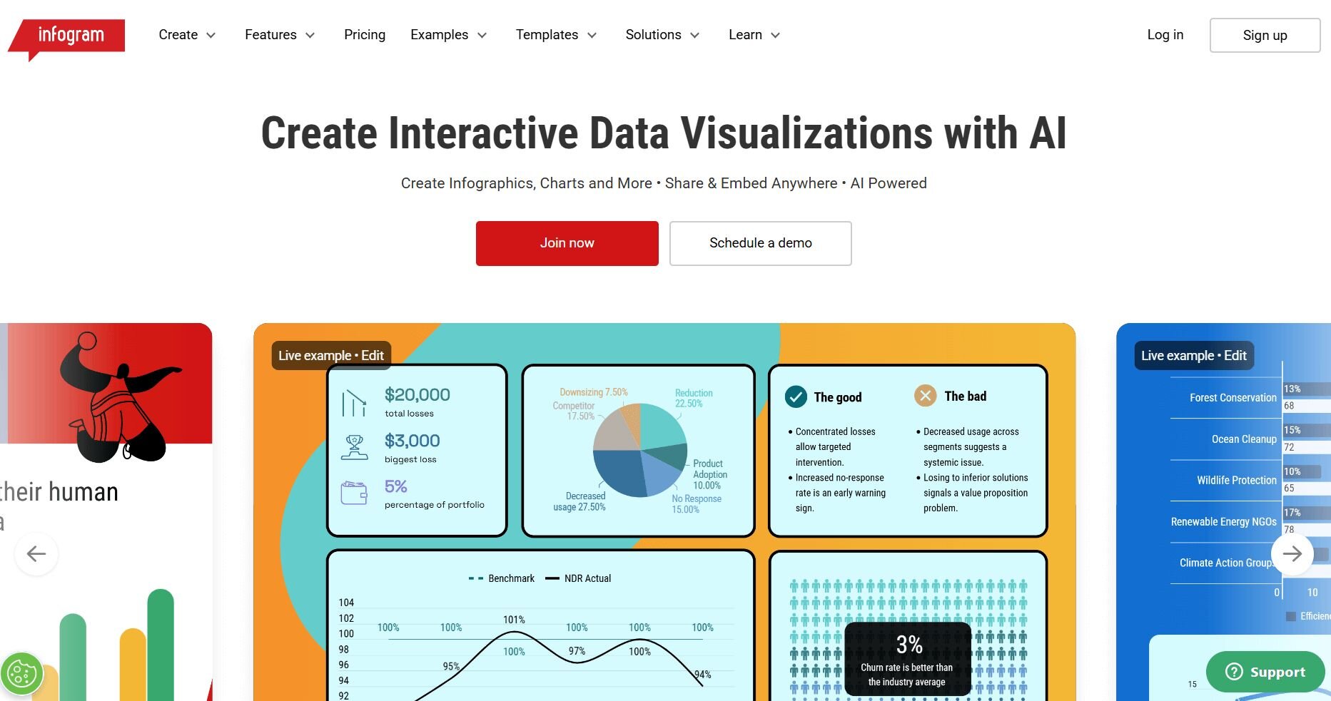
What it does: Infogram creates charts, infographics, and dashboards through a template-driven editor. You can import data from spreadsheets, adjust styles, and export visuals for presentations. The tool focuses on clean layouts with simple customization.
Who it’s for: Marketers who need ready-made visuals for reports or presentations.
I tested Infogram when I needed polished visuals without a long setup. The templates helped me get a chart into a presentable format quickly, and the editor gave me enough control to adjust labels and colors. It worked well when the goal was a clean visual rather than deep analysis.
During testing, I imported campaign tables from Sheets to see how fast I could build a report-ready layout. The editor grouped elements in a logical way, and I could switch between chart types without losing formatting. Exporting to PNG and PDF stayed consistent.
Templates remained clean even when I added supporting numbers or labels. The exported charts also held their clarity when placed in slide decks.Key features
Templates: Build polished visuals fast.
Chart editor: Adjust labels, colors, and styles.
Easy exports: Download visuals in multiple formats.
Pros
Fast setup
Good for branded reports
Simple editor
Cons
Limited advanced analysis
Not suited for big datasets
Pricing
Infogram starts at $19 per month.
Bottom line
8. Datawrapper: Best for clean charts for publishing
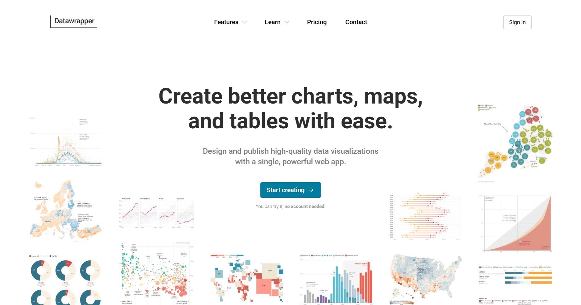
What it does: Datawrapper creates responsive charts, maps, and tables through a no-code interface. You can paste data directly, choose a visual style, and publish or export it. The tool prioritizes clarity and accessibility.
Who it’s for: Users who need clear, publication-ready charts.
Testing Datawrapper showed me how well it handles straightforward datasets that need a clean visual. I could paste data directly into the editor and preview several chart types before settling on the one that worked. The tool reacted quickly, which helped with light reporting tasks.
During testing, I used the annotation tools to make small adjustments that improved clarity. Labels, tooltips, and colors were easy to tune without affecting layout. The responsive preview helped me check how the chart would appear on different screens.
Charts kept their proportions across screen sizes, which helped maintain consistency. The export options made it simple to produce polished files for reports.
Key features
No-code editor: Paste data and pick a visual.
Responsive charts: Preview across devices.
Clear styling: Adjust labels and colors easily.
Pros
Clean output
Easy setup
Good for publishing
Cons
Licensing costs for commercial use
Less flexible than D3 for custom designs
Pricing
Datawrapper starts at $5990 per year.
Bottom line
9. Zoho Analytics: Best for automated dashboards
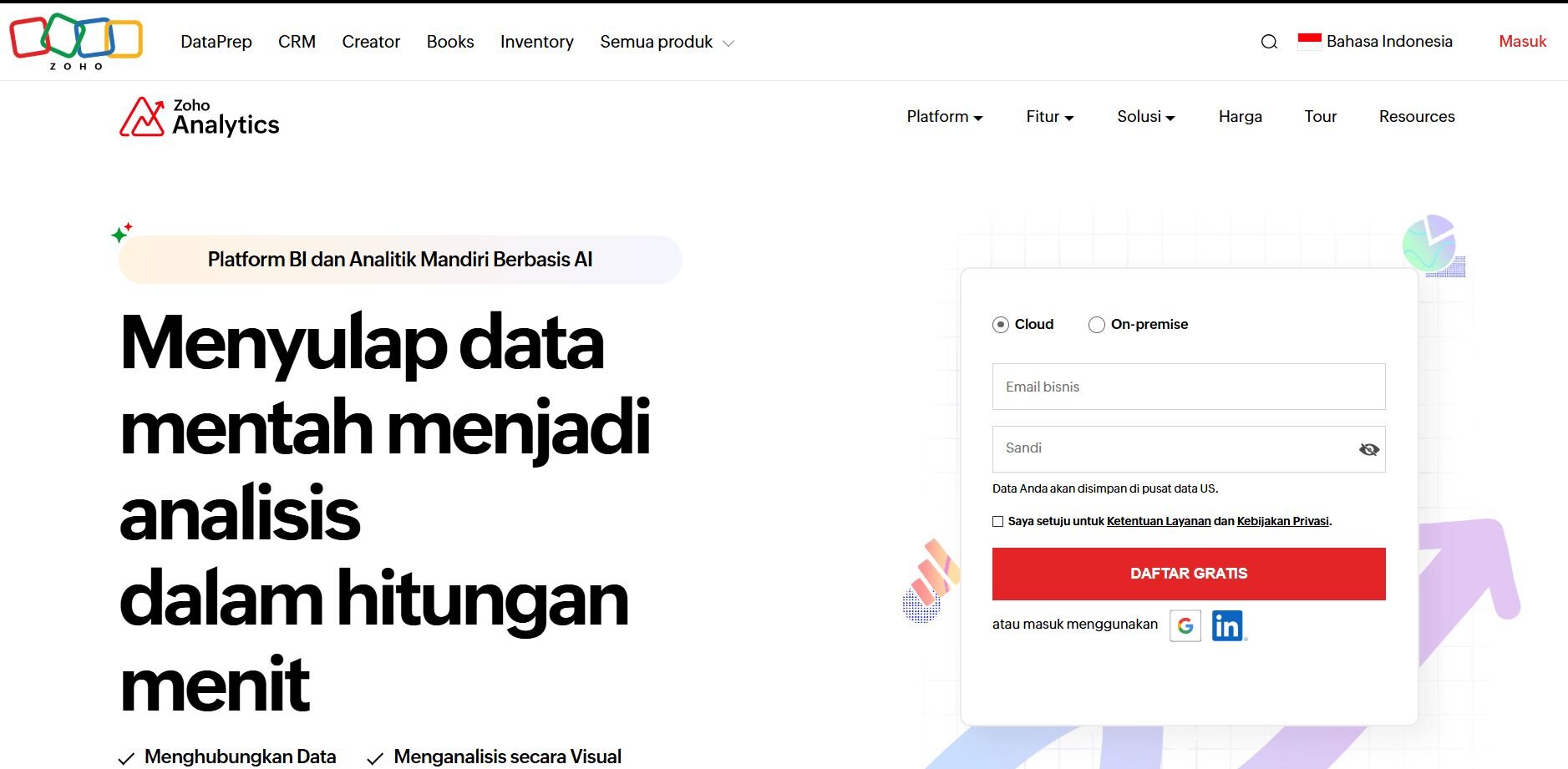
What it does: Zoho Analytics brings data from multiple sources into automated dashboards. You can set refresh schedules, shape tables, and create charts for performance reviews. The platform supports deeper reporting through built-in modeling tools.
Who it’s for: Users who need recurring dashboards with automated updates.
I tested Zoho Analytics by connecting ads, web analytics, and CRM data to see how it handled recurring reporting. The auto-refresh options helped me keep dashboards current without manual updates. Chart creation was quick once the model was structured.
During testing, I used the data preparation tools to fix field types and remove duplicates. Cleaning the data upfront improved the reliability of the dashboards. The editor supported table joins that made sense for channel-level reporting.
Tabbed dashboards helped separate insights for different teams without cluttering the layout. This structure kept recurring reports organized throughout the month.Key features
Auto-refresh: Keep dashboards updated.
Data prep tools: Clean and shape tables.
Dashboard editor: Build multi-page reports.
Pros
Good for recurring reporting
Strong prep tools
Supports many connectors
Cons
Learning curve
Some visuals are rigid
Pricing
Zoho Analytics starts at $48 per month for 5 users.
Bottom line
10. RAWGraphs: Best for custom chart types
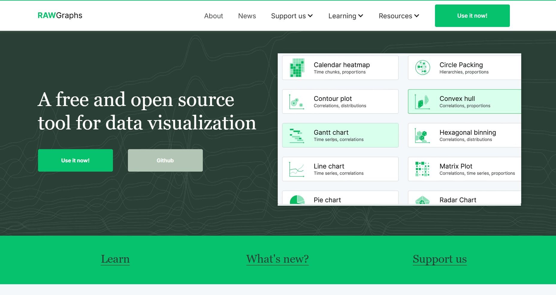
What it does: RAWGraphs builds custom charts from unique templates that aren’t common in standard tools. You upload data, select a chart type, and map fields to visual elements. The tool focuses on flexibility rather than automated reporting.
Who it’s for: Users who need uncommon or experimental visual formats.
I tested RAWGraphs when I needed a chart type I couldn’t find in other tools. Mapping fields was straightforward once I matched each column to the visual element. The tool worked well when I wanted something different from standard bar or line charts.
During testing, I generated a few variations to compare readability. Some templates were harder to adjust, but they offered layouts that made sense for niche use cases. Exporting to SVG gave me more control for final edits.
Unusual chart formats rendered well without heavy adjustments. The SVG exports gave me room for detailed tweaks when needed.
Key features
Unique templates: Build uncommon chart types.
Field mapping: Assign columns to visual elements.
Vector exports: Edit results in design tools.
Pros
Wide variety of formats
Good for experimentation
Easy data uploads
Cons
Limited styling control
Not suited for dashboards
Pricing
RAWGraphs is open source and is free to use.
Bottom line
11. AgencyAnalytics: Best for client reporting dashboards
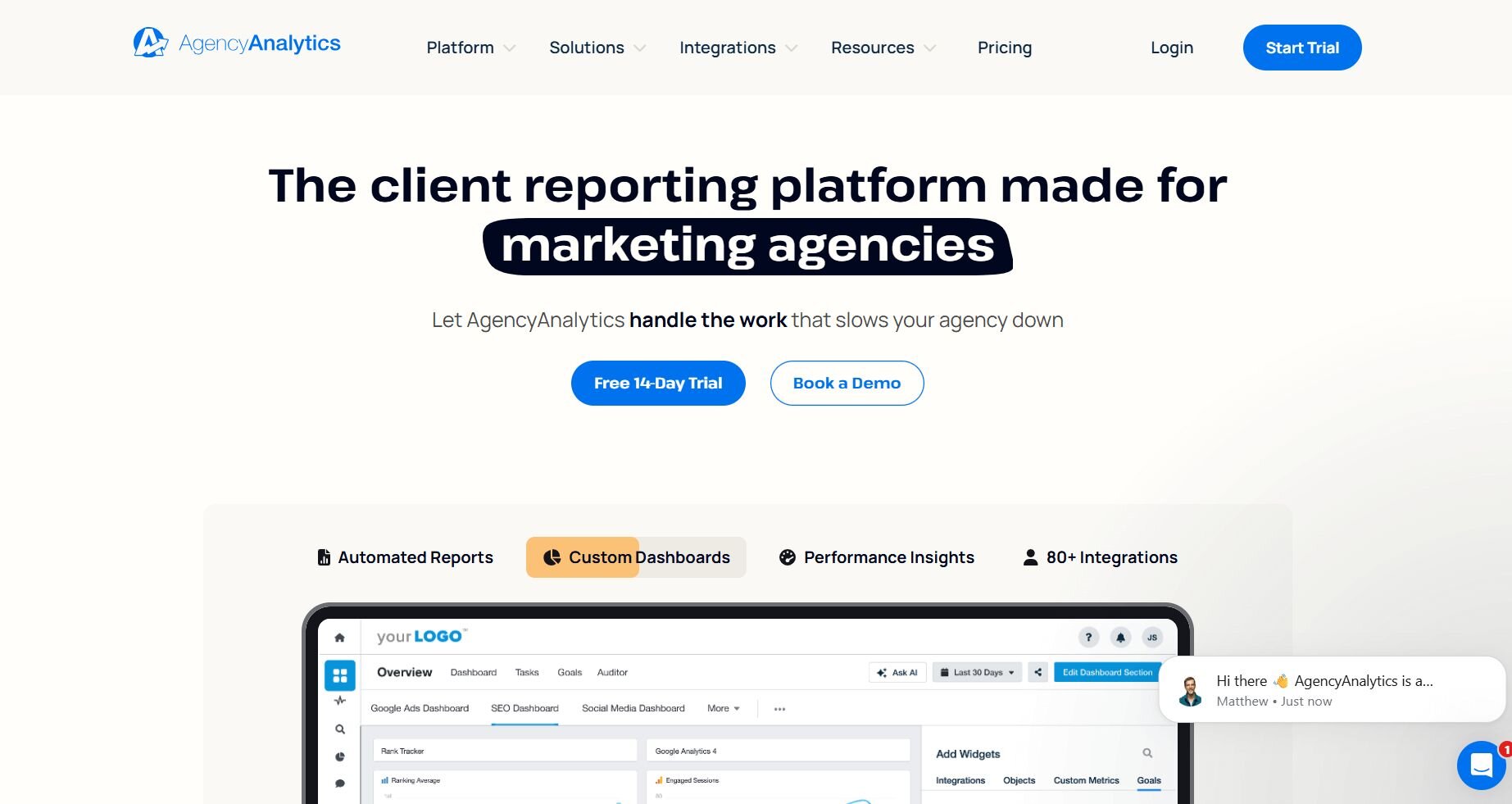
What it does: AgencyAnalytics connects marketing platforms and builds dashboards for client reporting. You can choose templates, schedule reports, and share access with clients. The interface centers on multi-channel visibility.
Who it’s for: Agencies that deliver recurring reports to clients.
I tested AgencyAnalytics by connecting several marketing accounts to see how quickly I could build client-ready dashboards. The templates helped me get a full view of performance without designing from scratch. The workflow made sense for recurring reporting.
During testing, I used the widget editor to adjust fields and highlight metrics that mattered for weekly updates. Scheduling reports saved time because everything was delivered on its own. The client permissions were simple to manage.
Duplicating dashboards for different clients saved setup time during weekly reviews. The layout stayed stable when I updated metrics across accounts.
Key features
Templates: Build dashboards quickly.
Scheduled reports: Automate delivery.
Client access: Share views with permissions.
Pros
Easy setup
Good templates
Clean client access
Cons
Limited design flexibility
Some widgets are rigid
Pricing
AgencyAnalytics starts at $59 per month for 5 clients.
Bottom line
12. Sisense: Best for embedded analytics
What it does: Sisense embeds analytics into internal tools and dashboards. You can build models, design widgets, and connect large data sources. The platform supports custom applications through APIs.
Who it’s for: Teams that need embedded analytics inside internal products.
Sisense impressed me with how much control it gives over embedded widgets. I tested it by pushing large marketing datasets into the model to see how the system handled them. The editor let me test different layouts before embedding them.
During testing, I used the modeling tools to shape data for predictable visuals. Fixing relationships early made the widgets react consistently. Embedding the charts into an internal page worked once the model stabilized.
Embedded widgets adapted well across internal tools with different layouts. The responsive design kept visuals readable on a range of screen sizes.Key features
Embedded widgets: Add charts to internal tools.
Modeling tools: Prepare data for predictable visuals.
APIs: Build custom analytics experiences.
Pros
Strong embedded options
Good modeling control
Works with large datasets
Cons
Steeper learning curve
Requires setup for embedding
Pricing
Bottom line
How I tested these marketing data visualization tools
I worked through these tools the same way I handle real reporting cycles by using live campaign exports, weekly pacing checks, and multi-source datasets that marketers manage every day.
My goal was to see how each platform handled routine tasks. I worked with imperfect data, shifting timelines, and the rapid checks that come up when you need answers before a meeting.
Here’s the approach I used:
Connected real data: I loaded paid media, CRM, and web analytics tables to see how each tool managed mixed structures and field types.
Built recurring reports: I recreated weekly and monthly dashboards to check how fast I could refresh data and keep layouts consistent.
Tested joins and blends: I combined spend, conversions, and lead data to see where tools struggled with matching fields.
Checked visual clarity: I compared the readability of charts, labels, and filters during quick scans and longer reviews.
Measured setup friction: I noted how long it took to get from a blank page to a usable chart or dashboard.
Reviewed export quality: I saved charts as images and PDFs to see which tools produced clean files for presentations and handoffs.
Tracked performance: I monitored load times, refresh behavior, and stability when tables grew or queries expanded.
Which marketing data visualization tool should you choose?
The right marketing data visualization tool depends on how often you review campaign data, the complexity of your sources, and the kind of visuals you need for your team or clients. Choose:
Julius if you want quick charts from natural language prompts and don’t want to write SQL.
Looker Studio if your work revolves around Google Ads, GA4, and Search Console and you need a free dashboard option.
Tableau if you need deeper analysis with detailed visuals and drilldowns.
Power BI if your reporting relies on large tables and strong modeling tools.
Domo if you manage many marketing sources and want all your dashboards in one place.
Qlik if your data requires complex models and flexible exploration paths.
Infogram if you need clean, branded charts for presentations and client decks.
Datawrapper if you publish charts and want responsive visuals with clear formatting.
Zoho Analytics if you need recurring dashboards with automatic refreshes.
RAWGraphs if you want unique chart types for niche datasets.
AgencyAnalytics if you run client reporting and need ready-made marketing dashboards.
Sisense if your analytics must live inside an internal product or tool.
My final verdict
Tableau and Power BI suit teams that need heavy modeling, while Looker Studio works better for quick Google-based reporting. Domo and Zoho Analytics handle multi-source dashboards well, but they take more setup than I’d expect for lighter reviews.
Julius centers on speed and clarity, which makes it a better fit for everyday reporting than tools built for complex modeling. You get a direct way to turn questions into charts without managing complex models, and I think that matters when you need answers during a busy reporting cycle. I’ve found that this structure gives you faster clarity without adding steps, and it keeps your workflow simple as your campaigns grow.How Julius supports faster marketing analytics visualization
Marketing data visualization tools give you charts and dashboards, but they don’t always help you get quick answers during everyday checks. Julius steps in by turning your questions into visuals you can use for campaign reviews, pacing updates, and weekly summaries.
Here’s how Julius helps:
Quick single-metric checks: Ask for an average, spread, or distribution, and Julius shows you the numbers with an easy-to-read chart.
Built-in visualization: Get histograms, box plots, and bar charts on the spot instead of jumping into another tool to build them.
Catch outliers early: Julius highlights suspicious values and metrics that throw off your results, so you can make confident business decisions based on clean and trustworthy data.
Recurring summaries: Schedule analyses like weekly revenue or delivery time at the 95th percentile and receive them automatically by email or Slack.
Smarter over time: With each query, Julius gets better at understanding how your connected data is organized. It learns where to find the right tables and relationships, so it can return answers more quickly and with better accuracy.
One-click sharing: Turn a thread of analysis into a PDF report you can pass along without extra formatting.
Direct connections: Link your databases and files so results come from live data, not stale spreadsheets.
Ready to see how Julius can help your team make better decisions? Try Julius for free today.
