November 23rd, 2025
9 Best Redash Alternatives for Data Visualization in 2025
By Tyler Shibata · 14 min read

I compared dozens of Redash alternatives this year, and these 9 tools delivered the strongest mix of analysis features, dashboard quality, and practical day-to-day use.
Expert take:
Julius works well when you're dealing with connected data and need quick charts, summaries, or repeatable reports without writing SQL. Tableau and Power BI suit teams with established BI workflows, while Metabase and Trevor fit simpler dashboard and data-access needs.
9 Best Redash alternatives: At a glance
Redash alternatives cover different needs, from quick charting to full BI setups with deeper modeling. I compared pricing, ideal use cases, and the main edge each tool offers so you can see which one fits your workflow. Let’s compare these 9 tools side by side:
Alternative | Best For | Starting Price (billed annually) | Key Advantage vs Redash |
|---|---|---|---|
Fast analysis without SQL | Clear charts and summaries from connected data with minimal setup | ||
Simple dashboards and AI-assisted queries | Easier onboarding and built-in AI query support | ||
Enterprise analytics with strong governance | Central modeling layer and deeper control over data definitions | ||
Visual exploration and multi-layer dashboards | $75/user/month for the Creator license | Richer visual options and stronger dashboard customization | |
Microsoft-focused teams | Tight connection to Microsoft tools and a lower entry price | ||
Mobile KPI tracking | Fast mobile access to metrics with lightweight dashboards | ||
Teams that prefer no-code querying | $75/month, billed monthly | Easy query builder and clean dashboard layouts | |
Budget-conscious teams that want simplicity | $100/month for 5 users | Open source setup with basic charts and straightforward dashboards | |
Data modeling with flexible reports | Unified modeling layer for repeatable reporting |
Why I looked for Redash alternatives
Redash has changed a lot since the hosted service shut down in 2021. The commercial platform is gone and support from the original team ended, so the only official option now is the open source version. You can still use it through self-hosting or a third-party hosting provider. In both cases, you’re responsible for updates, fixes, and deployments.
When I tested the self-hosted edition, core querying still worked, but tasks that relied on newer connectors or regular maintenance took more effort. The community rebooted the project and continues to release updates, but the pace depends on volunteers. That creates uncertainty if your analytics setup needs predictable development or long-term stability.
From my testing and research, three main issues push teams to look for Redash alternatives:
End of hosted support: The official Redash SaaS platform is gone, and ongoing maintenance now falls to either your own hosting setup or a third-party provider.
SQL dependence: Every question requires manual queries, which slows non-technical users.
Variable update pace: Community releases help, but features and connectors evolve unevenly.
These gaps are why I started comparing tools that offer easier onboarding, active product development, and reporting features that don’t require deep technical resources to maintain.
1. Julius: Best for fast analysis without SQL
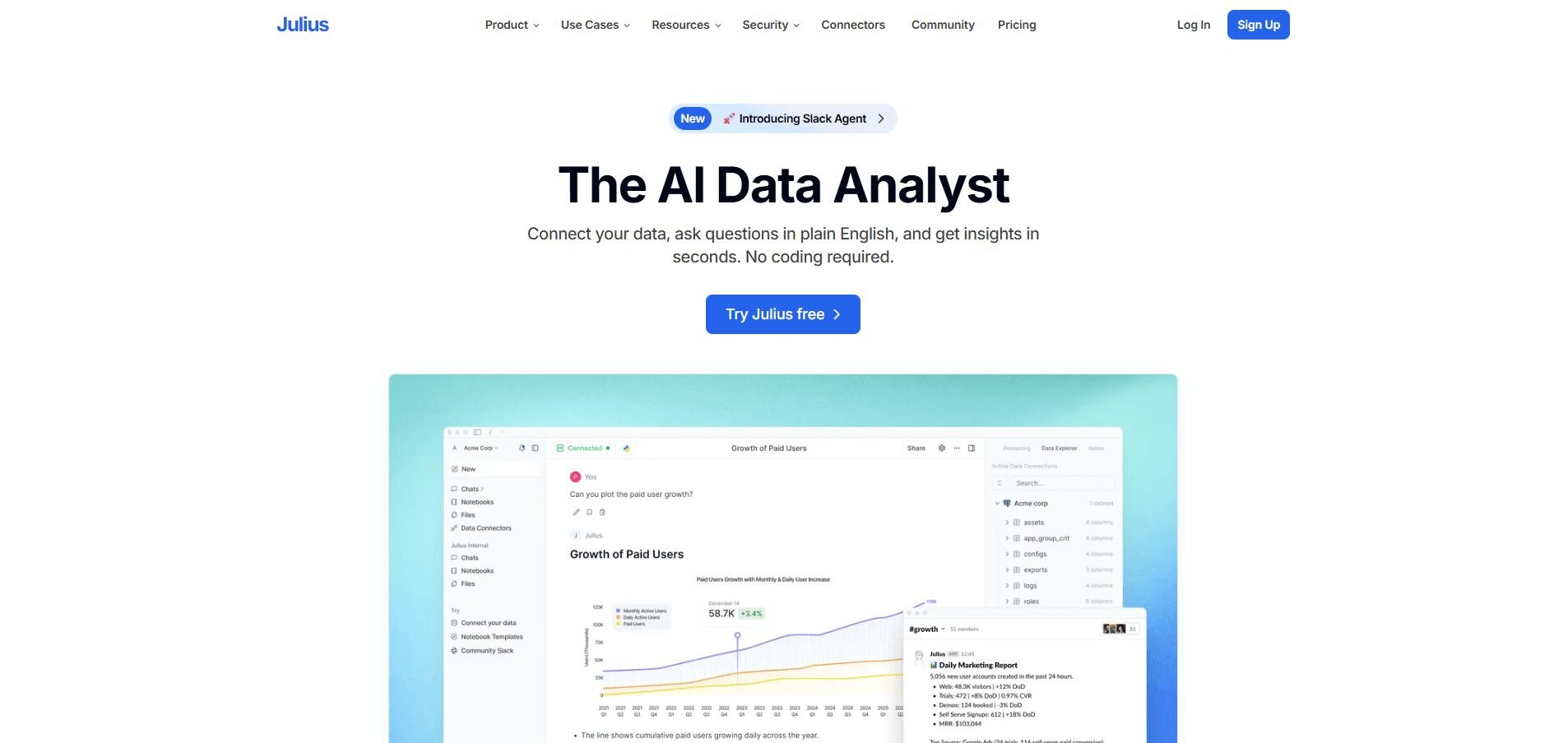
We designed Julius to make everyday reporting easier for business teams that don’t want to write queries. It lets you ask direct questions about your connected data and get clear charts or summaries fast without building dashboards first. That reduces the back and forth that usually slows basic analysis.
We also built strong connectors for sources like Google Sheets, BigQuery, and Postgres, so you can bring in data without technical setup. Scheduled exports send reports to Slack or email, and each update keeps formatting stable across runs. This helps with weekly reviews and recurring reporting.
Where Julius differs from traditional BI tools like Redash is how quickly you can move from question to result. Redash expects SQL and manual joins, so non-technical users often rely on someone else to prepare queries. Julius handles the structure by reading table relationships, which makes simple questions easier to run on your own.
That said, Julius isn’t meant to replace full BI stacks. It focuses on everyday checks, recurring reports, and quick comparisons rather than deep modeling. The value shows up in the routine moments where you need an answer that’s clear and ready to use.
Why it beats Redash
Lower barrier to use: Ask direct questions without SQL
Faster first results: Connect a source and get answers fast
Clearer output: Charts and summaries are ready to share without editing
Pros
Direct connections for Sheets, BigQuery, and Postgres
Scheduled exports keep recurring updates consistent
Simple question-driven workflow
Cons
Not built for complex BI modeling or custom visual layers
Fewer visualization options compared to larger BI platforms
Pricing
You can try Julius on the free plan. Paid plans start at $37 per month.
2. Draxlr: Best for simple dashboards and AI-assisted queries
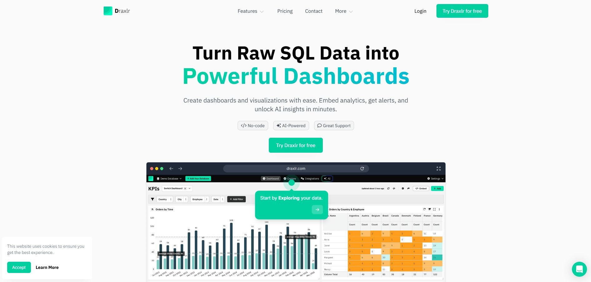
I tested Draxlr on a few small datasets to see how fast I could build dashboards without touching SQL. Basic charts came together quickly because the interface guides you through filters and groups without slowing you down. I didn’t need much setup to reach a usable view.
My first run with the AI prompts showed that Draxlr can produce SQL for you, and the tool explains the logic so you can confirm accuracy. This helped when I needed quick checks before sharing results.
I noticed that Draxlr works well for teams that want lighter reporting without dealing with complex fields or layered dashboards. It keeps the workflow simple.
Overall, the tool focuses on fast output rather than deep customization. It suits smaller teams that want simple charts without too much configuration.
Lower barrier: Non-technical teams can run queries without SQL
Faster setup: Dashboards come together with fewer steps
AI guidance: SQL suggestions reduce manual work
Pros
Easy setup for smaller teams
Clear charts with minimal configuration
Helpful AI prompts
Cons
Limited custom visuals
Not suited for large BI deployments
Pricing
Draxlr starts at $600 per year.
Bottom line
3. Looker: Best for enterprise analytics with strong governance
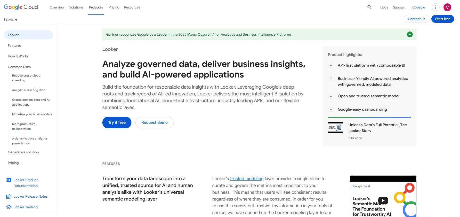
I started my testing by running Looker on a structured marketing dataset to understand how much control the modeling layer offered. The LookML setup produced consistent metrics across reports and cut down on guesswork when teams viewed shared dashboards. It took time to configure, but the payoff showed up in cleaner outputs.
I noticed Looker handled large tables well once the model was in place. Queries stayed predictable because the definitions lived in the modeling layer rather than scattered across reports.
Looker also helped with access controls. I could assign views based on roles without editing each dashboard. This made governance easier to maintain.
The tradeoff is the learning curve. It works best when you have technical resources to manage the models and keep definitions current.
Why it beats Redash
Central modeling: Shared definitions keep reports consistent
Role controls: Permissions stay structured
Reliable scaling: Larger datasets run steadily
Pros
Strong governance features
Consistent definitions across reports
Good support for large datasets
Cons
Long setup time
Requires technical resources
Pricing
Looker uses custom pricing for its Standard, Enterprise, and Embed editions.
Bottom line
Looker helps teams keep data definitions consistent across large analytics setups. Choose Tableau if you want richer visuals, or pick Power BI if you need tight integration with Microsoft tools.
4. Tableau: Best for visual exploration and layered dashboards
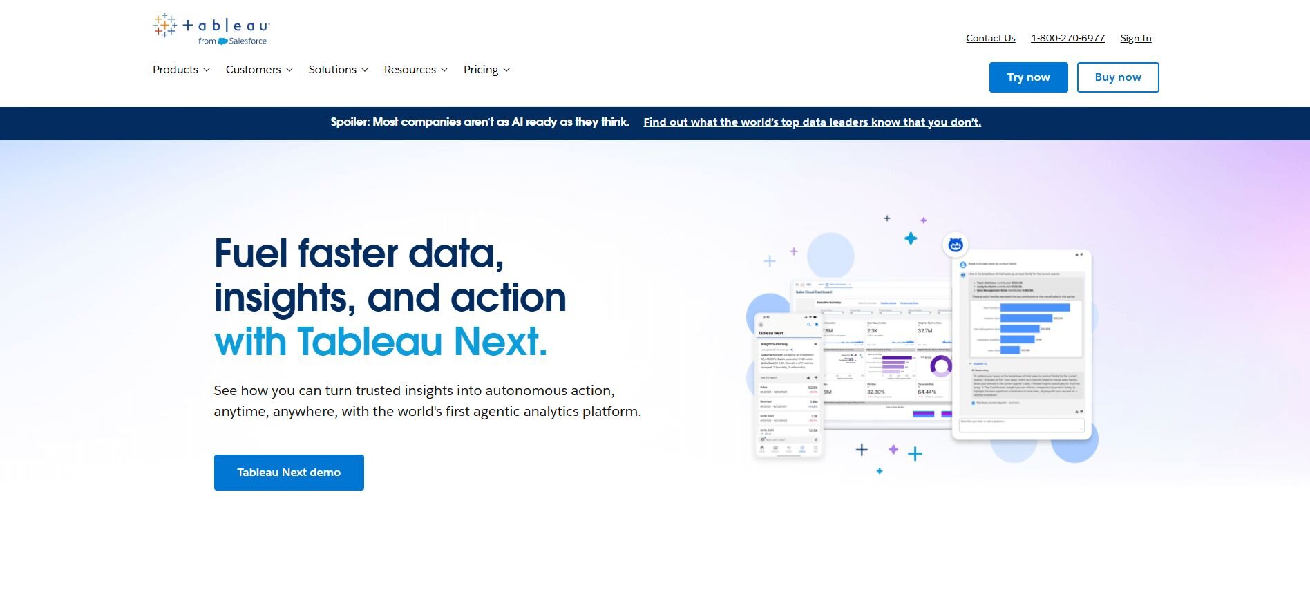
I tried Tableau on a multi-sheet dataset to see how well it handled different views. The drag-and-drop interface made it easy to switch between charts without rewriting queries. I moved from line charts to maps quickly because Tableau detects field types on its own.
What stood out was how flexible the dashboard layout was. I could build multiple views and compare trends without creating new pages. This helped when I tested different date ranges and categories.
Tableau also handled larger files smoothly during my tests. It supports many connectors, so I could bring in data from several sources without major setup.
The learning curve is there, but once you understand the layout, building visuals becomes faster and more reliable.
Why it beats Redash
Rich visuals: More chart types and layouts
Interactive dashboards: Easier comparisons across views
Strong connectors: Broad data source support
Pros
Wide range of chart types
Good performance on larger datasets
Flexible dashboard layouts
Cons
Higher cost than lighter tools
Needs time to learn
Pricing
Tableau starts at $75 per user per month for the Creator license.
Bottom line
Tableau fits teams that need flexible dashboards and stronger visual controls. If you want faster answers from connected data without writing SQL, Julius handles everyday analysis more directly.
5. Power BI: Best for Microsoft-focused teams
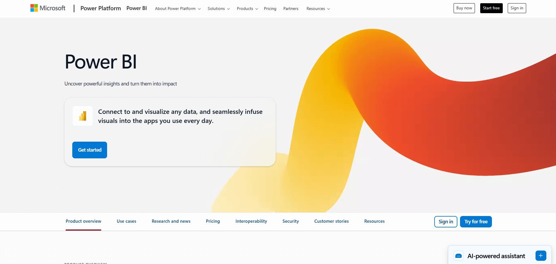
I tested Power BI with data stored in Excel, SQL Server, and SharePoint to check how well it handled mixed sources. The imports were straightforward because the connectors match Microsoft tools directly. Once loaded, the interface made it easy to build reports with basic drag actions.
During testing, I noticed the DAX language gave more control for custom measures. It takes time to learn, but it supports detailed reporting once you understand the structure. This helped when I needed year comparisons and segmented views.
Power BI also made sharing easier inside Microsoft environments. Reports moved into Teams and SharePoint without extra setup. This kept everything in one workflow.
The main limitation is that Mac users cannot run the desktop app, which affects teams with mixed devices.
Why it beats Redash
Microsoft integration: Smooth connection to Office tools
Custom measures: DAX supports deeper reporting
Lower entry price: Affordable for growing teams
Pros
Strong connectors inside Microsoft ecosystems
Useful custom measures
Simple sharing in Teams and SharePoint
Cons
No desktop app for Mac
DAX takes time to learn
Pricing
Power BI starts at $14 per user per month.
Bottom line
6. Datapad: Best for mobile KPI tracking
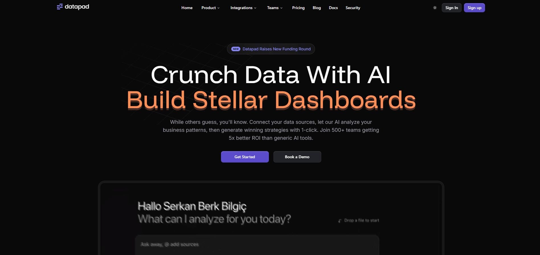
Datapad stood out in my testing for how quickly it handled short, mobile-first KPI checks. The app let me move between metrics without extra steps, and the layout kept daily changes easy to scan.
I compared the web and mobile versions to see how each handled the same dashboards. The mobile app remained the stronger option because the charts stayed clear on a small screen, which helped when I checked metrics away from my laptop.
Alerts also shaped the experience. Notifications matched the thresholds I set, so I could stay updated without opening the app each time.
The tradeoff is that Datapad focuses on high-level tracking rather than deeper modeling or custom reporting.
Why it beats Redash
Mobile focus: Designed for quick checks on the go
Simple setup: Charts load with minimal configuration
Fast alerts: Notifications keep you updated
Pros
Easy mobile experience
Clear KPI tracking
Reliable metric alerts
Cons
Limited chart customization
Not suited for large datasets
Pricing
Datapad starts at $15 per month.
Bottom line
7. Trevor: Best for teams that prefer no-code querying
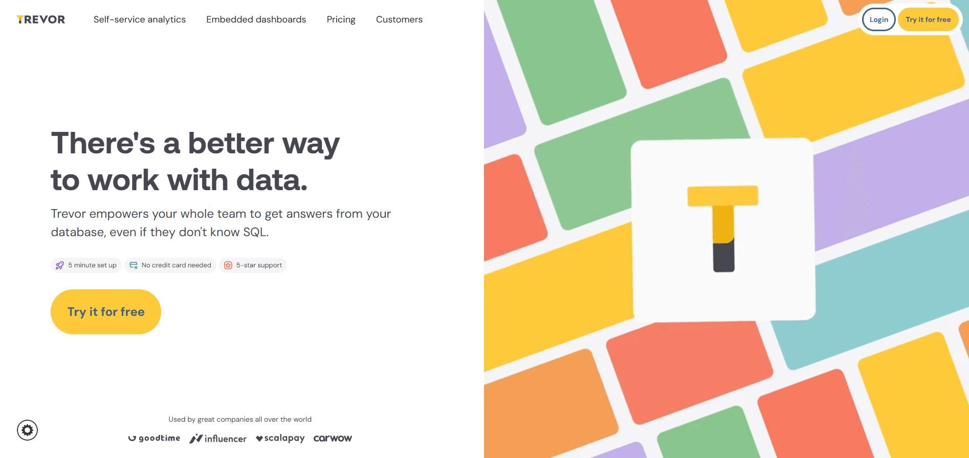
Trevor performed well in my testing. I used it on sales and product tables to see how accurate the no-code builder was, and it handled the structure without slowing me down. The tool guided me through filters and groups, and I reached clear answers without writing SQL.
I created a few dashboards to see how fast they updated. They refreshed quickly once queries were saved, and exporting results to Google Sheets worked without extra setup.
To test flexibility, I switched between no-code mode and SQL for more precise calculations. The changeover stayed stable and did not break the earlier work.
Heavy datasets take longer to load, and that slows down larger reporting workflows.
Why it beats Redash
No-code builder: Lets non-technical users run queries
Clean dashboards: Easy to scan
Flexible modes: SQL available when needed
Pros
Simple query creation
Helpful for mixed-skill teams
Clear dashboard layouts
Cons
Slower with heavier data
Fewer visual options than larger BI tools
Pricing
Trevor starts at $75 per month, billed monthly.
Bottom line
8. Metabase: Best for budget-conscious teams that want simplicity
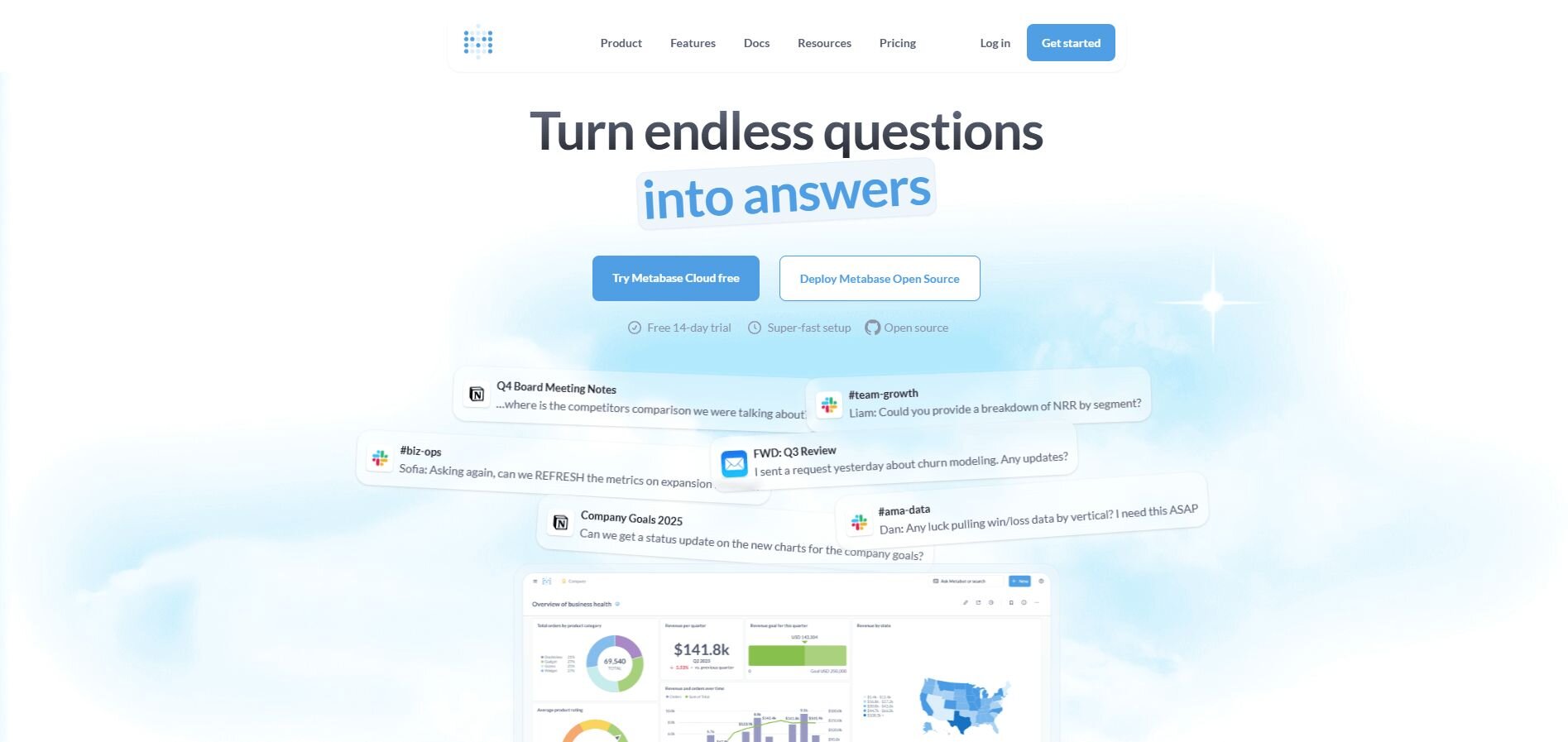
Testing Metabase on a small marketing dataset showed how quickly I could move from questions to basic dashboards. The interface made field selection simple, and the questions feature guided me through early reporting.
I then set up email scheduling to test recurring updates. Reports arrived on time, and the setup stayed straightforward, which made weekly reviews easier.
To check flexibility, I ran a few SQL queries after using the no-code approach. Switching between both modes helped when I needed more detail than the default options provided.
Metabase keeps things simple, but that limits deeper modeling or advanced formatting.
Why it beats Redash
Lower cost: Affordable even for small teams
Simple onboarding: Easy for new users
Flexible modes: SQL available for detailed work
Pros
Fast setup
Clear basic charts
Good balance of no-code and SQL
Cons
Limited customization
Not suited for complex BI needs
Pricing
Metabase starts at $100 per month for 5 users, then $6 per month for each additional user.
Bottom line
Metabase fits teams that want simple dashboards at a reasonable price. Try Holistics if you need modeling features, and choose Looker if you want strict governance for larger datasets.
9. Holistics: Best for data modeling with flexible reports
Holistics is a modeling-focused BI tool, and my testing confirmed how much consistency you gain once metrics are defined in one place. Reports stayed aligned, and dashboards reflected the same calculations without extra cleanup.
I set up drill paths to test how the tool handled exploration. Once the model was ready, I could move into details without repeating work, and that made comparisons across segments easier.
Scheduled delivery worked well during weekly reporting. Exports kept their formatting, so recurring reviews stayed stable.
The tradeoff is the setup time. Teams without technical resources may need help building and maintaining the model.
Why it beats Redash
Modeling layer: Central definitions for metrics
Consistent reports: Stable across updates
Useful drills: Easy exploration once configured
Pros
Strong modeling tools
Reliable scheduled reports
Good control over metric definitions
Cons
Longer setup time
Needs technical support for modeling
Pricing
Holistics starts at $800 per month.
Bottom line
Holistics suits teams that want structured models and consistent reporting. If you prefer simple dashboards, Metabase is easier to start with, and Tableau fits teams focused on visual exploration.
How I tested these Redash alternatives
I spent several weeks working through each tool in reporting scenarios to see how they handled everyday analysis, recurring dashboards, and multi-source data. I approached the testing the way a business team would. My goal was to understand how quickly I could get answers, how reliable the results stayed over time, and how much technical setup each tool required.
Here’s what I evaluated:
Data onboarding: I connected Sheets, BigQuery, Postgres, and CSV files to see how much work it took to reach a usable dataset.
Query flow: I tried both no-code tools and SQL editors to check how each platform handled common reporting tasks like comparisons, splits, and trends.
Dashboard behavior: I built small dashboards, updated them over several days, and watched how each tool refreshed and organized results.
Performance with real tables: I used datasets with thousands of rows to test load times, stability, and whether the tool kept responses consistent.
Export and sharing options: I sent reports through email, Slack, and file exports to see how well each platform supported weekly or monthly reporting.
Error handling: I looked at how tools explained failed queries, missing joins, or bad inputs so I could judge how practical they were for non-technical users.
These tests helped me see how each platform handled common data visualization techniques and tools that teams use during weekly reporting.
How to choose your Redash alternative
Your choice of Redash alternative depends on cost, setup time, and how much structure your reporting needs. Choose:
Julius if you want quick answers from connected data without writing SQL.
Tableau if you need flexible dashboards and stronger visual control.
Power BI if you already rely on Microsoft tools and want lower entry pricing.
Looker if your team needs strict governance, shared definitions, and stable modeling.
Draxlr if you want simple dashboards and guided queries with light setup.
Datapad if you track KPIs on mobile and want fast metric alerts.
Trevor.io if your team prefers no-code queries with optional SQL support.
Metabase if you want budget-friendly reporting with clear, basic charts.
Holistics if you need a modeling layer that keeps metrics consistent across reports.
My final verdict
I noticed that smaller groups often lean on Metabase or Draxlr for quick charts, while data teams with heavier governance needs move toward Looker. Tableau and Power BI tend to attract teams that want more visual control or already work inside the Microsoft ecosystem.
Julius fits the space those tools leave open. You get fast answers from connected data without extra setup, and I’ve found that this helps you stay focused on the analysis instead of the mechanics. It sits in the middle of the workflow, not as a replacement for full BI stacks but as the tool that keeps everyday reporting practical.
How Julius can help your reporting and analysis
Redash alternatives solve different parts of the reporting workflow, but you still need SQL or extra setup in many of them before you can get a chart you trust. Julius helps you move faster by turning connected data into charts, summaries, and reusable reports without having to manage queries or maintain your own hosting.
Here’s how Julius helps with financial data visualization and reporting:
Quick single-metric checks: Ask for an average, spread, or distribution, and Julius shows you the numbers with an easy-to-read chart.
Built-in visualization: Get histograms, box plots, and bar charts on the spot instead of jumping into another tool to build them.
Catch outliers early: Julius highlights values that throw off your results, so decisions rest on clean data.
Recurring summaries: Schedule analyses like weekly revenue or delivery time at the 95th percentile and receive them automatically by email or Slack.
Smarter over time: With each query, Julius gets better at understanding how your connected data is organized. It learns where to find the right tables and relationships, so it can return answers more quickly and with better accuracy.
One-click sharing: Turn a thread of analysis into a PDF report you can pass along without extra formatting.
Direct connections: Link your databases and files so results come from live data, not stale spreadsheets.
Ready to see how Julius can help your team make better decisions? Try Julius for free today.
Enter some text...Frequently asked questions
What is the best Redash alternative in 2025?
The best Redash alternatives in 2025 are Julius, Tableau, Power BI, and Metabase because they each solve different reporting needs reliably. Julius helps you get quick answers from connected data without SQL, Tableau gives you stronger visual control, Power BI fits if you already use Microsoft tools, and Metabase works when you want simple dashboards at a lower cost.
Can you still use Redash after the hosted service shut down?
Yes, you can still use Redash by self-hosting the open source version, since the community continues to publish new releases. You also have the option to run Redash through third-party hosting providers if you don’t want to manage infrastructure yourself. If you choose to self-host, you’ll have to handle updates, patches, and deployments because the original hosted service closed in 2021.
What should you look for when choosing a Redash alternative?
You should look for a Redash alternative that helps you run reports without depending on SQL for every question. A good replacement gives you clear onboarding, stable connectors, and dashboards that refresh reliably. You also need a tool that matches your team’s skill level so you can move faster without constant query writing.
A sales dashboard should include KPIs like total revenue, lead conversion rates, average deal size, pipeline velocity, and sales cycle length. These metrics show both sales efficiency and overall growth. Add filters by region or product to understand where performance is strongest or lagging.
Are there free data visualization tools?
Yes, there are open-source data visualization tools like Metabase, Looker Studio, and Redash. These platforms let you create basic charts, review core metrics, and share simple dashboards without a paid plan. They work well for small teams or early reporting needs, but they don’t offer the deeper modeling or advanced visuals you get in paid tools.
